Atrium by Forceflow

Map Rating

  • 0
  • unrated

Map Download

Map Info

Map Description

This was my entry for the Snarkpit 2004 map competition.
The twist is texture limitation/roman style ... i only used 6 textures.

I must admit the r's are a bit high at some points (peaks at 1200), but since this is a DM map for 3-4 players, and less people are playing HL on archaic computers, it shouldn't be a big problem.

Many thx to Fishy for the models, without them the map would be nothing.

Discussion

Posted by Forceflow on Mon Aug 2nd 2004 at 12:37am
[Author]

yes ... silly me ... I mixed up pitch and angle ... I might think of
correcting it, but only if I get my other work done. Thx a lot.
Posted by beer hunter on Sun Aug 1st 2004 at 11:21pm

Errr, that -30 is maybe the pitch ? its the light direction/angle that seems a bit off as the shadows look as tho' they're lined up at a 90 degree angle with the walls although its hard to tell from the screenys :sad:
Posted by Forceflow on Sun Aug 1st 2004 at 7:45pm
[Author]

I have some other work to do, so I don't think I can make those changes before the mapping contest deadline.

I do appreciate all the remarks and I will finish this map when the time is there.

environment_light angle is set to -30 ... wrong ?
Posted by Crackerjack on Sun Jul 25th 2004 at 2:05pm

Wow, im glad we still have people at snarkpit who are willing to be so kind to review and give tips like this.. nice one beer hunter. Forceflow deff take these tips.. it could only help.
Posted by beer hunter on Sun Jul 25th 2004 at 9:16am

Hmmm, its prolly a bit late to suggest stuff but never mind, here goes... The lighting direction looks as tho' its set at 0/90/180 or 270 degrees, changing it to 70 or some other value so that its not at a right angle should make it look better.

User posted image

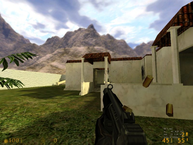
1 - rope ladder (?) is ok but it would be more interesting to have a climeable trellis or vines up that wall, the cs_havana.wad has got trellis and vine tex's.

2 - needs something on those walls - window, alcove etc.

3 - roofs are typically supported with timber beams, i would use a different tex for the roof underside, tfc2.wad's m_ceiling usually works ok for this.

4 - the wall looks as tho' its got an angled brush at the base (?) but it'll maybe still look too flat. A different tex at the lower level will help or make the ground slope up the wall a bit - something like the blue lines although maybe not so high.

User posted image

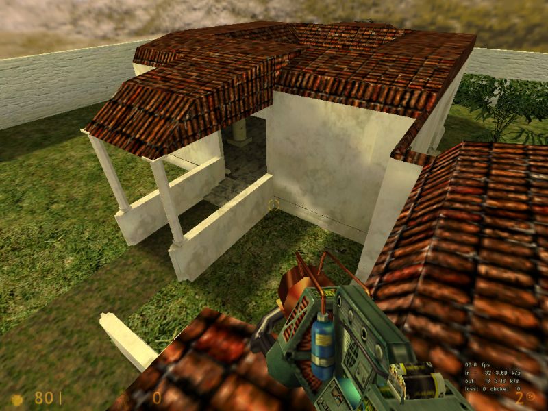
1 - big stretch of boring wall here and prolly in other parts of the map - add some trellis, vines, brick buttress etc. to make it look better.

It always looks unrealistic when theres only a wall around the map edges, put in a few tree models behind the wall or use some func_walls textured with bushes/trees on top of the wall.

2 - that wall looks a bit thin ?

3 - needs some trim around the door edges and some doors if the r's can take it. Maybe arched doorways would fit in ?

4 - ummm, this roof on the bit that juts out may look better if it's lowered to where the white lines are so that the roofs are at different levels and it looks a bit more random.

5 - the line between the two different ground tex's sticks out, could do with something less obvious.

Hard to say if the textures are ok although the perimeter wall does seem a bit plain, maybe worth trying tfc2.wad's i_wall_base for that wall and see if it makes a difference.

And thats it :smile:
Posted by Ferret on Fri Jul 23rd 2004 at 6:43pm

I believe that lep is gonna extend the contest a couple of days.

So I'd suggest planning more cause its pretty drab atm.
Posted by Forceflow on Fri Jul 23rd 2004 at 5:29pm
[Author]

Ok, can live with that. I've built this thing in a week. Maybe I'll
edit it when I'm back, but I just wanted something for the compo.
Posted by Tracer Bullet on Fri Jul 23rd 2004 at 2:59pm

I've got to say Force, I'm not very impressed.

-Flat lighting

-Unimaginative architecture

-Boring textures

Sorry to be so harsh, but that is what I see.
Posted by 7dk2h4md720ih on Fri Jul 23rd 2004 at 12:56am

Post a beta download link or pm me a link and I'd be happy to look for errors and give suggestions.
Posted by Forceflow on Sun May 23rd 2004 at 7:52pm
[Author]

I've scaled them down, they look better now.