Myth by SuperCrazy

Map Rating

  • 5
  • 1 rating / 5 stars

Map Download

Map Info

  • 1 rating
  • 6465 views
  • 1902 downloads
  • added Thu Oct 14th 2004
  • updated Sun Oct 26th 2025
  • more content for: Unreal Tournament 2004

Map Description

This ancient building is one of last preserved structures from a time that has long been forgotten. Now it hosts the bloody struggles of those who enter its cold stone walls.

Discussion

Posted by Crono on Wed Oct 13th 2004 at 12:42am

er can't you click "hide weapon" in the menu and it wont show the weapon at all, just the hud?
Posted by Orpheus on Tue Oct 12th 2004 at 11:24pm

Obligatory Warning: I own UT2K4, but I have yet to play it, so I will be reserving my comments to mainly errors, construction, layout and lighting.. the item placements may need someone who knows the game better to judge, as they seemed heavy in spots and bare in others.. I honestly don't remember UnrealDM well enough to say tis good/bad.

User posted image

These things just seem to jut out of the walls in order to give the appearance of holding the floor above. Somehow they look wrong. It may be nothing more than the way it actually bonds to the wall i dunno, but it just looks wrong.

User posted image

cannot remember where i saw this exactly, but that piece seemed to glow

User posted image

The only really major glitch I saw throughout the map.. I know unreals engine doesn't create holes, but they do have their equivalent of HOM effect, which resembles holes..

User posted image

Another angle of the same error/glitch.

User posted image

These light fixtures are some of the most original I have seen in a long time.. They most definitely fit the theme.. some of the blue ones were not really ugly, but no where near as nice as these ones are

User posted image

Nice looong sight lines.. nothing wrong with this screen, or any of the others I will post like them, I just liked them so well I had to show the people who may not have this game.. Very nicely done SC

User posted image

Very sweet design on these steps (and the others to of course)

User posted image

Another extremely long sight line.. nice spots to catch the unwary or snickers to catch you as well.

User posted image

If I had a wish, I would like to see more stuff like this throughout the map.. these chains set the mood of this area, but alas I saw them no where else.. (always the chance that since its my first run through, that I overlooked more placements).. this map lacked the finer touches these chains represented.

User posted image

More of those things just jutting from the wall.. I think they need some sort of an anchor, or base if you will.

User posted image

this lift... had me scratching my butt, what is wrong with it.. 1) it doesn't fit the theme. 2) if left, it needs some sound and 3) its bulky.. if it were I, I'd replace it, but since I don't know whats on the other side of those walls, it may not be possible to replace now..

User posted image

One of my favorite additions to this map, these indentations are nothing special, but they truly perk up the looks. Very well done.

User posted image

A tree, a very nice tree too.. the map could have used many more plants throughout.. maybe some sills looking out to the sky with some plants beyond.. maybe a bit of water, this map had many places that could have benefited from plants and water.

User posted image

This hall, it has got to be one of the best I have seen in a long time.. The map could have used a couple more such, but at least it had this one.

User posted image

Another long sight line.. nice ceiling too i might add, much better than the drab flat ones before.

User posted image

IMO, these lights were underused.. the map could have benefited from a few more of them.. Also, i would have placed them closer to the floor..

User posted image

This support beam, very well done.. it looks very nice, and doesn't clash at all.

User posted image

Another long sight line, but this time you can see how odd those supports look from afar. the flat ceiling is about the only really ugly thing about this shot.

User posted image

The vertical in this map is ever present.. This screen shows one of the better areas for a good top down ambush.. Nice depth.

User posted image

I would like to have been able to get under a few of these ramps.. no big issue but it would have made for a nice ambush site.

User posted image

Beautiful, just plain beautiful.. this would be a nice long sniper site.

Some may have noticed that I used a few weapons that Sc didn't place.. My reason was simple.. UT uses such large weapons that i couldn't take the screen shots without half the viewable area taken up by the weapon.. so i used a cheat and loaded them all so i could find one a bit less obstructive..

I can only hope that someone who plays UT2K4 can comment and fill any gaps I may have inadvertently omitted..

Very well made map SC.. My compliments.
Posted by Agent Smith on Mon Oct 11th 2004 at 3:55am

It's looking cool SuperCrazy, and I don't have anything to add, as its all been said.

I've made one small DM map for UT2003 myself (A path problem I can't fix has meant it hasn't been released) and am currently working on one for UT2004, probably a capture node map, not quite sure yet. The reason I'm bringing this up is that I know it's a real bastard moving from HL mapping to UT mapping, as the systems are completely back to front, so to release something that looks this good is a real achievement. Nice one. :biggrin:
Posted by SuperCrazy on Mon Oct 11th 2004 at 12:16am
[Author]

Last updated version of the night is ready. The ugly weapon bases have been changed and I've made a bunch of architectural changes as well. The uber flat ceilings are slowly being erradicated.

The first shot has some very minor changes, the second shot is from a different perspective so the ceiling looks better, and the third shot is from a completely different area.
Campaignjunkie said:
  • I think the map needs more landmarks; the big, giant, majestic kind. While the areas are somewhat unique and different from each other, I don't think it's enough to distinguish them immediately while the player is learning the layout. Maybe have a giant gaping hole in the ceiling in one room, a giant tower in another, etc.
There are some landmarks/noteable areas - One room has a gate sort of thing hanging from the ceiling, there are a couple of skylights, one room has a completely open ceiling, and there's an outdoor area. I like the idea of a tower, statues, etc. but it's hard to just throw them into a mostly completed map and have them look good. I'll see what I can do though.
Campaignjunkie said:
  • The overall room layouts are quite boxy. If all/most of the static meshes are stripped away, it's all quite boxy and rectangular. Some rounded corners or slanted surfaces wouldn't do any harm, and might add more interest and strategy. Also, I think lots of ancient civilizations utilized slanted surfaces, so it should fit the theme well.
The boxy thing has always been something of a problem for me. I have some slanted/rounded surfaces now, but I'll look to see where I can add more.
Campaignjunkie said:
  • What's the purpose of the blue-purple lights? If you haven't already, I think you should attach some kind of context to them (e.g. red lights are used for vents in Natural Selection). Maybe place weapons near them, so the player will catch a glimpse of that color and immediately run out to see what's there? Don't know.
I like this idea, but I also like how I have it currently. Hm... :confused:
Posted by thursday- on Sun Oct 10th 2004 at 8:15pm

I agree with all comments. I couldn't do half as decently on my first UT2k4 map, I'd also have to get the game to try too.
Posted by Campaignjunkie on Sun Oct 10th 2004 at 6:23pm

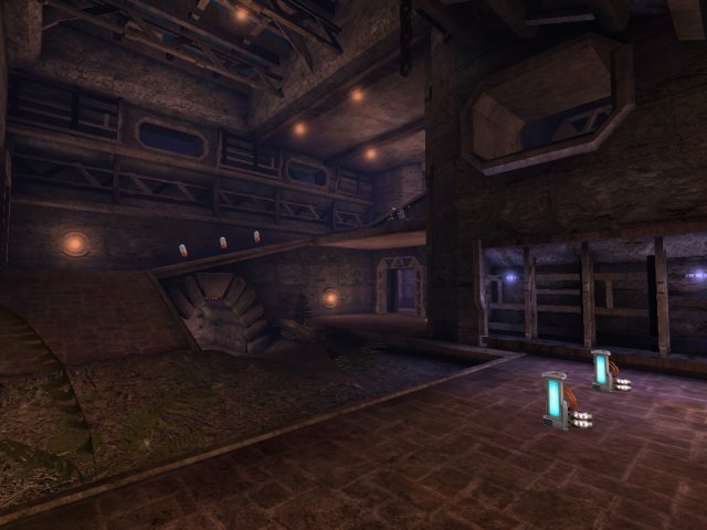
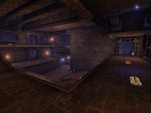
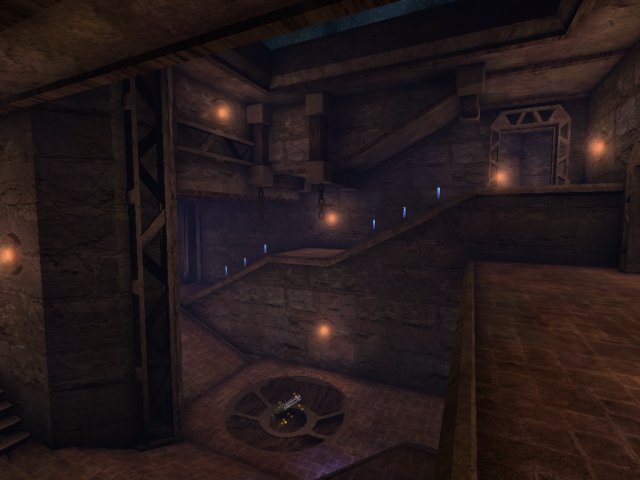
I can't play through the map unfortunately, but from the screenshots, I'm going to attempt some (hopefully useful) feedback:
  • I think the map needs more landmarks; the big, giant, majestic kind.
While the areas are somewhat unique and different from each other, I
don't think it's enough to distinguish them immediately while the
player is learning the layout. Maybe have a giant gaping hole in the
ceiling in one room, a giant tower in another, etc.
  • The overall room layouts are quite boxy. If all/most of the static
meshes are stripped away, it's all quite boxy and rectangular. Some
rounded corners or slanted surfaces wouldn't do any harm, and might add
more interest and strategy. Also, I think lots of ancient civilizations
utilized slanted surfaces, so it should fit the theme well.
  • What's the purpose of the blue-purple lights? If you haven't already,
I think you should attach some kind of context to them (e.g. red lights
are used for vents in Natural Selection). Maybe place weapons near
them, so the player will catch a glimpse of that color and immediately
run out to see what's there? Don't know. :smile:

Looks good though, but I have to agree that much of it could be done in
HL. However, I think your theme allows great flexibility for giant
setpieces. Statues, obelisks, ziggurats, pyramids, towers, etc. look
like they could fit in the level and serve as good landmarks. Good
luck! :smile:
Posted by Orpheus on Sun Oct 10th 2004 at 5:29pm

you're one of our best SC, i have faith that you won't let snarkpit down :smile:

defend our honor on that other forum :biggrin:
Posted by SuperCrazy on Sun Oct 10th 2004 at 5:27pm
[Author]

New version uploaded. Most of the changes were from suggestions on another forum, but the uber flat ceiling in the third shot was taken care of, and the rest of the flat ceilings will be worked on later.

I agree that there's not much here that couldn't be done in HL, but pretty much everything is wood, stone, or brick, so there's not a lot of room within the theme for ultra high-tech flashy meshes with thousands of polygons.
Posted by Tracer Bullet on Sun Oct 10th 2004 at 4:46pm

I don't much like the sprite you are using for those lights. it seems too dull to actually emit any light, making things look kind of weird.

Pic 1 - Add some supports for that ramp

pic 2 - As Orph and ReNo said. Flat ceilings... You should also look into more architectural detail in the walls and such.

pic 3 - Uber flat ceiling... But I really like those stairs, and the door frames look pretty cool.

Honestly, beyond slightly longer sight-lines, I don't see anything here that couldn't be achieved in HL. As disappointing as that is, I still say it looks damn nice overall.
Posted by ReNo on Sun Oct 10th 2004 at 2:35pm

I like a lot of the architecture but as Orph said, the ceilings are
awfully flat looking. I'll take an in game look later on and try and do
a full critique.