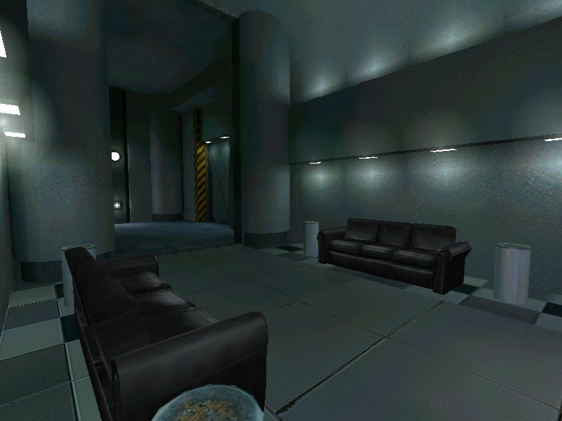
that third screen in the map profile reminds me of a
Nightwatch shot. I'm not accusing you of anything, they just look similar. :smile:
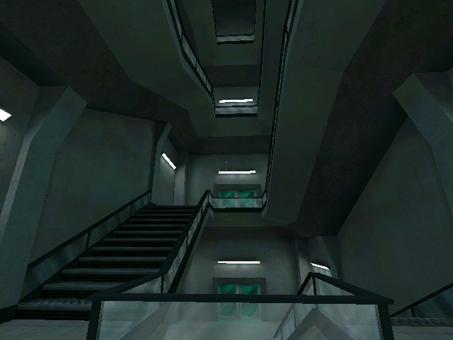
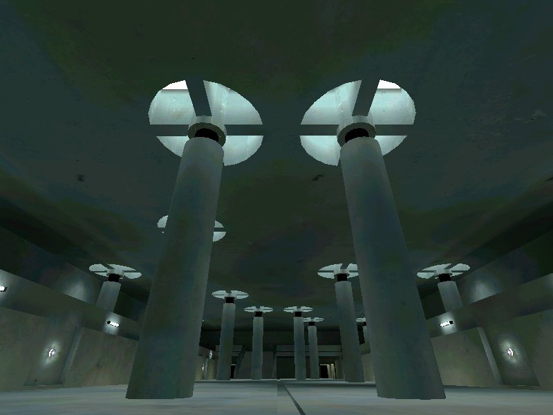
TBH, the shots look really bland (although fair enough, the sets in the movie were blander than bland as well :smile: ). I suggest you try to create a larger ligh/dark contrast in your lighting, should make it look more sinister. Also, try to use some better textures; instead of copying the movie's bland sets, spice them up a bit.

