This is a hl sp map pack I have been working on for several months. It is my first map I have seriously worked on.
Unfortunately progress has stopped. I'm not satisfied with some of the layouts and I'm also having trouble adding puzzles at this stage. Kinda bums me out to give up at this point but at least it was a good learning experience.
Looks like somebody is using nearest point texture sampling - they look so blocky :P
Look at maps like cs_office for ideas on how to pull off a convincing office environment - they don't only manage it by using spinky textures, the architecture conveys it too. The map is looking not bad, though a bit "standard", most likely due to some rather simplistic brushwork and the use of default textures. Obviously as its a single player project, going through to retexture is a somewhat daunting and unlikely prospect, so I think you should work on sprucing up the detail in the brushwork where possible.
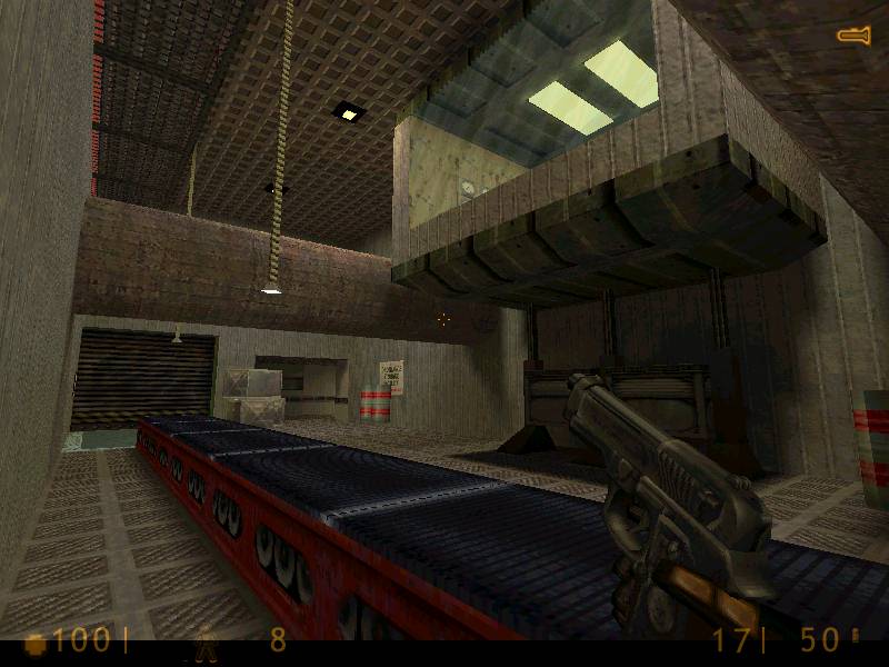
Looks nice. I think you should fix the repetition of the textures on the ceiling in pic 3. And you should also put up some support beams or something. That may help eliminate the problem of the textures.
Just based on the pictures, a few things I can see are
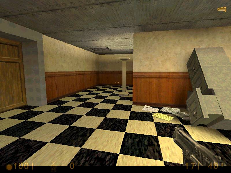
Picture 1:
-Floor and ceiling textures are too repetitive and don't match. Find different ones. Break the brushes up a bit. Give some variation
-There seem to be no light sources... they're probably just around the corner, but I thought I'd point it out anyway.
-That coathanger/pillar thingy has no shadow.
-I like that fallen file cabinet, but it seems out of scale
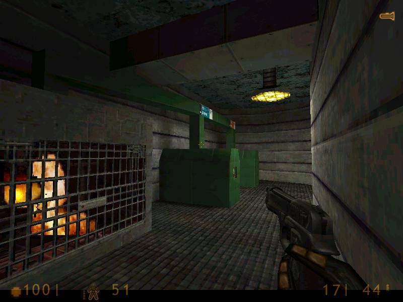
Picture 2:
-Texturing on the floor isn't so great.
-That light texture looks fugly.
Picture 3:
-Looks somewhat washed out. Use spotlights on those lights hanging over the conveyor
-Wall texture is incredibly boring IMO
-That room hanging out is just wierd. Add some borders to that glass and change the ceiling and floor textures
-conveyors add to the lag a lot in HLDM :sad:
Sorry about the delay real life stuff popped up. Anyways here's some new pictures optimized with the xat.com tool. Hopefully they are of better quality.
If you haven't got an image editing program with jpeg optimising tools, go get the xat.com which is mentioned the heading box when you hit 'new reply'. Unless you have somereally intense detail, 50k is about as large as they should be.
Posted by Tracer Bullet on
Fri Mar 12th 2004 at 3:34am
IMO 800x600 jpeg gives the best balence of quality and size.
Posted by Kage_Prototype on
Thu Mar 11th 2004 at 10:28pm
.bmp is not a good idea, they're way too big for the 'net. Use .jpg or .gif.
Posted by Forceflow on
Thu Mar 11th 2004 at 10:27pm
Map design looks ok ... but the red tank is ugly textured, imho.