1... week?!? Dear god, what have you been feeding him andrew.. Btw, Ferret, looks absolutely awesome *cowers.
-BB
Posted by Crackerjack on
Thu Mar 18th 2004 at 11:45am
Hey Fetter, I agree with Mr.Ben env_gamma it. Lighting was looking a bit bland in the play test. But just to remind you again from what i told you earlier, the vent needs to be moved in teh brighter part of the MS, and fix those few problems i showed you in-game (white gaps, and new placement for lights :smile:
http://ferret.hl-nightwatch.net/co_eden.zip enjoy. Yes I know that there is a HOM, and I have some nitpicks to handle. But for now that'll do until I get back from my vacation in florida.
savannah georgia krew are gonna roll up to daytona beach tommorow. Holler from the dirty south. Tip your glasses and down your shots cause we are replacing yall.
Wow. That looks excellent :smile: Only mistake I see is the nasty texture alignment in shot 4 - the horizontal stripes on the ceiling just don't fit. But that is picky, picky detail.
One of those "jaw drop" moments, to be honest :smile:
Posted by Hornpipe2 on
Wed Mar 17th 2004 at 8:28pm
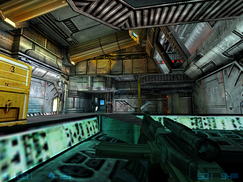
Screenshot 4 - can you get a sharper wall texture for that blue part at the bottom? Since you seem to be standing in that trough it'd be nice if it wasn't so blurry and stretched looking.
Also, align those textures on the metal dealie in shot 4. Maybe you could put some little glue block thing to sort of connect them and hide the fact that they don't align right, you know?
I really like NS maps that use a lot of yellow trim and stuff. Areas with lots of high constrast between light and dark (e.g. a dark metal area with some brightish yellow paint around) can look really really neat.
