Booster Tower by SkyOniX

Map Rating

  • 0
  • unrated

Map Download

Map Info

Map Description

Best suited for 1on1 play. Set in space. Turned out really cool if I do say so myself.

This is my second map

Discussion

Posted by 7dk2h4md720ih on Mon Apr 19th 2004 at 10:31pm

I see blocks, so many blocks!!!!:(
How constructive. It's what we've come to expect though. :rolleyes:

Change the sky to something more interesting. You won't get away with using that sky since it's so prominent. Keep working on it. :smile:
Posted by ReNo on Mon Apr 19th 2004 at 1:09pm

Tracer has a good point about the fades needing modified - they look too strong, and yet not bright. I think the reason for this is that you have set the render mode to "texture" and given them a high render fx value. Try setting them to render mode "additive" and giving them an fx amount of about 64 or 96, and see if it looks better. It should give a more subtle effect and yet feel brighter...if that makes any sense.

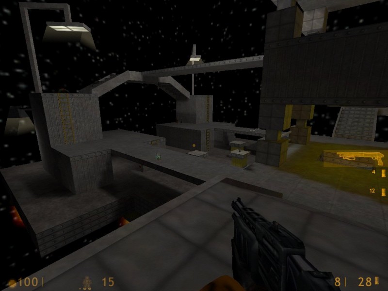
I still think those stairs look bad and could use a little more tweaking, basically by adding a trim. This coud in fact help around the entire map by adding them to all your walkways. I've included a screenshot of a little example I knocked up. Obviously it will increase the r_speed a bit if you use them extensively, but I think they are normally useful in adding a bit of basic detail to a level.

User posted image

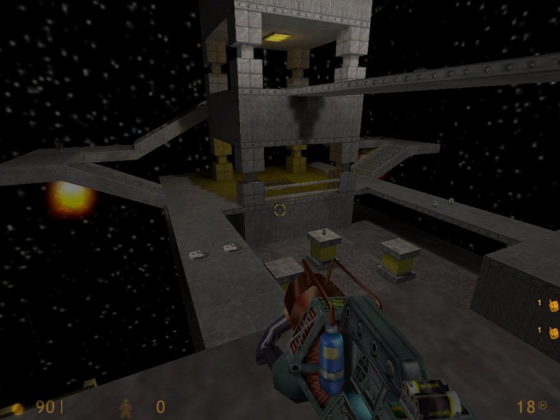
Otherwise, it looks as if you are using entity lighting only, rather than any texture lights, but I guess at this early stage its not a huge issue - its something you will want to look into for future levels however.
Posted by matt on Mon Apr 19th 2004 at 10:54am

I see blocks, so many blocks!!!! :sad:
Posted by Tracer Bullet on Mon Apr 19th 2004 at 4:43am

I like this map allot. there isn't much in the way of complex archatecture, but the blocky style works quite well. You have kept r_speeds down even though there is zero visblocking. This would be allot of fun on a small LAN.

A couple of suggestiuons:

The fades: make them less obtrusive (lower fx value), add some sprites to supplement them, break them up into smaller chunks that make up the whole shape so they look a bit more volumetric.

You should add some ambient sound coming from those rocket engines.

I might just get rid of the railings if I were you. they don't really fit the theme of the map.
Posted by SkyOniX on Mon Apr 19th 2004 at 3:36am
[Author]

OK....I changed a few things in my map "Booster Pass". I put the fades around the lights as Reno suggested,added a few different colors, and changed the stairs to be more real. Check it out and tell me whatcha think!

Http://www.geocities.com/dillonsayz/Booster.zip
Posted by Yak_Fighter on Mon Apr 19th 2004 at 1:50am

Depends on the situation. If you're trying to use railings on stairways then the { texture ones just don't cut it. However, if there is no height variation then the { textured railings are superior. (especially if they are func_illusionary and clipped)
Posted by ReNo on Sun Apr 18th 2004 at 7:20pm

I think if done well it can be ok - provides more interesting semi cover, unlike texture railings which are either total cover or no cover. Of course in HLDM, cover isn't a big issue, in fact hiding behing that brush railing would do more harm than good with the gauss spray.
Posted by Cassius on Sun Apr 18th 2004 at 4:39pm

I cringe whenever I see brush railings. It's pointless and blocky.
Posted by ReNo on Sun Apr 18th 2004 at 4:35pm

Looking good. I like the stairs and the way the buildings are constructed.
You seriously like the stairs?!
Posted by Forceflow on Sun Apr 18th 2004 at 4:22pm

Looking good. I like the stairs and the way the buildings are constructed.