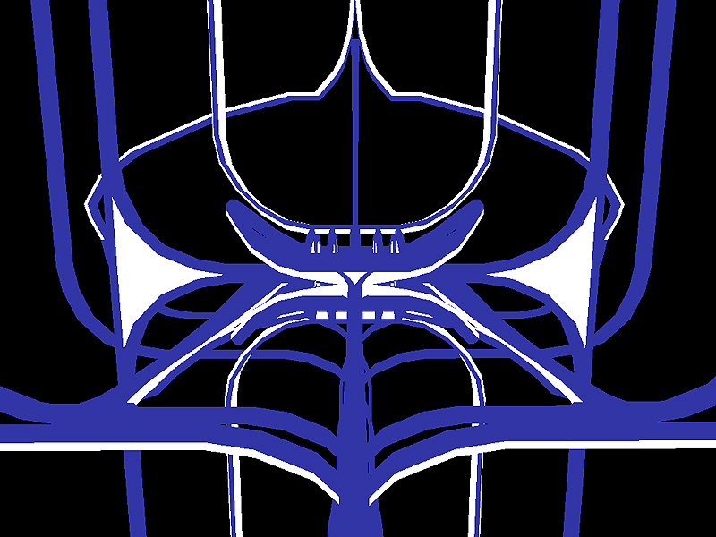
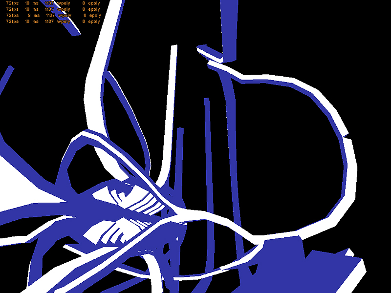
I really like the blue and white, they work really nicely together, though I feel a third shade (a light blue, most likely) could add a lot of needed definition to it. The tall blue only spires need another colour on them for sure, they look like a huge waste of polys since they are quite complex but none of that complexity can be made out (at least in the screenshots). Certainly some funky and original brushwork going on here though, good job so far