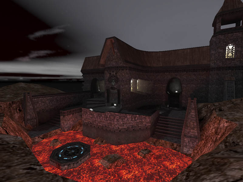
Wow, I'm extremely impressed by this one, it looks quite amazing. The layout looks pretty cool though screenshots can never paint that great of picture of that area of a map. I love the feeling of integration between the building and the surroundings - it all FEELS like one consistant place, with the building and terrain flowing nicely into each other.
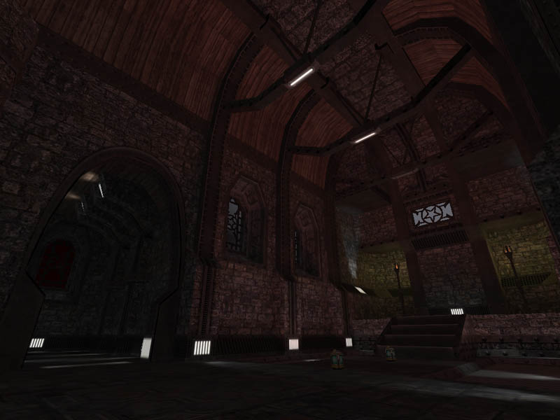
The only criticisms I have are the same as the others - if you have your windows that bright on the outside, it should at least be notably brighter inside than out. The use of bricks on the floor and walls (I guess it might be a different texture, but they look nigh on identical) looks a bit repetitive too.
Otherwise, wonderful, can't wait to take an up close look in game :smile:
Looks nice, very much from the Quake 3 school of design is the general impression I get - which isn't a bad thing, and very impressive if you managed to keep the r_speeds as low as you say :smile:
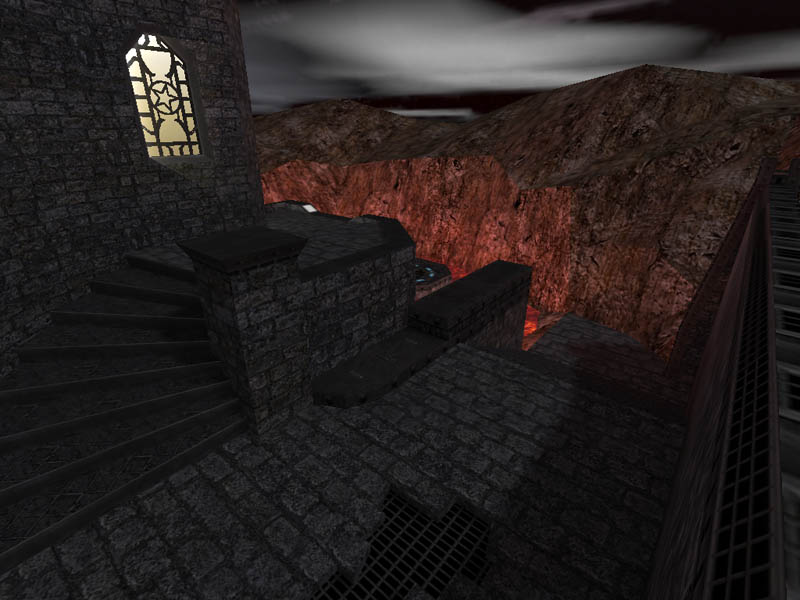
The window in that 3rd shot looks a bit dodgy though, overly bright in a way. In fact, all of the windows seem to glow an awful lot considering the light levels outside the buildings.
MMm looks great. Under 600 rspeeds is great work. I like the fades, gives it a really nice touch. Nice brushwork on rocks. Only criticism is the floor of the 3rd shot. Same as walls, doesnt look good imho. Keep up the great work looks supoib.
insta said: It's not my first map, I don't know what gave you that impression :razz:
insta said: Hiya, new guy posting :smile:
most people on a second or third map, have already been to snarkpit, so i just assumed.. its a rare event when someone comes along who makes decent maps without our assistance. nice job BTW.. if the R's are genuinely that good..
lets hope the design/layout matches its architecture.. cause that portion is very sweet judging by the screens :smile: