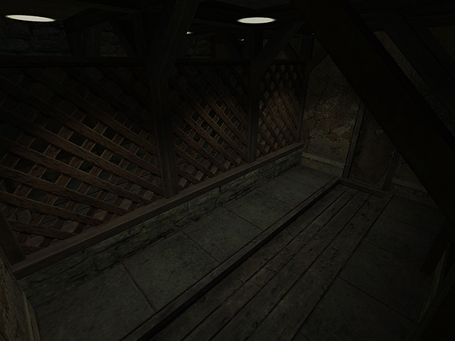
I didn't mean my comment as an insult to Cass's brush work. Just that the textures help the overall atmosphere.
The lighting. I forgot to comment on that, didn't I?
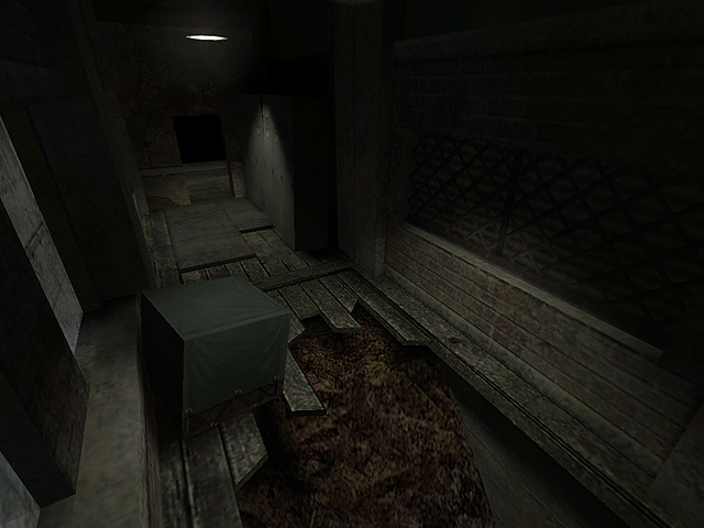
Looking at the screens some more, I think the lighting against the ceiling should be darker. Whenever I think of a dark hallway with hanging lamps, I always imagine not being able to see the ceiling.
You could create a wood to black gradient texture for the beam to ceiling areas, and then texture the ceiling (such as in shot three) with black. It might give a very 'eerie' effect. :smile:
This is stupid cass, why would you let one thread force you off the forums? You know fine well nobody wants you gone.
Anyway, back on topic, the map looks nice - as the others have said the textures look great and the lighting is working very well too. The only thing I really noticed to criticise - the wall on the left looks really blurry compared to the rest of the sharp textures and it looks a bit out of place. When you can only find one such lame criticism to natter about, you know that your on to a good thing :smile:
Good luck with the map, and I hope you change your mind about avoiding the forums.
Swinging I didn't know my shots were so good you'd forget what engine I was working with!
And Crono, this map is really a test to see how powerful lighting can be - and I'd like to believe it's pretty powerful here. The textures are by Mikezilla and Blazeer; and if you know these two guys, they are not only two of the best texture artists I've ever seen (well... maybe not Blaz) but they make clean textures, so I took the liberty of dirtying them up.
In case you were wondering, which you weren't, I'm going to post solely in this thread - maybe in the rest of the maps forum, but never in general again. And yes, pink is my favorite color.
Crono said: Its maps like this that show how important good textures are. Without them this map would still look good, but no where near as impressive.
I personally would take that as an insult
I think the textures are really good, but the map needs something more, maybe some swinging lights or flickering ones or some pipes or cables, just something to make the hallways a tad more interesting- even a bloody death threat or poster on the wall.
Posted by Crackerjack on
Mon May 17th 2004 at 12:53am
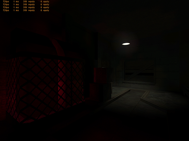
The atmosphere is quite nice, architecture is though, weak in areas. What I can see from these shots are that you know how to create a creepy atmosphere in small, compact hallways. Try to go for more open areas, once the map is further in development. I also think the bright red light.. is way to pink and way to bright.. tone both down a tad.

 I didn't know my shots were so good you'd forget what engine I was working with!