Say hi to our newest member, RichardELDEN!

Crono said:and, i realize it, and accept it, but will this new guy know it as well?
I know, I was just giving you a hard time.
Crono said:i was trying desperately to be serious crono :/
What if he used light blue?

G.Ballblue said:i hate to be a prick, but i have a truly hard time reading this shade of blue.. we worked long and hard to refine the black background and white text snarkpit uses..
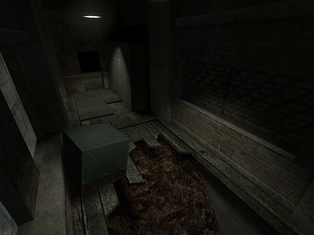
If the map is beta, then why is there realistic lighting? Must be pretty close to "done". Yet your profile says 0 %
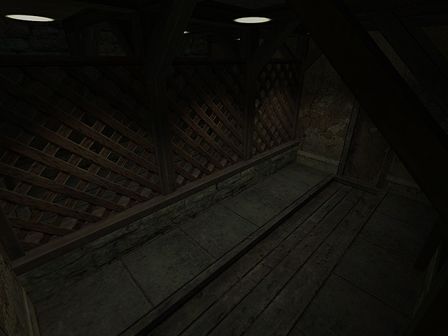
Deffinetly has atmosphere. Some people say that you need to at a little detail (two posts up). I feel that sometimes just having a blank wall can look just as fine. In my opinion... I see an air vent on the right wall, close to the door, a little taller than the player. (ABOVE the player. Not an 8 foot air vent =D )
Nice!!
Yippie Ki Yay!
If the map is beta, then why is there realistic lighting? Must be pretty close to "done". Yet your profile says 0 %What does the lighting have to do with it being a beta? Technically at this moment in time it is an alpha, since (as I'm sure) the map is not architectually complete and being 'tweaked'.
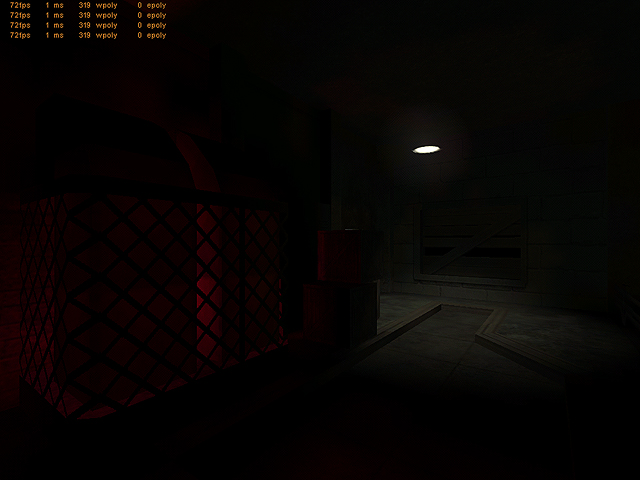
I can't really see much other than the floor (and yes my brightness is maxed)Buy a new monitor then
(also things in game are usually not as dark as the screens).