Black

Black

Re: Black Posted by mrnatural on Tue May 4th 2004 at 1:32am
mrnatural
63 posts
Posted 2004-05-04 1:32am
63 posts 16 snarkmarks Registered: May 3rd 2004
hey whats up.

Just wanna say hi. im new to this site and forums. looking forward to playing some of these maps ive seen from this site.

thanks
Re: Black Posted by EDEdDNEdDYFaN on Tue May 4th 2004 at 1:33am
EDEdDNEdDYFaN
12 posts
Posted 2004-05-04 1:33am
12 posts 1 snarkmarks Registered: Apr 29th 2004
It looks pretty nice but...the blue looks...so...ugly?
Re: Black Posted by mrnatural on Tue May 4th 2004 at 1:43am
mrnatural
63 posts
Posted 2004-05-04 1:43am
63 posts 16 snarkmarks Registered: May 3rd 2004
yeah.

in the end though its all going to be in all black and white. im going to strip the colors out of the halflife wad and make it custom.

so mulitshaded and textured.

at least so far thats the plan.
Re: Black Posted by parakeet on Tue May 4th 2004 at 2:01am
parakeet
544 posts
Posted 2004-05-04 2:01am
parakeet
member
544 posts 81 snarkmarks Registered: Apr 30th 2004 Occupation: n/a Location: Eastern US
the crates are neat but just one suggestion .. i doubt all the crates would survive after everythin else would splode
Re: Black Posted by Tracer Bullet on Tue May 4th 2004 at 2:32am
Tracer Bullet
2271 posts
Posted 2004-05-04 2:32am
2271 posts 445 snarkmarks Registered: May 22nd 2003 Occupation: Graduate Student (Ph.D) Location: Seattle WA, USA
-Pic 1: The hole in the wall is far too square. in general the rubble doesn't look very realistic, particularly as there is no real debris laying around.

-Pic 2: The glass seems to glow, you may want brighten up that area so that it isn't so noticeable. it too dark in that screen anyway.

-Pic 3: You appear to be using entities for those floor lights. I'm not one of those who thinks ent lights are evil, but in this case you really should do texture lighting

-Architecture: good job so far, you are doing well with keeping a blocky theme interesting. that can be a real challenge.

-Lighting: Generally flat. you need to experiment with both texture lights and Light_Spot entities. I terms of lighting mood I like that darker picture which I mentioned earlier. You can brighten it up without destroying the mood by making a spot light shine down from that hole in the roof or something similar. Don't think light or dark. think contrast. you want light and dark mixed together into yummy atmospheric goodness.

Good work so far!

Oh, I almost forgot. loose those crates entirely. Insipid cubes will not do your map any favors unless you are absolutely sure the fit the theme, and you place them logically. Using them simply to make rooms less empty is horrible.
Re: Black Posted by mrnatural on Tue May 4th 2004 at 2:33am
mrnatural
63 posts
Posted 2004-05-04 2:33am
63 posts 16 snarkmarks Registered: May 3rd 2004
oh

if any want to playtest this map let me know.

im running a server that i will be testing out my maps on consistantly.

hardly near done but input is welcome. new versions will be avaialble almost daily. so be sure to delete the old ones.

the game is half-life and the server called dead again and password is black

well thanks. email me at shayne@ptd.net for suggestions
Re: Black Posted by Crackerjack on Tue May 4th 2004 at 3:03am
Crackerjack
264 posts
Posted 2004-05-04 3:03am
264 posts 126 snarkmarks Registered: Feb 28th 2003 Location: DC
For new person to mapping, Im quite impressed, you deff came to the right place if u want to learn to map :wink:
Re: Black Posted by Vash on Tue May 4th 2004 at 3:11am
Vash
1206 posts
Posted 2004-05-04 3:11am
Vash
member
1206 posts 181 snarkmarks Registered: Feb 4th 2003 Occupation: Afraid of Spiders
I like the overall feel of the map. It seems low in texture quality, and brush work - but the ambience the pictures portray seems to be high.
Re: Black Posted by JFry on Tue May 4th 2004 at 3:15am
JFry
369 posts
Posted 2004-05-04 3:15am
JFry
member
369 posts 82 snarkmarks Registered: Mar 9th 2004 Occupation: Scumbag Location: USA
is that server on WON? If not could you give an IP address? I'm having trouble finding it.
Re: Black Posted by ReNo on Tue May 4th 2004 at 12:45pm
ReNo
5457 posts
Posted 2004-05-04 12:45pm
ReNo
member
5457 posts 1991 snarkmarks Registered: Aug 22nd 2001 Occupation: Level Designer Location: Scotland
I wouldn't call the blue ugly, I WOULD call it clashing with its surroundings though. It could work if the rest of the map didn't look like some dirty industrial area - how the hell did the blue stay so clean?! I appreciate that you are turning it black and white though, so its not an issue.

Otherwise, I think it looks quite cool - the blue structures provide a sense of integrity to the rooms, they feel solid and supported, unlike a lot of empty box rooms we see as the first shown work of most authors.

In the first shot, is that hole in the wall a window that has been bust up a bit, or is it just a blown up wall? If it is the former, give it a frame around the non-bust up bits, as some of those textures look wierd just ending in the middle of their pattern and a trim would help. If its the hole, then try and make the edges less straight.

In the second shot, the glass is much too bright compared to the rest of the scene. What render mode have you set it on? It should be texture, and try a render amount like 64 or 96 to make it quite subtle. The scene definately needs at least one light in it too - be it a fixture or just light coming in through the hole in the roof or the window.
Re: Black Posted by mrnatural on Tue May 4th 2004 at 1:12pm
mrnatural
63 posts
Posted 2004-05-04 1:12pm
63 posts 16 snarkmarks Registered: May 3rd 2004
thank you very much for the critisms and the compliments.

i looked at the tutorials for the textured lighting and such. especially the glass one.

dont quite it but will.

yes these rooms are blocky but i have plans to liven it up.

the main rooms which are test areas for weapons will be differant and fun.

the whole theme is going to be around a botched experiment that made the immeditate area black. gonna do like black and white color scheme in the main room. than branch off from there with grayscale textures than at the fringes colored textures. this coupled with shock that destroyed certain sections of the buliding.

yes the boxes and crates are nessacary. its to a elevator shaft with climbable cables and such. it works in well. already got rid of my glow in the dark glass. lol.

boxy but very three diminsional so far with varying heights.

r_speeds high. some at 1000 max. but im gonna cheat with hint brushes. so. most are at 700/600. but my theme is fun. fun with a artistic/imaginetive flair.

no im not new to mapping. i suck at doing the entity work. did it years ago so. but i enjoy mapping too much.

but yeah seems this is a very good site for mappers.

yeah ill have to post the ip.

thanks again.
Re: Black Posted by mrnatural on Tue May 4th 2004 at 1:17pm
mrnatural
63 posts
Posted 2004-05-04 1:17pm
63 posts 16 snarkmarks Registered: May 3rd 2004
oh that and the dark room that you said..half done. corridor leading to stairs downward will give me the lighting i need.

again im going to check into your suggestions about the lighting.
Re: Black Posted by ReNo on Tue May 4th 2004 at 1:47pm
ReNo
5457 posts
Posted 2004-05-04 1:47pm
ReNo
member
5457 posts 1991 snarkmarks Registered: Aug 22nd 2001 Occupation: Level Designer Location: Scotland
Do you understand how to use hint brushes? A lot of people who don't, think that they can miraculously reduce your r_speeds, and while occasionally this is true, they certainly can't always be used to great effect.
Re: Black Posted by Myrk- on Tue May 4th 2004 at 1:58pm
Myrk-
2299 posts
Posted 2004-05-04 1:58pm
Myrk-
member
2299 posts 604 snarkmarks Registered: Feb 12th 2002 Occupation: CAD & Graphics Technician Location: Plymouth, UK
Give it spaceship futuristic textures and it will look a lot like the Pillar Of Autumn from Halo :razz:
Re: Black Posted by Gollum on Tue May 4th 2004 at 1:58pm
Gollum
1268 posts
Posted 2004-05-04 1:58pm
Gollum
member
1268 posts 525 snarkmarks Registered: Oct 26th 2001 Occupation: Student Location: Oxford, England
ReNo said:
Do you understand how to use hint brushes? A lot of people who don't, think that they can miraculously reduce your r_speeds, and while occasionally this is true, they certainly can't always be used to great effect.
Agreed! HINT brushes have some ingenious applications but they are rarely effective at reducing polygon counts. It is certainly a bad idea to rely on them as a "last-minute save".
Re: Black Posted by mrnatural on Tue May 4th 2004 at 2:06pm
mrnatural
63 posts
Posted 2004-05-04 2:06pm
63 posts 16 snarkmarks Registered: May 3rd 2004
no..but i will. no im not looking for a last minute save. 1000 is my limit. but fun is my main theme. just gonna tweak it.

read where some feel with todays machines 1000 should be top limit. so.
Re: Black Posted by ReNo on Tue May 4th 2004 at 2:31pm
ReNo
5457 posts
Posted 2004-05-04 2:31pm
ReNo
member
5457 posts 1991 snarkmarks Registered: Aug 22nd 2001 Occupation: Level Designer Location: Scotland
I don't think there is any problem with hitting 1000, but you should still do all you can to keep it as low as possible for what you have in the map. If, for instance, you played a map that was basically just a box, and w_poly was up at 1000, that wouldn't be acceptable, but if you are playing a highly detailed level then 1000 is fine really. You don't wanna be up there TOO often of course...
Re: Black Posted by mrnatural on Wed May 5th 2004 at 12:09am
mrnatural
63 posts
Posted 2004-05-05 12:09am
63 posts 16 snarkmarks Registered: May 3rd 2004
right....i always try to keep r_speeds in mind. i agree. 700 to 800 its all around. just my elevator shaft is kinda high. 1060 some.

but i gotta keep that...too damn fun. lol.

played around with hint brushes years ago and its without a doubt the engine drawing too much before its seen.

i dont know how you guys do r_speed checks but i stand in the farthest areas and try to get as many brushes as i can on screen. taking into account the engine dynamics.

can wait till half-life 2...that lod engine is gonna rock.

oh and its a lab thats new that got hit by a shock wave. the blue is gonna be a very predominant theme. well it could change. hahaha
Re: Black Posted by wil5on on Wed May 5th 2004 at 2:14am
wil5on
1733 posts
Posted 2004-05-05 2:14am
wil5on
member
1733 posts 570 snarkmarks Registered: Dec 12th 2003 Occupation: Mapper Location: Adelaide
If its an elevator shaft, and youre standing in a corner looking at the entire thing, 1060 is qute good. Just keep in mind that people who have to use software mode (theres not many) have a limit of 800, above that and the engine drops polygons.
Re: Black Posted by scary_jeff on Wed May 5th 2004 at 9:32am
scary_jeff
1614 posts
Posted 2004-05-05 9:32am
1614 posts 191 snarkmarks Registered: Aug 22nd 2001
HINT brushes have some ingenious applications
They do? Like what?
Re: Black Posted by Forceflow on Wed May 5th 2004 at 12:17pm
Forceflow
2420 posts
Posted 2004-05-05 12:17pm
2420 posts 451 snarkmarks Registered: Nov 6th 2003 Occupation: Engineering Student (CS) Location: Belgium
Looking good ... rooms still look a bit blocky, but good architecture overall and texturing's good too.
Re: Black Posted by mrnatural on Wed May 5th 2004 at 12:32pm
mrnatural
63 posts
Posted 2004-05-05 12:32pm
63 posts 16 snarkmarks Registered: May 3rd 2004
yeah...its actually look out from it. see my new pics.

thank you again.
Re: Black Posted by Gollum on Wed May 5th 2004 at 1:16pm
Gollum
1268 posts
Posted 2004-05-05 1:16pm
Gollum
member
1268 posts 525 snarkmarks Registered: Oct 26th 2001 Occupation: Student Location: Oxford, England
scary_jeff said:
HINT brushes have some ingenious applications
They do? Like what?
Ask KFS for the full account :smile: The most useful one I know of is to drastically cut VIS times by covering a complex world brush with a HINT brush. Effectively this removes it from the VIS calculations. Of course, you could just use a func_wall, but there are some disadvantages to that.

That won't help the r_speeds in the slightest, but it could make a huge difference in compile times.
Re: Black Posted by scary_jeff on Wed May 5th 2004 at 1:26pm
scary_jeff
1614 posts
Posted 2004-05-05 1:26pm
1614 posts 191 snarkmarks Registered: Aug 22nd 2001
Oh, decent. I'll have to try that out some time :smile:
Re: Black Posted by mrnatural on Thu May 6th 2004 at 12:53am
mrnatural
63 posts
Posted 2004-05-06 12:53am
63 posts 16 snarkmarks Registered: May 3rd 2004
hey zoners costum build tools reduced my wpoly count. like 100 in spots. huh. better compiling?
Re: Black Posted by Gorbachev on Thu May 6th 2004 at 1:53am
Gorbachev
1569 posts
Posted 2004-05-06 1:53am
1569 posts 264 snarkmarks Registered: Dec 1st 2002 Location: Vancouver, BC, Canada
mrnatural...hm, weren't you just playing DoD in the same game as me?
Re: Black Posted by mrnatural on Thu May 6th 2004 at 2:16am
mrnatural
63 posts
Posted 2004-05-06 2:16am
63 posts 16 snarkmarks Registered: May 3rd 2004
noper wasnt me....lol. though dod rocks.

hey someone let me email you my rmf for what i have of my map so far and compile it using hint brushes. and see if it works than send me the rmf back. wanna get this down pat of where in my map they should be correctly placed. i want as low as r_speeds as possiable.

i have em but not sure if i placed em correctly.

only getting one bad spot and thats at the top of the elevator shaft looking near the entrance where the screen in knocked out.

thank you if you would do this for me.
Re: Black Posted by mrnatural on Fri May 21st 2004 at 1:21am
mrnatural
63 posts
Posted 2004-05-21 1:21am
63 posts 16 snarkmarks Registered: May 3rd 2004
check out my new screenshots there people.

thanks
Re: Black Posted by Tracer Bullet on Fri May 21st 2004 at 1:30am
Tracer Bullet
2271 posts
Posted 2004-05-21 1:30am
2271 posts 445 snarkmarks Registered: May 22nd 2003 Occupation: Graduate Student (Ph.D) Location: Seattle WA, USA
#1 Too dark

#2 very nice, but just haveing a texture for the lights on the ceiling is kind of weak. do some brushwork there.

#3 I still think the lights on the floor like a bit silly. are you useing texture lighting? I bet it would make them look much better if they were recessed.

overall you need more contrast. it's all kind of flat grey and boring. I don't nesecarily recomend changing your textures, they doo seem well chosen. just be more dramatic with the lighting. light_spot is calling for your name. heed the call.
Re: Black Posted by ReNo on Fri May 21st 2004 at 1:33am
ReNo
5457 posts
Posted 2004-05-21 1:33am
ReNo
member
5457 posts 1991 snarkmarks Registered: Aug 22nd 2001 Occupation: Level Designer Location: Scotland
I agree with Tracer entirely - its the lighting that is bringing this down. Play around with colour a little, particularly for little highlights at certain bits of brushwork or in corners, etc. Tone down the general lighting and provide alternating pools of light and dark for contrast. Using the light_spot entity is an easy way to achieve this.
Re: Black Posted by mrnatural on Fri May 21st 2004 at 1:47am
mrnatural
63 posts
Posted 2004-05-21 1:47am
63 posts 16 snarkmarks Registered: May 3rd 2004
ok

the one room is dark. i have yet to fiq out tex lighting.

though your right. alot more contrast too make a black and white map more predominant. black and white tends to make a map look simpler. so ill have to work on lighting alot.

ill check the recessed floor lights. see if i like it.

thanks
Re: Black Posted by 7dk2h4md720ih on Fri May 21st 2004 at 1:50am
7dk2h4md720ih
1976 posts
Posted 2004-05-21 1:50am
1976 posts 198 snarkmarks Registered: Oct 9th 2001
A marked improvement on your last effort, no more blue. :smile: The area in the third screenshot needs the most attention. It's a solid hallway, but it's lacking in colour and the lighting needs serious improvment. I like the first screen, the only serious flaw is the unnatural way the window is broken and the inappropriate decal on it. Screen two faces similar issues to the third one regarding the lack of atmospheric lighting. I remember it was mentioned about the last build too but that destroyed section of wall still looks squarish.

Overall good work and improvements, keep working on it. :smile:
Re: Black Posted by mrnatural on Fri May 21st 2004 at 2:09pm
mrnatural
63 posts
Posted 2004-05-21 2:09pm
63 posts 16 snarkmarks Registered: May 3rd 2004
thanks..no color though. its gonna be done in black and white.

than in negative image for my second map...haha. ( but thats a secret )

yeah bad shot on the broken section. other way its look grovery....

ok..decal is gone...but i got spinning arrows pointing to my weapons. do i really want that much realism? besides i like fake looking broken glass. haha joking.

thanks again for pointers. i appreciate feedback.
Re: Black Posted by mrnatural on Fri May 21st 2004 at 2:12pm
mrnatural
63 posts
Posted 2004-05-21 2:12pm
63 posts 16 snarkmarks Registered: May 3rd 2004
any want a bsp ?????

lol. ill send it via email.

some of the themed maps ive seen id love to run around on even if they arnt done.

id give ya feedback...so.
Re: Black Posted by 7dk2h4md720ih on Fri May 21st 2004 at 3:09pm
7dk2h4md720ih
1976 posts
Posted 2004-05-21 3:09pm
1976 posts 198 snarkmarks Registered: Oct 9th 2001
You don't really need the giant red arrows for weapons, they needlessly detract from the realism of the map. :)
Re: Black Posted by mrnatural on Tue May 25th 2004 at 1:28pm
mrnatural
63 posts
Posted 2004-05-25 1:28pm
63 posts 16 snarkmarks Registered: May 3rd 2004
Their sweet..want a bsp? map rocks.
Re: Black Posted by mrnatural on Mon May 31st 2004 at 4:58pm
mrnatural
63 posts
Posted 2004-05-31 4:58pm
63 posts 16 snarkmarks Registered: May 3rd 2004
hey if any want to try out my map on won the server is dead again and the ip 24.229.184.211:27015

the password is black.

glitches in the map so. working alpha. lol

cya
Re: Black Posted by Cassius on Tue Jun 1st 2004 at 4:04am
Cassius
1989 posts
Posted 2004-06-01 4:04am
Cassius
member
1989 posts 238 snarkmarks Registered: Aug 24th 2001
I tried to join and I got REJECTED for some reason.
Re: Black Posted by mrnatural on Wed Jun 2nd 2004 at 12:16am
mrnatural
63 posts
Posted 2004-06-02 12:16am
63 posts 16 snarkmarks Registered: May 3rd 2004
ah...sorry...no idea.
Re: Black Posted by mrnatural on Fri Jun 4th 2004 at 2:03am
mrnatural
63 posts
Posted 2004-06-04 2:03am
63 posts 16 snarkmarks Registered: May 3rd 2004
hey.

that texture lighting is kewl. making my own unique rad files works out well with my custom textures.

anyway..check out the third screenshot and you guys let me know how it looks please.

thank you

shayne "mr.natural" hawkins
Re: Black Posted by 7dk2h4md720ih on Fri Jun 4th 2004 at 2:15am
7dk2h4md720ih
1976 posts
Posted 2004-06-04 2:15am
1976 posts 198 snarkmarks Registered: Oct 9th 2001
I took some pics of this but didn't write comments, give me a few mins.
Re: Black Posted by mrnatural on Fri Jun 4th 2004 at 1:29pm
mrnatural
63 posts
Posted 2004-06-04 1:29pm
63 posts 16 snarkmarks Registered: May 3rd 2004
i changed the map around quite a bit. thats why just the last screenshot.

thanks

shayne
Re: Black Posted by 7dk2h4md720ih on Fri Jun 4th 2004 at 1:37pm
7dk2h4md720ih
1976 posts
Posted 2004-06-04 1:37pm
1976 posts 198 snarkmarks Registered: Oct 9th 2001
Ignore any of this that is obsolete.

User posted image

1. The weapon arrows are a bit unnecessary, it just seems like you added them because they look cool.

User posted image

2. Have the button target an ambient_generic with a locked door type sound.

User posted image

3. These light fixtures are neat but they'd look just as good flush
with the floor while saving polys. They're also far too close together.

User posted image

4. Shameless use of crates here. Why would there be a bunch of wooden
crates blocking the door to the elevator? No wonder the place is in
such disrepair! :biggrin: A couple of medium sized crates would look better
but something not a crate would be preferable.

User posted image

5. I wouldn't go with a black and white theme. While it may seem a
novel idea, it just ends up looking dull and lifeless. Handicapping
yourself by not using colour puts you at a severe disadvantage.

User posted image

6. As you can see, I was quite thorough! :biggrin: I liked all the destroyed stuff and the way you had to go around damaged areas.

User posted image

7. Just a world brush a few units too small, looks far too straight to be an intentional crack.

User posted image

8. It's generally considered bad practice to have areas where you can't get out of. Maybe it's just not finished though.

User posted image

9. If you want people to be able to jump/fall off the side, make the exterior a little more presentable.

Overall a decent map, but needs more razzle-dazzle! :smile:
Re: Black Posted by 7dk2h4md720ih on Fri Jun 4th 2004 at 2:01pm
7dk2h4md720ih
1976 posts
Posted 2004-06-04 2:01pm
1976 posts 198 snarkmarks Registered: Oct 9th 2001
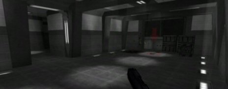
A mid-size map centered around a scientific weapons research building
theme. After a incident the lab and building are in rubble.
There's no actual suggestion as to what the building actually is when you're inside it. :smile:
Re: Black Posted by mrnatural on Fri Jun 4th 2004 at 2:16pm
mrnatural
63 posts
Posted 2004-06-04 2:16pm
63 posts 16 snarkmarks Registered: May 3rd 2004
yeah....clip brushes are gonna be placed....that and certain areas will teleport so.

i keep forgetting about that button and non working elevator. haha

and i stuck the weapon arrow in cause it looks cool. haha

ill have to make something in place of those wooden crates. but it works in well with getting out of the elevator.

ok...kewl.

thanks for the comments. nevermind about my r_speeds..they are down alot. hint brushes work well.
Re: Black Posted by mrnatural on Sat Jul 17th 2004 at 12:45am
mrnatural
63 posts
Posted 2004-07-17 12:45am
63 posts 16 snarkmarks Registered: May 3rd 2004
User posted image
Re: Black Posted by Kage_Prototype on Sat Jul 17th 2004 at 1:15am
Kage_Prototype
1248 posts
Posted 2004-07-17 1:15am
1248 posts 165 snarkmarks Registered: Dec 10th 2003 Occupation: Student Location: Manchester UK
If you're going to have a black and white theme, you need to emphisize the contrast. The lighting is where you fail, it's too smooth and bland, and just makes things incredibly dull.
Re: Black Posted by mrnatural on Mon Jul 19th 2004 at 12:25am
mrnatural
63 posts
Posted 2004-07-19 12:25am
63 posts 16 snarkmarks Registered: May 3rd 2004
http://shaynehawkins.hlgaming.com

hey check out my screenshots on this web site. if any are interested in beta testing my map let me know.
Re: Black Posted by mrnatural on Thu Jul 22nd 2004 at 12:13am
mrnatural
63 posts
Posted 2004-07-22 12:13am
63 posts 16 snarkmarks Registered: May 3rd 2004
[url]http://www.edgefiles.com/file.x?id=/hlgaming.com/shaynehawkins/betablack[sh].bsp[/url]

this is a working beta of black.....note that certain areas that are dead ends are ultimalty reserved for a few ideas i have in mind.
Re: Black Posted by mrnatural on Sat Aug 7th 2004 at 9:53am
mrnatural
63 posts
Posted 2004-08-07 9:53am
63 posts 16 snarkmarks Registered: May 3rd 2004
whats up people.....it be done now.

tough competition so far.