<DIV class=quote>
<DIV class=quotetitle>? quoting
Campaignjunkie</DIV>
<DIV class=quotetext>Playtested this briefly with some other Snarkpitters
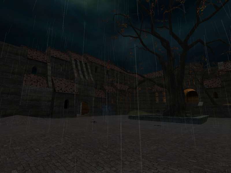
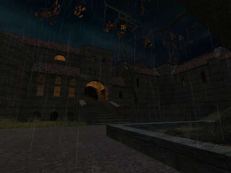
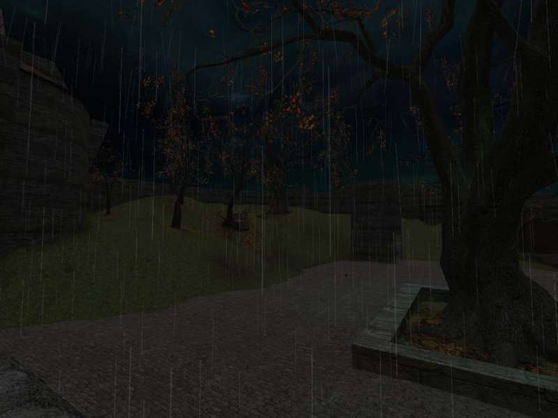
(I think Orph was there too). But anyway, I agree with Orph - big and empty. Kudos for attempting such a setting, but gameplay just really wasn't there. Plus, you just threw a box around it so it would compile, and that worsened the framerate a lot (averaged 20-30 FPS in the common area). Get rid of the water too, you can't even really see it with the dark light_environment setting.
EDIT: I noticed in the map profile you wanted to make it as "realistic as possible." Don't do this. Realism is a tool to make a map more attractive. You probably shouldn't build a map around realism, as gameplay will suffer as a result.
</DIV></DIV>
oh yeah, this old man, he played one, he played knickknack on his thumb...
i mean, i was there from beginning to end... i must confess, adding "noclip" to a playtest really blew my mind.. i was thinking "OH f**kING GREAT!!!, now my connection is truly f**ked.. look at these guys zoom around"
i couldn't hit a sole :sad:
then i notice, some jackass was floating in a tree..