dm_fetid by Minotaur0

Map Rating

  • 0
  • unrated

Map Download

Map Info

Map Description

HLDM map for a hl.wad only contest. Been working on it for over a month and since its look cool I decided to post here for C&C.

Credits:
Skybox: Minotaur0
Models: TheDoenerKing, Minotaur0
Sprites (glows): Minotaur0

Discussion

Posted by BlisTer on Mon Apr 25th 2005 at 4:07pm

i agree with cassius. like the first shot the most. good usage of that silver pipe texture. and the sun coming through the windows. feels hl2
Posted by SpiKeRs on Mon Apr 25th 2005 at 10:08am

From just looking at the thumbnails I at first thought this was a hl2 map, nice work
Posted by ReNo on Sun Apr 24th 2005 at 11:12pm

Now you mention it, I totally agree :biggrin: Much love for SC:PT multiplayer...if only my PC could run Chaos Theory properly :sad:
Posted by SWATSiLeNt on Sun Apr 24th 2005 at 10:34pm

First screen I love.....Reminds me of the goodol days of splinter cell pandora tommorow online. That map Warehouse if anyone has any experience with the game. Nice work though lookin great
Posted by Minotaur0 on Sun Apr 24th 2005 at 7:36pm
[Author]

Ren0, thanks for the tips.

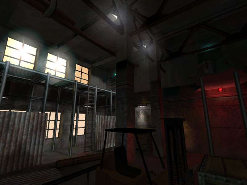
About the glows: I dunno whats causing that, theres actually one for each window and they are at a pretty low intensity (60). They look fine here (I can only run in software here, Im not home) but they looked f**ked up at my friends pc (who took the pics).
We also lowered the intensity for like 20 and it still looked f**ked up, so I dont have any idea on how to fix that.
I maybe keeping only one to give the effect of sun.

fraggard: Its for a brazilian contest, the deadline is may 1st I dont think anyone here would be interested but heres the link:

http://www.leveldesign.com.br/forum/index.php?s=535927d9d5abb89761429379b85f0396&showforum=51
Posted by Addicted to Morphine on Sun Apr 24th 2005 at 4:31pm

I like your usage of the HL.wad textures, especially the stacking
you've got going on in the third screenshot. I recognized all 3
on the walls but put together they look new.
Posted by ReNo on Sun Apr 24th 2005 at 2:00pm

Looks very nice given the limitations.

Screen 1

The dark line across the pillars just over half way up looks a bit
sharp and unrealistic. Looks as if you only have glows on two of the
windows - is that just the screenshot, or is there some reason behind
it? I also think they might be better toned down a little, but its hard
to tell without seeing the map itself.

Screen 2

The architecture out here is kinda boxy. I think you could do something
to spruce up the basic forms, particularly with the yellow upper
sections. The lowest wall texture looks ugely stretched, but then
again, perhaps I'm just getting too used to looking at source maps :wink:

Screen 3

Not really got any crits here, except that it is again quite boxy. The
walls are very uniform and all use the same texture layering - perhaps
you could have some recessed sections in certain layers, or anything to
break up the repetition? Not a huge issue and the room looks good as
is, but it might help.

Good job though, I'll have to take a run through this sometime.
Posted by Orpheus on Sun Apr 24th 2005 at 8:35am

two thumbs up.

/me likes.. i am commenting strictly off the screens, but it looks promising.
Posted by Cassius on Sun Apr 24th 2005 at 7:32am

The layout seems a little boxy - that is, the rooms/areas themselves are squarish - but it looks good otherwise.
Posted by DrGlass on Sun Apr 24th 2005 at 5:58am

screens look great