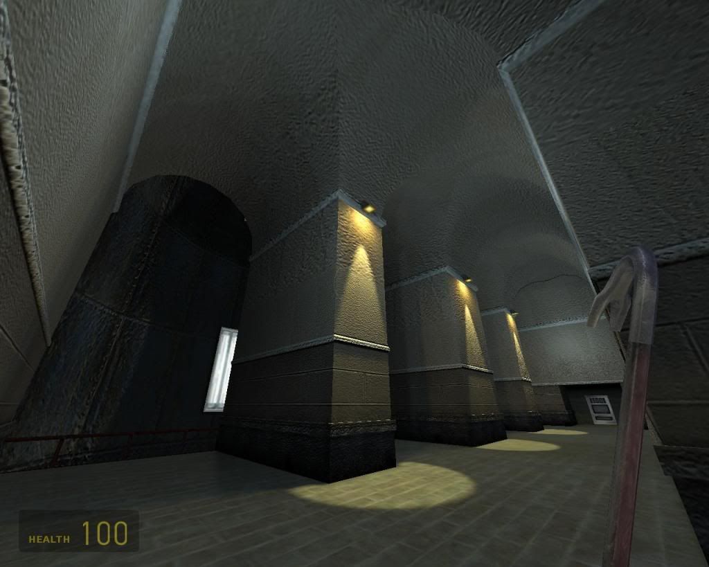
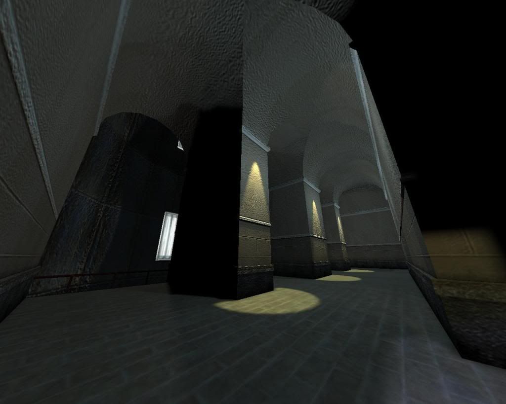
Aaron, I like the feel, but it's way to dark. I have trouble making out most of the parts. Might get a little technical, but... if this isn't HDR (doesn't look like it >_<) you only have 255 brightness levels per color with 0 being pitch black and 255 being bright white. Your pictures only uses the lower 1/4 of that range. Just like in a good photograph, you generally want to use a balanced spectrum, with equal distribution between dark and bright pixels. Even for night scenes. Especially the floor area, which usually makes up about 50% of your screen, should be in the brighter range for good navigation.
Here are the levels of your screenshot in Photoshop. You hardly make use of brightnesses over ~64. This also means a lack of contrast since you're not making full use of the available spectrum.
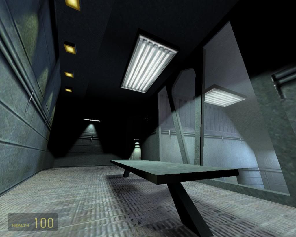
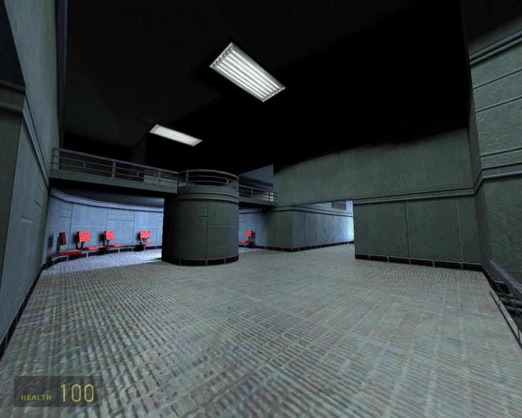
Enforcer, those screens look interesting. Are those screenshots in Goldsource?