WIP / Concept Area Screenshots by ReNo

Map Rating

  • 0
  • unrated

Map Download

Map Info

  • 0 ratings
  • 17270 views
  • 0 downloads
  • added Sun Jan 22nd 2006
  • updated Sun Jan 22nd 2006
  • more content for: Half-Life 2: Other...

Map Description

NOT a real map - just a map to link the WIP screenshots thread to. Just a workaround to make a non-map specific thread in the map forum in other words :)

Discussion

Posted by reaper47 on Thu Jul 5th 2007 at 6:41pm

I'm currently redoing my old dm_vienna map into something different. Likely a Zombie master map, so it's a bit more evil and underground but maybe there will be a DM version as well. 90% of the architecture is done from scratch but I'm using a lot of bits and pieces from the old map which speeds things up. A first release could be ready within a week or so, but you know how it is with those release dates :wink:

Current name is "zm_underworld" (working title).

User posted image

User posted image

User posted image

User posted image
Posted by reaper47 on Thu Jun 28th 2007 at 9:45pm

These huge, transparent "cylinders of doom" in the citadel levels have a shader effect around them that is close to what I described. Maybe you can find it somewhere.
Posted by Riven on Thu Jun 28th 2007 at 7:56pm

Well, that "ceiling" is actually the underside of a bridge, so those are trusses holding it up over the canal. It is a human scene with Combine architecture overlaid on top. I think what I'm going for here, if I don't leave this scene "as is," is a purpose for existence that portrays a Combine scene under construction. We always saw in HL2 all these Combine structures that were just there! Well after playing EP1 you could see while in the citadel, that these aren't just solid walls of metal. They have pipes and wires within them and they can burn, and blow up! So, it may be that these structures could (and have according to what I've read) just appear out of nowhere, but I would like to show the player a Combine structure "under construction."

The detail isn't ripe enough yet to portray that idea within these pictures, but if I have the drive (and the time) I'd like to give purpose to this scene. Otherwise I guess it just looks like another cool Combine "place"

I have read tutorials on those cool refraction shader effects. Never tried it mind you, but I could understand what they were doing. But you're right, Now could never be a better time to learn!

Thanks for the feedback reaper! :smile:
Posted by reaper47 on Thu Jun 28th 2007 at 6:39pm

:eek: this is friggn' sweet.

I'm not a big fan of combine architecture, but vistas like this always remind me what awesome stuff you can make with it if you stay focused. The ceiling bit in pic 2 looks a bit like it was put on top of a simpler ceiling just to have something there. That's not bad but it's a bit obvious. Maybe try something more assymetric/alien/combiney?

As for the core: I'd try a (more intense?) refraction effect for the sphere. You could use the water shader and do something crazy with it, if you don't find an existing material. Custom shaders are pretty simple to play around with and don't need recompiles to test/change, so I'd look into this.

Keep this for round 3!
Posted by Riven on Thu Jun 28th 2007 at 5:20am

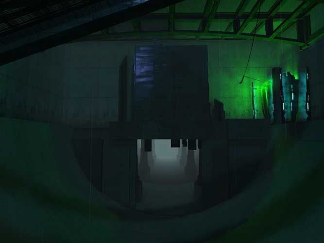
Black all the way Blister. It makes it look very stylish, and portrays that idea of the evil villain base. I love the design.

I actually totally forgot about this thread altogether. But now I shall utilize it.

Behold!:

User posted image

User posted image

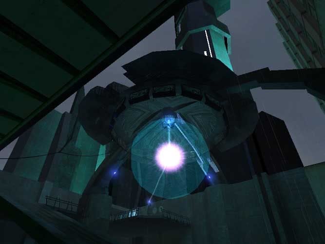
This was supposed to be part of my competition entry for round 2 of the "map from base" competition, but due to certain events and regardless of the week extension, I was unable to finish it :sad: . However, I do plan to complete it; for I have some interesting ideas to include in it, so now that some of these events are out of the way, I may continue to complete this map as planned, just a week or two overdue.

What do you think I could do to better up that "core?"
Posted by reaper47 on Wed Jun 27th 2007 at 8:21pm

Black.

This base looks like an alienware PC. :biggrin: I'm undecided whether that's a good or a bad thing.
Posted by Gwil on Wed Jun 27th 2007 at 4:58pm

Black :smile: Looks so much better, fits with the theme nicely. The grey looks to washed out/patchy
Posted by BlisTer on Wed Jun 27th 2007 at 4:50pm

i'm undecided between the grey and black top. Can you guys give me your opinion?

http://users.pandora.be/storage_dv/arktekt680000.jpg

http://users.pandora.be/storage_dv/arktekt680002.jpg
Posted by ReNo on Sun Apr 22nd 2007 at 5:07pm
[Author]

Well instead of settling for one style, I've now got a third - sewers :biggrin: Going for all the old cliches! Removed the trees from the middle floor however (replaced them with some dead looking shrubs), so it no longer looks much like a chinese temple. Not really sure WHAT it looks like to be honest, but I like to think that it does look pretty cool, so that'll do me :wink:

User posted image
Posted by reaper47 on Tue Apr 17th 2007 at 10:28pm

That industrial/metal buildings at the top are wild! Combined with the almost Chinese-temple style lower part. I'd settle for one style.

It's awesome to see you still mapping for good old HL2. :biggrin:

1024 Unit contests... why can't we think of something like this here :/