FF_Flare by BlisTer

Map Rating

  • 4
  • 2 ratings / 4 stars

Map Download

Map Info

Map Description

Designed for CTF Leagueplay.

Open, spaceous bases for smooth offense play.
2 bottlenecks for first line of defense.
One with 2 entrance routes (upper level + ramp) and 1 exit route towards fr.
One with the main ramproom as entrance and 2 exit routes (T-junction and airlift) towards fr.

Discussion

Posted by BlisTer on Tue May 8th 2007 at 9:55pm
[Author]

I currently took down the FF version as it is outdated. I think it's now in a stage where i need FF to be able to put in the finishing touches and upload it.

if you really want to have a look ingame maybe you can ask some of the guys here to upload it, or download the ctf mod version here, but bear in mind the gameplay is mostly different. The bases have lost their rear parts, the ramproom has been made the flagroom, there's an airbridge over the yard etc. shots of the hl2ctf version: 1, 2, 3http://
Posted by 417 on Sun May 6th 2007 at 4:54am

Please fix your download link.

Currently our clan runs a FF/CTF map server and would love to play test this map using TDM until FF comes out.
Posted by G.Ballblue on Fri Feb 9th 2007 at 2:18pm

Being the lazy arse that I am with HL2 maps, I haven't run through it yet -- but the last screenshot, which appears to be a designated "blue" area, seems to lack the blue lighting. I might also add that the areas with blue lighting come off as being really strong.

Something similar seems to apply to screen4 -- you have a "blue" area, but it's not... blue enough. The white lights are completely squashing the blue lights, and the result (at least, this is merely my opinion) is that the lighting looks really slapped-together.

/2 cents
Posted by reaper47 on Fri Feb 2nd 2007 at 5:43pm

No more complaints from my side. :biggrin: Great!
Posted by BlisTer on Fri Feb 2nd 2007 at 5:37pm
[Author]

Some images in this post have been automatically down-sized, click on them to view the full sized versions:

Some images in this post have been automatically down-sized, click on them to view the full sized versions:

Some images in this post have been automatically down-sized, click on them to view the full sized versions:

Some images in this post have been automatically down-sized, click on them to view the full sized versions:

Beta 5 is up for download. A few minor alterations here and there, mostly to the yard and flagroom:

User posted image

User posted image

I also changed the blue light color somewhat. I kinda like it but i'm having doubts about the purple base color it's casting:

User posted image

User posted image

comments are appreciated
Posted by reaper47 on Thu Jan 25th 2007 at 8:49pm

Neat! But, at the risk of driving you insane: I still think the linear shape dominates too much up there. The round supports are added on top of it but the shape still stays very flat.

... sorry <:] I just really think this could be worth it.
Posted by BlisTer on Thu Jan 25th 2007 at 8:14pm
[Author]

Some images in this post have been automatically down-sized, click on them to view the full sized versions:
Reaper47 said:
The only thing that stands out now, that the rest is pretty much perfect in my eyes, is the shape of the outside-base. It looks really monumental with interesting shapes everywhere but the skyline of the bases, probably the strongest visual in the map, is this rather boring trapezium-shape. You can even see the texture repeating in stripes. Maybe if you repeat the shapes of the middle part or the rounded top part for the side? It just looks very static and boring compared to pretty much all the architecture around it
idd. I still wasn't happy with the yard, so this is beta 4 with a new yard.

User posted image

download beta 4
Posted by Orpheus on Tue Jan 23rd 2007 at 10:52pm

The two bright areas in front of the skull: The lack of a source, but the incredible lumen's is peculiar. Not wrong, just strange. There could be a source I dunno about so.. shrugs

The colored lights made one hell of a difference. It really helped.
Posted by reaper47 on Tue Jan 23rd 2007 at 2:10pm

Some images in this post have been automatically down-sized, click on them to view the full sized versions:

From looking at the screens I'd say you pretty much nailed it. You stayed true to the visual style and added the extra detail needed to fill the parts that looked a bit empty.

The only thing that stands out now, that the rest is pretty much perfect in my eyes, is the shape of the outside-base. It looks really monumental with interesting shapes everywhere but the skyline of the bases, probably the strongest visual in the map, is this rather boring trapezium-shape. You can even see the texture repeating in stripes. Maybe if you repeat the shapes of the middle part or the rounded top part for the side? It just looks very static and boring compared to pretty much all the architecture around it:

User posted image
Posted by BlisTer on Mon Jan 22nd 2007 at 6:27pm
[Author]

Some images in this post have been automatically down-sized, click on them to view the full sized versions:

Some images in this post have been automatically down-sized, click on them to view the full sized versions:

Some images in this post have been automatically down-sized, click on them to view the full sized versions:

Some images in this post have been automatically down-sized, click on them to view the full sized versions:

Well i feel we're slowly getting there :wink:

I took another detailed look at all the remarks and i felt that these still stood out a bit:
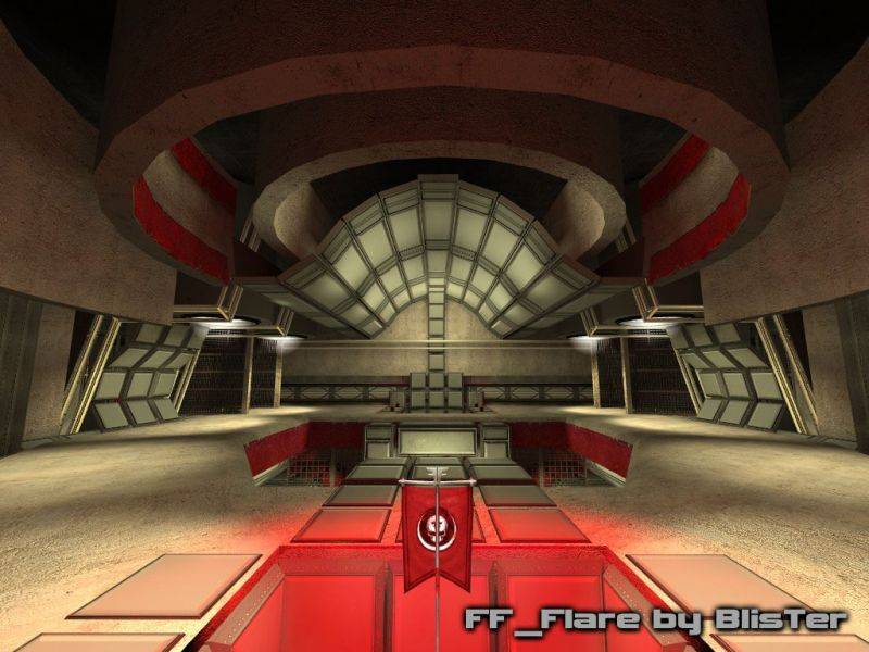
  • some of the rooms to feel a bit empty
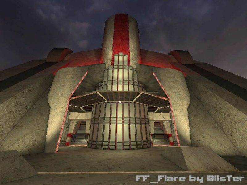
  • red lights in the map don't stick out enough
  • The yellowish lighting + gray textures on most everything makes the map look and feel monotonous. Throw in some more variation in the lighting
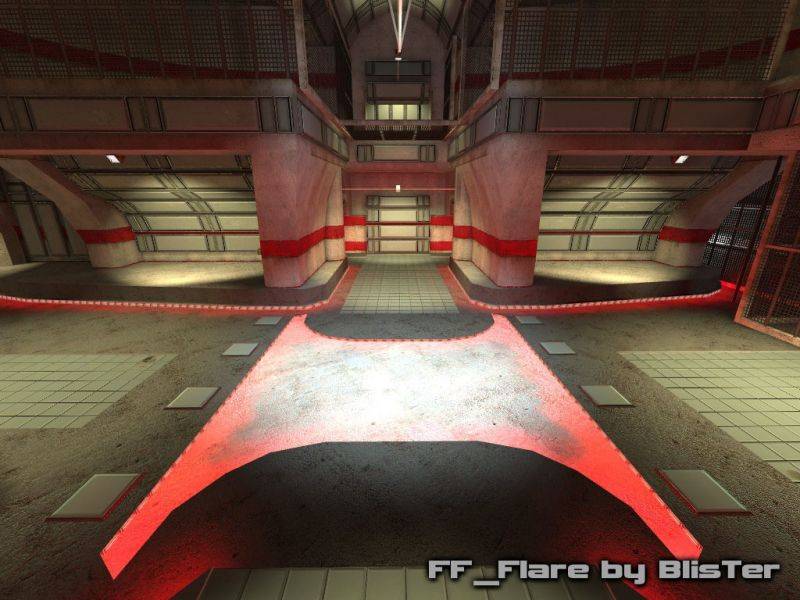
  • nothing going on on the ground. To make matters worse, one of the textures you are using a lot on the floors is extremely clean and near featureless, which doesn't sit well with the fairly crisp and detailed concrete texture used frequently alongside it.
  • tiles on the floor look hideous, they bring the whole map down. I'd suggest maybe scaling them up to 0.50 or using an alternative colour
  • 'stain' or 'blood' overlays
apart from these, i got remarks about that the bare parts could do with more panelling, and that the yard could be improved.

So i mixed all these remarks in a big c**ktail and came up with an expansion of style. i felt the coloured lights i now mainly had in the upper corridors could be expanded onto the yard, main ramproom and lower corridors. For the latter 2 i combined them into more interesting floorwork. apart from that i used more panelling in the frontside of the bases. apart from the overall yellowish and blue/red colourd lighting, i also threw in more white for variation and contrast. i also darkened the colour of the floortiles somewhat and added stains here and there. furthermore i added flag direction signs.

remarks are welcome!

download beta 3

User posted image

User posted image

User posted image

User posted image