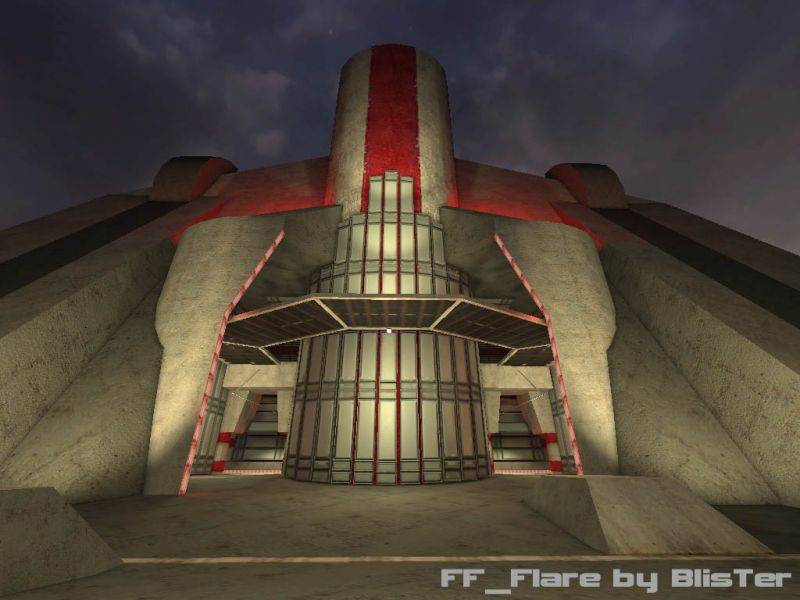
Open, spaceous bases for smooth offense play.
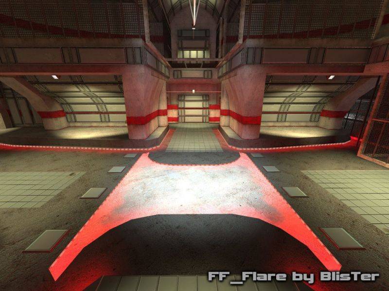
2 bottlenecks for first line of defense.
One with 2 entrance routes (upper level + ramp) and 1 exit route towards fr.
One with the main ramproom as entrance and 2 exit routes (T-junction and airlift) towards fr.
no worries Jon, i appreciate your feedback. surely someone else's first impression will be similar as yours. i was just affraid this was going to turn into a mapping style discussion.
Reaper, interesting take about the floor. Personally i don't think it's the flatness or sameness of it. especially since it's varied a lot with normalmapped light-grey tiles or the "pit" in the fr. Nor do i think it's the dark gray color, i think it fits in well. But now that you mention it, it could be the specularity that is too much of a contrast with the unspecular concrete. maybe i was just afraid to have too simple a texture to not use specularity. could it be that ?
I wasn't trying to sound harsh Blister. I was only clarifying that advice freely given isn't something that should be grudgingly accepted. If anything I say about your map is not within your design intentions, feel free to not use them. However, not being privy to those designs, all I am able to do is throw out anything that comes to me.
I would hope that you'd understand that I meant no ill will. However, I also have no intention of second guessing myself because something I said about your map, fell outside your ambition for it.
IMO, the screenshots need light adjustments. If they do not, then they do not. I am not upset with that.
As for our style's being discussed. My maps have no theme's... If thats a style, its a truly vague one. :sad:
Forget my previous posts about your lights. I was actually disagreeing with Reaper.. Not you.
I willingly admit that my mapping style differs from yours, Blister. But I doubt it's only about style. There's a small detail missing that I think could bring together some bits of the architecture better. The more I think about it the more I could imagine it's simply the floor(ceiling?) texture. The dark-grey one. It looks very, very flat and clean compared to the other textures.
It's really hard to describe what distracts me, because there's so much impressive architecture there already... I even doubt most people will notice what I'm talking about here. It's more a playful way of trying to analyze the (very interesting) visuals. It's fun to try and give feedback on a map by a more experienced mapper. Probably it's painful for you, sorry. <:]
I don't know but I think different tastes/styles is a bit too easy as an explanation.
i meant it when i said i appreciate feedback. i'm hanging out my tentacles to be informed of the general consensus for improvements.
i only established that your opinion was about assumptions and about the mapping style rather than the map itself. A discussion about mapping styles is equally as valuable, but would take us too far from the overall consensus about this map itself, and hence can be better discussed in general banter or pm !
I admit I didn't download the map. My comments are 100% on the screens, which look to be nearly fullbright.
I have no intention of telling you how to map, just my views on how a map should be.
I am not part of your Psyche, so your final intentions are not my privy. I can only throw out suggestions. Its your job to catch them, or let them pass on by.
If Snarkpit has been reduced to curtailing its feedback, in the vain hopes of meeting with the authors idea... Well I don't want to be part of that Snarkpit.
My advice is given out free of charge. Don't ask for payment from me that you need to accept.
Orpheus said: You'd not have so much ceiling illuminated in a real sense
You assume i did not have lightspots directed at some ceilings on purpose. i did. It's to accentuate certain elements. If you'd had a run around in the map to inspect your assumptions closer you would see that every bright lit part has a lamp model facing it for realistic sourcing. We each have our own mapping style, i respect yours. An aspect of mine is that i use harsh contrasting lighting. My intended shadows are dark. I will not reduce overall light intensity, as imo in DM maps, and certainly in FF maps, you need to have clear vision to focuss on gameplay.
i appreciate feedback, i really do. but the fact you guys seem to be cancelling each-others remarks maybe means this is due to my mapping style and those remarks are personal wonderings, instead of general consensus.
And as much i am for discussions about mapping styles, plz continue those in PM :wink:
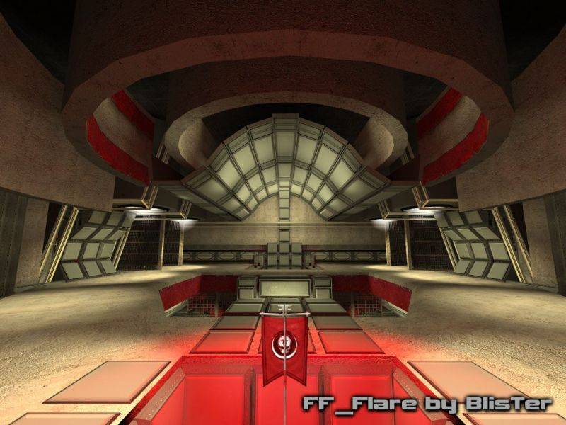
I have a problem with the texturing, however. It's too gray and there are big brushes without any structure or something the eye could hold on. That causes some of the rooms to feel a bit empty.
Not really. Its the lighting. To harsh.
Not arguing mind Master Reaper, but I like the texturing, a lot.
I said this in many a map, make dark areas dark. Lights tend to shine in the direction they are pointed... You'd not have so much ceiling illuminated in a real sense.
People make rooms with transitions, but forget that light needs them too.
Darken everything to 1/2 its current lumen's, then lets see what you got Blister.
I think it's mainly about texturing, the brushworks seems to have all the detail it will ever need.
I'll try and make a slideshow to illustrate what I meant. That could take a while. But I can say already it's mainly a texturing thing. I think it has something to do with the contrast between the very clean, crisp and the dirty, old, concrete textures. The contrast is either too light or too strong. Nothing wrong with the contrasty theme but it just doesn't feel clear enough yet.
Maybe you could also make the old concrete structure that should be renovated a little torn or asymmetrically structured, a reason for the renovation parts to be there.
also i'm not really sure which room seems a tad empty to you, care to point me to the relevant screenshot? bear in mind that i can't add panels or bars everywhere: not only to keep fps above the fps of the standard hl2dm maps, but i also want a kind of balance between rough (concrete) and crisp (panels/bars).