Say hi to our newest member, RichardELDEN!
Reno said:I see your point, and it has equally been brought up by other ppl. The problem with floors is that you can't vary in the z-direction too much, otherwise it would hinder movement and line of sight. In contrast, this is possible on ceilings and walls. So I experimented a bit with XY variation and a concrete, non-shiny texture too match the walls better. Plz share your feelings about the screens below.
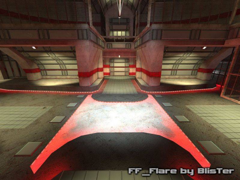
My big complaint is about the floors really, as you have these really interesting ceilings throughout, but absolutely nothing going on on the ground. To make matters worse, one of the textures you are using a lot on the floors is extremely clean and near featureless, which doesn't sit well with the fairly crisp and detailed concrete texture used frequently alongside it.
Gwil said:i used that colour as it comes back in the wall and ceiling panels, hence improving style harmony. I tried experimenting with .5 scale though, take a look at one of the floor tile stripes in the screenshots below.
the tiles on the floor look hideous, they bring the whole map down. I'd suggest maybe scaling them up to 0.50 or using an alternative colour.


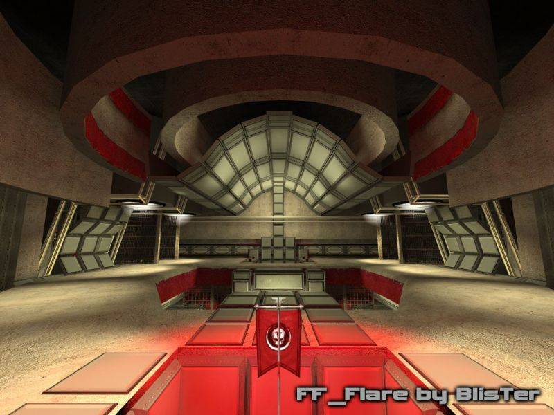
Baron von Snickers said:</LI> i first was affraid about this too. The "clodding through mud with your shoelaces tied together" really gives that feeling about us being small and the rooms too large, because it simply takes some time to cross them. However i suggest you take a look at the latest FF gameplay video. If you even look at medium classes like the sniper, he runs very fast. For a true feeling about dimensions and time needed to travel them, run through Flare with the boost on. I feel it's just about right. Also i feel the high ceilings and "wide" corridors aren't too high, but just high enough to conc/trim/double jump freely without feeling cramped. For gameplay reasons i implemented two bottlenecks (top ramp and T) for defense to put a halt to all this free movement.
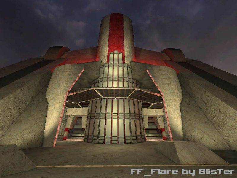
[*] I'm sure the movement in Fortress Forever is (will be?) faster than HL2DM (which is like clodding through mud with your shoelaces tied together), but there's a fine line between 'spacious' and 'over-scaled' and I'm afraid this leans more toward the latter. I feel about 2-4 feet tall running through this level, depending on the area.
