Say hi to our newest member, RichardELDEN!
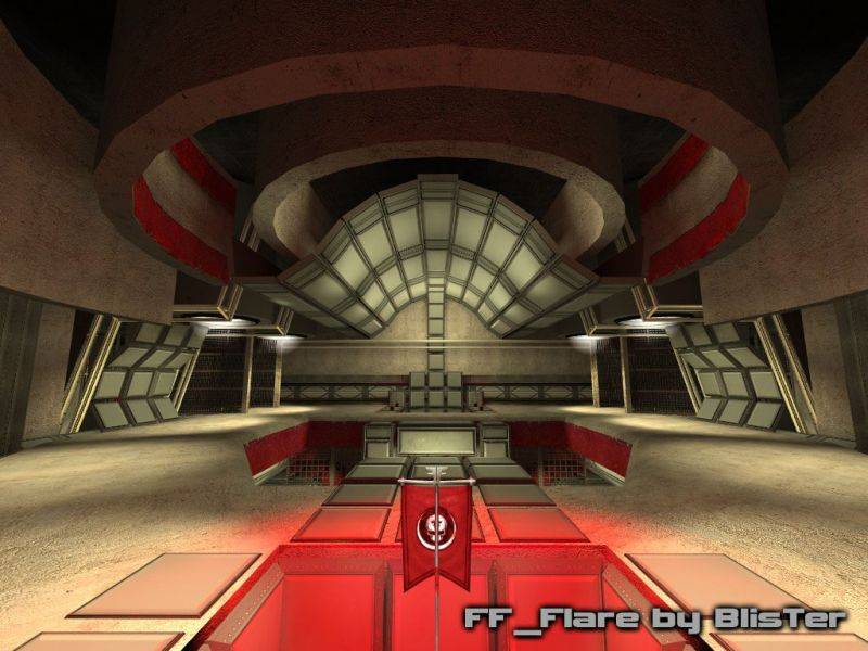


Junkyard God said:Ok this gave me serious doubts about my monitor settings? The red lights in the 4th screenshot are placed completely in shadow, there isnt one white/yellow light shining on there and stand out great imo. the only whiteness shining on there is from bounces, and since you see those bounces as making the red not stand out, i asked myself if the lights are really too overdone bright. So i did a fast compile of the ramproom with dimmed lights. i also replaced the few lights i had with light_spots. I do agree that it is more athmospheric, but on my monitor this is simply not acceptable for a FF map. This would only suit HL2SP or maybe HL2DM or other slowpaced mods. comments?
For example in the 4th screenie of the thread, the red lighting near the walls, could stand out a bit moe if you made the rest of the lights somewhat dimmer (i think).


This is a picture that Zombieloffe posted that I agree with as to how I envision lights looking in any map. Its a fair representation anyway. I know its not what you want, but its what I had in mind when I was commenting earlier. Sometimes, pictures speak better examples.You know me, I'm a lighting fetishist, and first I too thought it's all about the lighting. But I don't think that's it. All the tricks in the "GOOD" picture are there. Maybe there could be more cold/warm contrast and a night setting for the outside could bring some brightness contrasts. Maybe the ceilings could be darker...
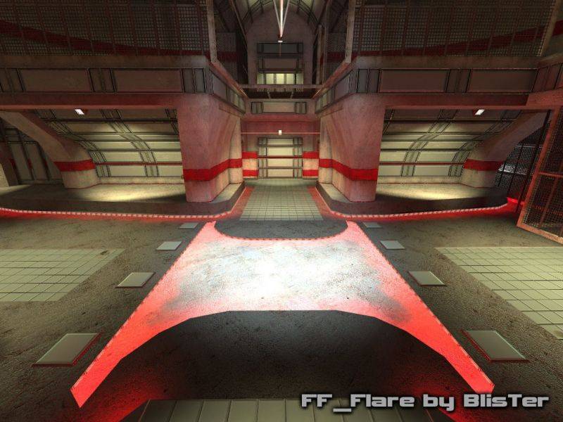
Orpheus said:well there's no question that in most cases it's better with lightspots than with lights. the 2 lightspot above one another, one small one facing the source and a bigger one facing the floor is a well-known trick. The thing is, i use it in most places if you look closely, see the 3rd, 4th and 5th screenshot.
This is a picture that Zombieloffe posted that I agree with as to how I envision lights looking in any map. Its a fair representation anyway. I know its not what you want, but its what I had in mind when I was commenting earlier. Sometimes, pictures speak better examples.

Captain P said:Yep a nightsky is an option. i'll do a night compile and a post a screen here.
I think those greyish flat parts are a nice, easy-on-the-eye contrast to the heavily filled, complex ceilings. It's sort of saying: "Yes, this map has a unique style, and it looks pretty, but here's the route to take, don't get distracted."
I do think Orph makes a good point though, about the lighting and generally, color contrast. It's generally very bright, with too little contrast to break it up. Perhaps that's why I like the brow-greyish floor parts so much, because at least those are a bit darker so they stand out somewhat.
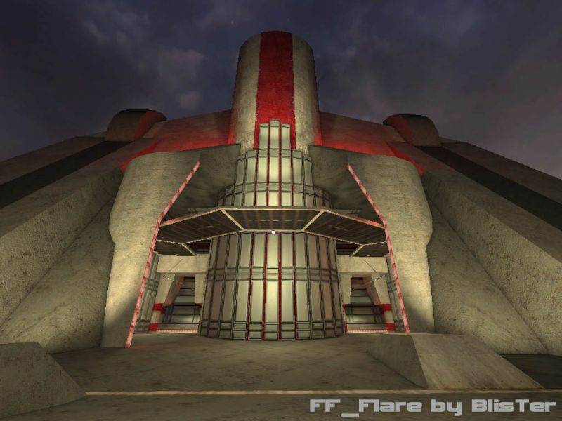
I like the outside, with it's high tower rising up in the night, lit by a few spotlights, but again, I think more contrast could greatly improve the feeling. A darker skybox, a darker top of the tower, with bright spotlights shining up to it... sppoky. :smile:
Dark_Kilauea said:I don't really agree that it looks to clean. The panels have a "dirty" spec map and the concrete has a "dirty" normalmap. btw, it's still an FF map.. so i won't add litter :razz:
<DIV class=quotetext>It looks nice to me, except that it looks... too clean. It looks cleaner than a hospital. Put some trash in there, or have some broken equipment or wires. I think a little trash and wear and tear would do wonders for this map.</DIV>
