After seeing ReNo's recent screenshots of his Paroxysm map, I decided to have a go at a sci-fi themed map myself as I haven't done one before. In my usual mapping style however, the theme changed totally into something different - so now it's no longer a space-stationy map (well I suppose it could be, it just depends on how you interpret it!). This will be my second entry to the 2004 Snarkpit competition.
Discussion
Posted by Junkyard God on
Tue Nov 23rd 2004 at 11:33am
To all the people who are complaining about getting lost:
The blood stains and corpses will tell you where you are.
Posted by Hornpipe2 on
Tue Sep 14th 2004 at 6:12pm
Sounds like you need to set your monitor to 6500k color temperature instead of 9300k.
Posted by Adam Hawkins on
Sun Sep 12th 2004 at 8:30pm
[Author]
Heh, I had to tone down the 'white' texture as it was even brighter before. It looks white on-screen, but its actually a light shade of grey. Though if you take screenshot, it comes across looking a pastelly (that a word?!) blue! :smile:
Posted by Yak_Fighter on
Sat Sep 11th 2004 at 4:40am
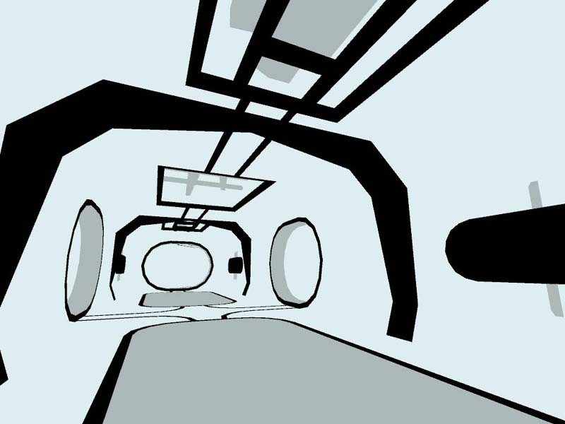
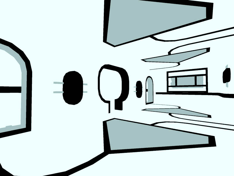
I dunno, the style didn't work for me. It was way too bright for my poor eyes. Perhaps if instead of white there was gray, or more gray colors instead of having the white be so dominant. Another thing that bothered me was that it felt like you were floating instead of walking on the floor, and that was due to the floor being almost exclusively white with nothing there to accentuate it. This would have been fixed if you had extended those black wall supports across the floor, and it would have added some needed detail in some of those hallways. The layout seemed fine enough, and the moving things all over the map looked great. I did think that the r_speeds were way too high for this map, but it's not like that matters these days.
I loved that corridor, it rocked :smile: Wasn't too keen on the floaty spinny things in it though, looked outta place to me.
Posted by Adam Hawkins on
Fri Sep 10th 2004 at 11:34pm
[Author]
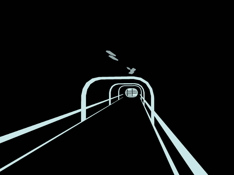
Part of the plan for a new version is to have more unique areas - definitely not symmetrical. Probably going to play on the contrast between the white and black areas - with the black areas being 'outside', and having more of them than the one 'corridor' in dm_pulse.
Posted by Tracer Bullet on
Fri Sep 10th 2004 at 11:20pm
ReNo said: Its a stunning map visually, so for style I can think of nothing to criticise. The layout is nice enough but I found myself getting lost and running in circles, but due to the symmetrical layout I was never sure if I was in the same room as before or not. I'd say on your next one make the layout entirely unique so people know where they are and where they are going at all times.
Ditto. I got lost very easily.
It really helps in map navigation if there are several "set piece" areas that you can use as land marks