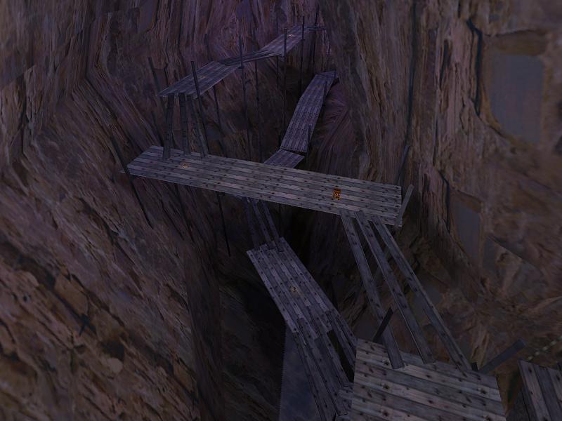
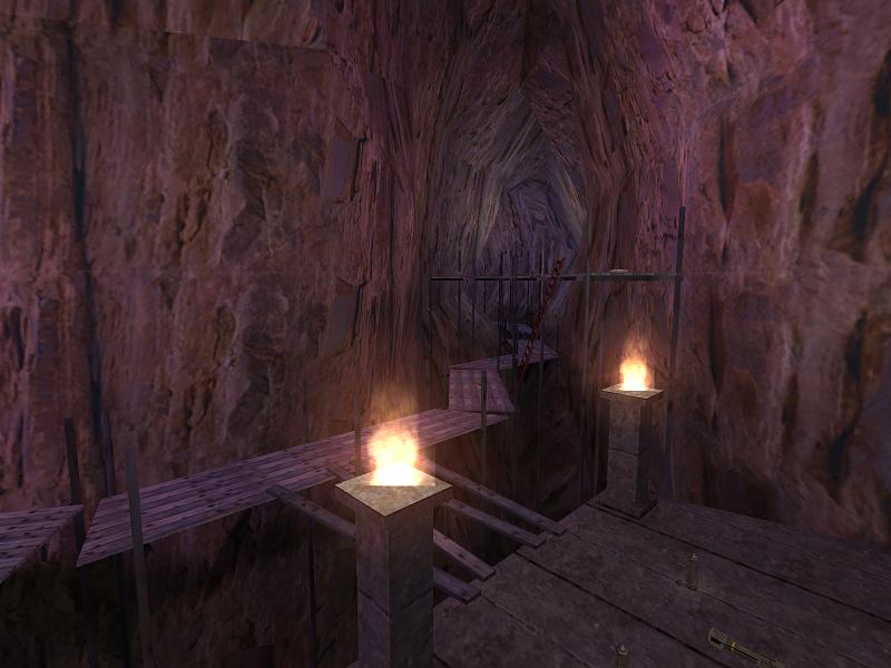
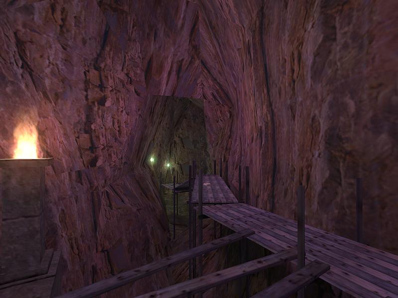
Mudanchee by Captain P

Map Rating

  • 5
  • 1 rating / 5 stars

Map Download

Map Info

Map Description

At this moment all work on Mudanchee is halted. A combination of designers block and the complexicity of this map. R_speeds are very close to 800/900 at some points and the amount of entities I used slow it down even on my computer.

Maybe I'll continue with this map, but most likely not. However, I might use the idea for a HL2 map, but we'll see about that.

Discussion

Posted by Erwaitin on Mon Jun 9th 2008 at 1:22pm

Nice map guy, really nice... How have you get the rock texture? Have you developed it or it's part of HL2? How have you get that crispy texture? Moreover, great work.
Posted by Kasperg_JM on Wed May 14th 2008 at 6:00pm

I should add that I played the map under HL2sp instead of HL2dm, but I'm not sure how that could be related to the problem I had. As I said, the displacements worked fine with player collision but not with physics objects. Random Source engine problems I guess.
Posted by Captain P on Fri May 9th 2008 at 4:56pm
[Author]

Jep, that's true. That HL1 map however, was far from finished. I ran into too many technical problems, so that map would never have been so great anyway.
Posted by tnkqwe on Fri May 9th 2008 at 10:39am

You have rebuild your HL1 Mudanchee map that isn't unleashed
Posted by Le Chief on Wed May 7th 2008 at 11:18am

+ Displacements
+ Lighting
+ Wooden pathways
+ Nice multiplayer flow
+ light use of ambient sound
  • stretched crates
The most obvious thing for the map for me was the displacement work, it was quite good and I imagine that was a few hours of tedious work right there.

As I said in the forum thread, the lighting was nice and it gave me a sense of being- I knew where I was. There was also some clever ways in which you lit the map with those little lamps.

The wooden pathways where constructed quite nicely and along with some props, it gave a nice human presence.

That little vista was good, but I thought that the little sand bank with the dead tree that was next to the creek was a bit...mmm.. rushed. The texture seemed a bit stretched and it looked flat, 5-10 minutes of work on the little sand bank could have improved it alot and made the vista area feel more complete and overall better imo, the sand bank really stood out and afraid to say, maybe detracted from the vista a bit, BUT thats not to say that it shouldn't have been there. But I liked the nice cliff geometry and how it casts a cool looking shadow.

The water in the cave was good, it was nice how it had a little steam effect to it, but I think it was missing something. Maybe a bit of reflectiveness in the rock near the waterfall, some moss, some sort of ambient sound or something else seemed to be missing that made it seem less "wet".. I don't know.

I felt that the map had a nice flow for multiplayer as well, although it can be difficult to judge when you play a map briefly with no other people on it.

And what about them crates huh? Dude, they where stretched, well some of them but again, thats not to say they shouldn't have been there, because they should have, but some of them where stretched and you could tell.

I would also just like to point out, that I'm sure you know that the map was mainly wood and stone, I'm just thinking about what the map would have been like with a bit of metal in it, would a bit of metal such as some metal trusses or metal sheets improve the map or not?

But over all, it was a good map, a worthy addition to your profile, I'm going to give the map 8/10, well done.

BTW, I had no problems with displacements and props, everything was bouncing off just fine.
Posted by Captain P on Mon May 5th 2008 at 7:58pm
[Author]

That's odd... because dismaps behave just fine here, and you're the first who mentiones the problem. How comes that on some systems, there's no problem, while on others, dismaps misbehave?
Either way, I'll give it a recompile. We shall see. :)
Posted by Kasperg_JM on Mon May 5th 2008 at 6:43pm

Beautiful map, not only visually but regarding sound ambiance as well. Layout works better than in the previous version thanks to more differenciated lighting, and the addition of custom props completes the theme.
The only problem I see is that you compiled without the -novirtualmesh parameter for BSP, which makes your displacement surfaces ignore any physics objects you throw at them, including grenades. You might want to recompile.
Posted by Captain P on Fri May 2nd 2008 at 2:24pm
[Author]

v50 is here. Please check it out and see if it's better (it should be, heh): Download! (.rar, 6.8 MB)

There's two or three minor fixes I still want to do and then it's dm_mudanchee, no more _v postfixes. :smile:
Posted by reaper47 on Thu May 1st 2008 at 10:40am

It looks good, but I see potential for true greatness in this shot. So, let me do some nit-picking:

First, I'd make one cliff much higher than the other. Obviously, the right one to leave room for the sun.

I'd also get rid of the street lights, to have more of this "middle of nowhere" feel.

Thirdly, I'd make a very, very simple blend-texture between the original cave-rock texture and the alternate one you used outside. Then displacement-paint the alternate texture only at the top and bottom parts to get a nice transition.
Posted by Le Chief on Thu May 1st 2008 at 4:11am

Cool, looks good Captain P. I suggest you put a block light brush to make the left cliff side cast a nice shadow :smile: .