Say hi to our newest member, RichardELDEN!
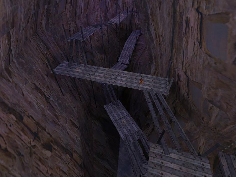

I like maps with great, high area's. Not reallyI agree. Can we get some shots of your level thats show off the
accessible area's always but just to impress players.
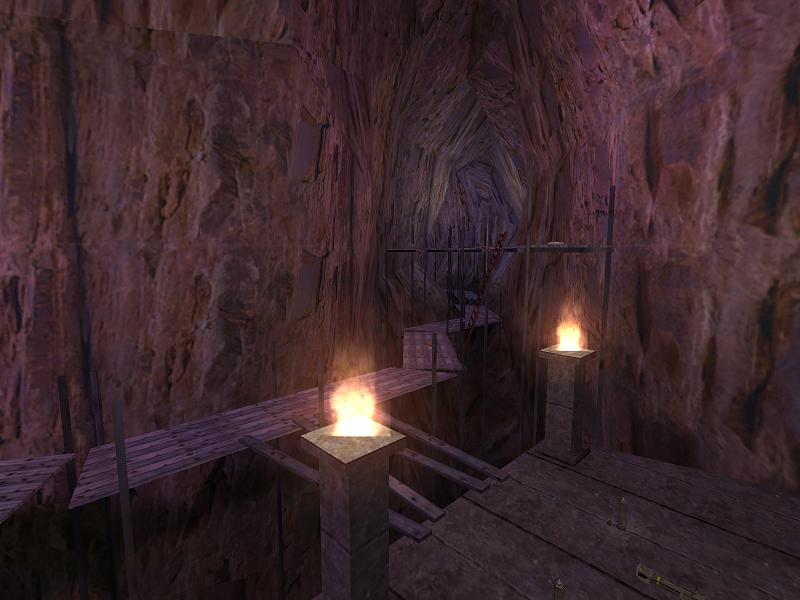
Hehe, well, the cave theme is not as original as you think, but not half as exploited as the HL2 one.I know it's not original, heh, the idea for this came from another game (Abe's Oddworld)... :smile:
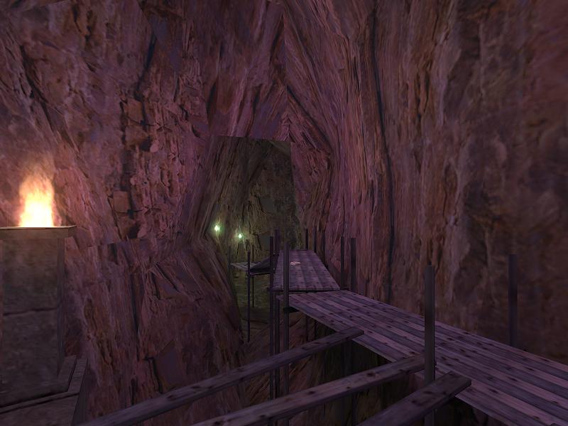
I agree, the way you used displacements is very nice but I was just
wondering: don't you have that alpha mask bug most of us seem to have?
No more-of-the-same HL2 themes. :smile:Hehe, well, the cave theme is not as original as you think, but not half as exploited as the HL2 one.