First off, are you happy with this map? I'll be honest, for the most part its a step back from cliff complex. Lighting is extremely rudimentary, architecture is bland, textures are often muddled, and nothing seems finished. Here is some pretty in depth criticisms...

I'm not a frequent visitor to sewer systems, but I'm fairly sure they aren't QUITE so drab. That texture is horrible and on the angled sections it looks out of scale. If you do use this or any other single texture, ensure you play about with the "to world" and "to face" texture settings in order to get it looking natural.

Very unrealistic sewer access - just a hole in the brick wall, leading to a giant trim of a big gaping hole? Surely if you had sewer access in your building, you would want it to be subtle? Perhaps in a boiler room, underneath a manhole cover that is flush with the ground? Obviously its a bother having a manhole cover on for gameplay so perhaps just have it permanently set aside, leaning against a nearby wall or something? Try to think how these things would be in real life and aim to emulate that.

You need to work on your texture transitions. Here, you jump from grey bricks to a concrete wall with no transition whatsoever, its just instant. Its extremely jarring on the eyes to be honest and doesnt look right. Also, while I appreciate that this indent thing is meant for gameplay purposes, it seems very architecturally awkward. The fact that the corners of the inner support are so sharp makes it feel like it would have trouble supporting itself as opposed to the wall above. Also, don't feel that independant structures like that pillar need to mimic the textures of the walls around them - it could just be a metal pole or something, or at the very least just use one coherent material for it.

Handrail seems a little tall to me (just by a bit) but the glaring problem here is that odd looking growth from the ceiling! Looks to me like you didn't accomodate for rooms you were planning on adding later, so you just cut into this room to make room for the others. Guess there isn't much you can do as the layout will dictate that that is where the rooms are, but you could try and make the ceiling look more natural within the size constraints you have set.

Another texture transition issue here. Why use that metal floor texture (the raised portions are there for grip, which is why you get them on floors), on the side of a concrete step? If the step is metal, it should be metal on top, and if its concrete, it should be concrete on the side.

Simple little things like a door frame would do some good here, I believe the other side of this doorway has another texture transition issue that a frame could solve also.

Nicest room of the map, definately. I like the attention to detail in the ceiling here particularly. It still, however, isn't without its flaws. The room doesn't have any sense of structural integrity, in particular that concrete ledge running around the wall. What is its purpose? As far as I can see, all it is doing is weighing down the wall. Put some pillars holding it up. The walls are also really flat, have little indents and pillars to break up the flatness.

You need more like this. The door here is inset into an indent, which give a sense of depth. Have little bits in the wall like this, without the doorway of course, and it will add a lot of realism and interest.

Once again your walls are suffering for being flat, shove in more of what I suggested for the previous room.

Another example of having dodgy texture combinations. If you want this concrete ledge to have metal sides, then the metal should have some depth - as it is, it looks like wallpaper pasted onto a concrete block. Have a thin (4 units or something) metal edging around the block instead of just an infinitely thin texture.

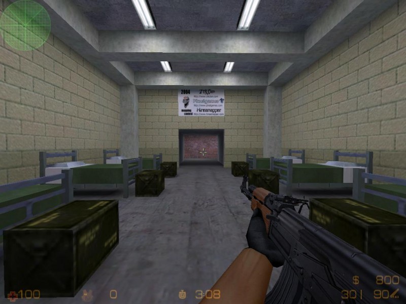
I hope this are is unfinished, considering its just an empty box room, without so much as a light.

Again, obviously unfinished, not much to say I guess.

Hmmm, not exactly realistic terrain here. This is basically a square room, with some bevelled walls, and a cylindrical hole in the centre, which doesnt make for natural scenery. Make the room non-uniform and sporadic, not so blocked as if god was working on a grid the day he sculpted this area.

Oh my, this is a horribly long and featureless tunnel. have some intermediary rooms along its length or at least SOMETHING. Just because Militia gets away with a hugely long tunnel doesn't mean you will too :razz:

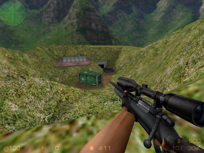
Awfully steep walls for grass to grow on, wouldn't rock or something be more likely?

This is a nice touch, I never thought when in the room below that the vents actually led anywhere, so it was a pleasant suprise when I found they did.

Ummm, please tell me thats work in progress? Those stairs demand sides of some description.

Thats not right...

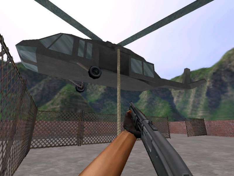
Using cylindrical poles here is bumping up polygons for no reason, and having them so fat is just ugly. Use square poles, and keep them reasonably thin, theres no need to have them a foot wide. To be honest, this is a 100% pointless area in general, it seems like an excuse to put in the helicopter. It needs a lot of work, as having those clothes lines as the only objects of interest is scraping the barrel!

Bit of a clipping issue up there, kept getting launched away from the grate, as if jumping off a ladder.
Well I know this came off as extremely harsh, but to be fair, it really isn't the sort of standard I was expecting from you after cliff complex :sad: There are some nice things in the map but they are few and far between, I think it should be scrapped and commited to experience, but of course thats your own decision.