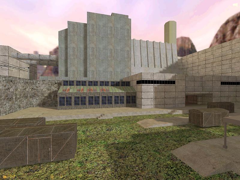
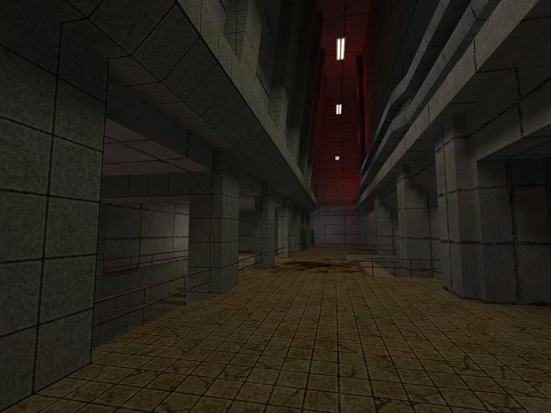
Sector Gamma plays around the Chernobyl reactor. The outside features a lonely train station, the inside shows radioactive coolant-water and athmospheric corridors. As you can see, I'm creating the textures for this level myself...
I was inspired for this level by screenshots from S.T.A.L.K.E.R: Oblivion Lost... obviously...
Posted by Captain P on
Sat Apr 17th 2004 at 6:57am
[Author]
I agree it looks too clean. I'll do something about it.
The buildings are large and they're meant to be large. I stretched the textures on them 4 times. But these textures are Half-Life textures. I still need to replace them with custom ones. They look lifeless indeed now.
The grass texture comes from de_piranesi, and so does the rock texture. I'll replace them too.
To tell you the truth, the problem is hard to identify for me. It doesn't look like there are buildings, just large grey blocks slapped on the ground. There isn't much life in them.
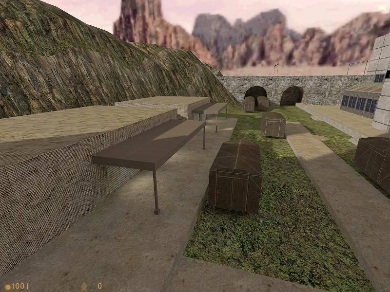
I really like your choice for the direction of your environment lighting and I think it compliments your architecture very well (the first pic especially looks good). I think the problem with the textures is that it clashes your theme (which I'm assuming is industrial factory). Everything looks too clean and perfect. Maybe some pollution and rust hehe. It doesn't look all that bad as is however I do agree about the bricks being too small. Also I can't quite put my finger on it but the third pic just looks wierd...
EDIT: Forgot to add that the mountainy thing in pic 2 looks very good.
Posted by Captain P on
Thu Apr 15th 2004 at 4:55pm
[Author]
I think the bricks are of good size, in reality they are quite small too actually.
I'll go for the plaster here and there. The repetitiveness of that texture has been mentioned before by some others from my Dutch forum, so I'm aware of it. (If not, I should be by now... :biggrin: )
And what do you mean, Cassius? Keep in mind that some are still test textures, especially the ones on the buildings on the background.
You don't necessarily need to not use bricks, its just that the current texture is of loads of really small bricks and it looks repetitive. By all means use a brick wall if you think its most suitable, just try some less repetitive ones and that will probably go hand in hand with having larger bricks. It might be a good idea to break up the surface as well though, be it with some sections having plaster over the brick or whatever.