reclamation by Yak_Fighter

Map Rating

  • 0
  • unrated

Map Download

Map Info

Map Description

STORY:

The human invasion of Xen went all according to plan. The Nihilanth is dead, thanks to Gordon Freeman, and the Xen forces are in disarray. In order to control the border world the military built multiple bases in strategic locations and began hunting down the remnants of the Xenian forces. The G-Man, with both Xen and Freeman in his control, is confident that he has accomplished his mission.

That is, until contact with one of the bases was lost. Recon teams were sent in, but none returned. Now you've been sent in to see what has caused this mess. Hope you have better luck than those who entered before you...
This is my competition entry. I know it's got some problems, but I wanted to enter anyways :P. Depending on people's reactions to it I may fix up any problems and redo the lighting.

Discussion

Posted by Yak_Fighter on Thu Aug 5th 2004 at 2:16am
[Author]

1. I'll try. Hope no one cares about r_speeds!
2. Thanks! One of those rare moments of genius I guess, as it wasn't planned.
3. :razz:
4. I'll get rid of that.
4A. Thanks!
5. I'll change that thing around a little bit to add detail. A red light is a good idea too.
6. :cool:
7. I'll fix that too.
8. I wanted to allow people to go through that one. I'd change the texture to differentiate, but there aren't many other options in the xen.wad
9. I'm going to have to remake that thing to make it look cooler than a 6 sided brush.
10. What's wrong with a little subtle detail :razz:
11. I don't know...
12. ouch
13. That's just a cycler_wreckage. I haven't quite figured out if I can change it but I'll try...

Thanks for the critique. I appreciate it :biggrin:
Posted by 7dk2h4md720ih on Thu Aug 5th 2004 at 1:28am

1. This roofline is still a bit flat. At the very least put something behind it.

User posted image

2. This bit kicks ass and chews bubblegum but then it ran out of bubble
gum and stole some from a well lit but dead soldier but it was too busy
kicking ass to chew properly. True story.

User posted image

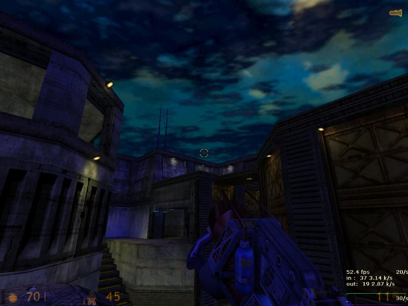
3. That yellow light has gone horribly wrong. Open hammer, select the
texture and press the 'fit' button. I can make a tutorial if you want.
:razz:

User posted image

4. Inexplicable texture transition. Why does the floor magically change colour?

User posted image

4. These are really cool.

User posted image

5. I'd give this a bit more depth and maybe add a small red light near it.

User posted image

6. Ooh baby.

User posted image

7. These lights don't looks right at all due to having the trim texture on the sides.

User posted image

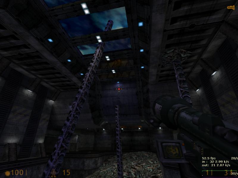
8. You can jump through this giant spagetti tangle but you can't get past any other ones I tried.

User posted image

9. This is a just a tad too large. Scale it down a smidge!

User posted image

10. Raise this wall up by about 64 units as you can't see that much of it from below.

User posted image

11. What were you thinking?

User posted image

12. Reno made me do this so his map would win. :sad:

User posted image

13. The smoke here is a bit thick. Thin it out or have it rise higher into the air.

User posted image

Overall the map is great but to be honest it's a little dirty and messy
in places. You could have at least swept all the rubble into one
corner. I won't even start on all the goop lying around. I wish I could
find more wrong with it, but I couldn't. I'll have another run around
at a later stage though.
Posted by Yak_Fighter on Thu Aug 5th 2004 at 12:25am
[Author]

Critique away!

http://yak_fighter.tripod.com/reclamation_beta5.zip

Some things to remember as you're running around:

-layout isn't complete, since I haven't made a bunch of connecting hallways

-most of these hallways are there only as visblockers, I really hate hallways myself :\

-the dead grunts on the ground are there to show how the lighting will play on entities

-my gamma is set at a little over half on the slidy bar in steam

-the tank area is getting changed

-r_speeds are no worry at this point
Posted by ReNo on Tue Aug 3rd 2004 at 3:00pm

Doesn't look way too bright to me mate, I reckon it could use more light :razz: The central expanse of floor seems to be lacking any sort of illumination judging from the screenshots. While there are loads of nice accenting light fixtures, there is a real lack of functional lighting I'd say. Perhaps a nice arrangement of light spots on the floor could look good.

I'd be interested in doing a critique if you want - PM me a link or tell me to go to hell, your call :smile:
Posted by 7dk2h4md720ih on Tue Aug 3rd 2004 at 11:37am

That's awesome, link me. :wink:
Posted by Yak_Fighter on Tue Aug 3rd 2004 at 11:32am
[Author]

User posted image

Here's the final area. It's not completed and is way too bright, but eh. I've got a lot of work to do to finish by the deadline, but here's hoping!
Posted by Ferret on Tue Aug 3rd 2004 at 3:57am

Wow! Very nice job!!! I love the Xen vines. Nice job with that. The blue and yellow lighting is good contrasts! You're doing a wonderful job with this map, can't wait to see it finisehd.
Posted by Yak_Fighter on Thu Jul 29th 2004 at 4:17am
[Author]

ok, thanks guys. work continues unabated!
Posted by Crackerjack on Thu Jul 29th 2004 at 12:46am

An idea for lighting up the rubble area: Have a construction looking like (one on a stand) so it looks like they were trying to clean it up. And lighting should be alot better in that area.

As for the new screens, the hallways look a bit boring, but that maybe due to your R's not sure. The arched area looks real nice.. maybe some alpha textures for detail?
Posted by ReNo on Wed Jul 28th 2004 at 3:29pm

I going on the basis that the view models are barely lit, and therefore other player models will barely be lit, making the game probably very hard to play. I'm all for keeping the sky lighting blue, but if you are going to have that then you shouldn't rely on it it alone to light up areas, as that tone of blue isn't great as functional lighting. Atmospheric yes, good for playing in, I doubt it.