
Re: Voting Thread for 2009 Competition
Posted by G4MER on
Mon Oct 19th 2009 at 12:23pm
Posted
2009-10-19 12:23pm
G4MER
floaty snark rage
member
2424 posts
360 snarkmarks
Registered:
Sep 6th 2003
Location: USA
First off, very nice work one and all. I remember reading in the contest rules that it should be a vista where the player is trapped and can not walk about the vista, but instead can see it from the place they are... and for that reason, I am voting for Arron. I feel he pulled off the theme well. It was hard because redwoods map is just crazy pretty and also has aspects of both new and old.. but the open I am free to roam around in the vista killed it for me.. Arron's made me wish I could get the heck out of here and go look what was over yonder. Good job people.. it was very interesting to see how your mind works, and how you took to this challenge. Your all winners in my eyes.
+1 Arron da Killa

Re: Voting Thread for 2009 Competition
Posted by Gwil on
Mon Oct 19th 2009 at 12:50pm
Posted
2009-10-19 12:50pm
Gwil
super admin
2864 posts
315 snarkmarks
Registered:
Oct 13th 2001
Occupation: Student
Location: Derbyshire, UK
For me it was a choice between tnkqwe and RedWood. I loved the feel tnkqwe had captured, the terrain reminded me of the biodome in the Op4 singleplayer campaign. It looked good considering the age of the engine, too.
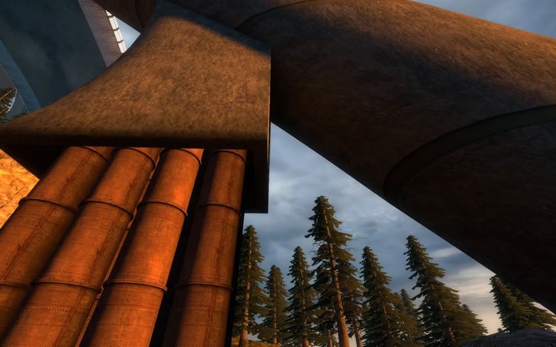
However, I think RedWood got the theme spot on. The striking ancient architecture bathed in a golden sun draws our eye first and then, wham - we see the superstructure above. It did seem to be integrated into its environment and looked just fantastic.
My vote goes to RedWood. I will echo Muhnay though, all entries were fantastic and showed skill and vision. Congratulations to all entrants on some quality work and thanks also must go to Riven for once more working hard to bring the community together.

Re: Voting Thread for 2009 Competition
Posted by haymaker on
Wed Oct 21st 2009 at 1:40pm
439 posts
921 snarkmarks
Registered:
Apr 1st 2007
Location: CAN
Very nice work you guys! The talent level here is getting pretty impressive! After going through these in 'look' mode I want to go through them again in 'play' mode too.
I appreciate your disciplined approach here Aaron. Something I failed at miserably. It's truly a 'vista'. Love the custom content, was looking for a clue to the drink combination for a bit. I zoomed in around the view and found lots to look at ( upside-down waterfall?? must be my vid setting ).
The "wow" factor is really here in yours, Redwood. Stellar piece of work. It's pretty much "ancient vs futuristic" incarnate. Thanks for putting the suit in so i could zoom even though I was puzzled by the player boundaries. Again Ill say Im a sucker for grandiose architecture in games and you nailed that here.
Im bummed I dont have HL1 installed Tnkqwe. This looks as impressive as anything valve put together though. Good idea putting the npc's in there for some extra visual interaction too.

Re: Voting Thread for 2009 Competition
Posted by RedWood on
Fri Oct 30th 2009 at 10:01pm
Posted
2009-10-30 10:01pm
RedWood
member
719 posts
652 snarkmarks
Registered:
Sep 13th 2006
I should have posted earlier but between school and the flu and bla bla bla...
Tnkqwe: thats some of the best looking Hl1 shots iv seen. Looks like u really captured a mood. My only complaint is that some of your textures in the background are obviously over tiled. I just cant vote for Gold Source though. It just a apples to oranges thing when it come to Source.
Haymaker: I really enjoyed running around. After a while I was trying to jump back in the ship so i could take off but to no avail. lol
Aaron: I voted for your entry. Grate work as usual. It looks like a real city witch was built and blended together over time. I have 2 complaints though. One being the lighting. I found the lighting scheme boring. It was rather gray with little contrast. It match the new winter overcast that was outside while i was playing, so depressing. The other complaint is that i couldn't tell what the ancient part was of your map. from the posters i get it that im in the future but what the ancient? Overall grate job though.
As for my entry it was obviously a few days past due but if it bothered anyone ill let you know that because of school and work i was only able to put in less then 8 hours of work from the original dead line to the final one.
If anyone was wondering, what your looking at in my map is the maximum amount of displacement the compile will allow you to have in your map.
Reality has become a commodity.


