Say hi to our newest member, RichardELDEN!


"omegaslayer" said:A brush covered in nodraw doesn't count as long as the player can't touch it.
What about nodraw brushes? I could use one displacement to be walls (4) and ceiling (1), but I would still need 5 brushes to be nodraw behind the displacement. Do those count?
"Orpheus" said:Huh? It still counts as 6 brushes to make a box room.
The concept of 6 making a box has been reduced to 1.
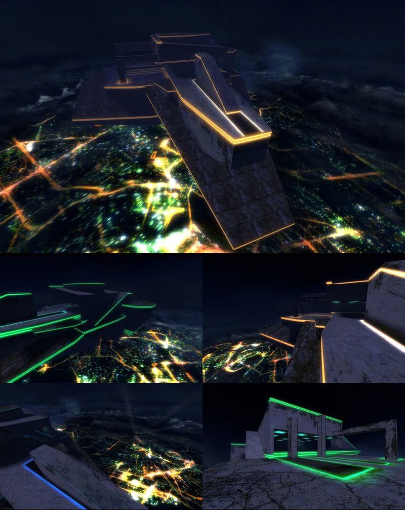
"mazemaster" said:Yeah you have to use the 20 brushes efficiently. Here are some of the results from previous times a "20 brush competition" has been held at other places:
Wow what an extreme constraint - it takes 6 brushes just to make an empty box room. I'm super interested to see what people come up with.

aaron_da_killa said:(Unless I misunderstood the rules)
Huh? It still counts as 6 brushes to make a box room.


"Muhnay" said:They look like weapon_ and ammo_ entities to me which are allowed.
and another 5 or more objects that you said count against the count..
"Muhnay" said:I'm surprised that one is under 20 brushes too. But apparently he was able to squeeze out 619 total surfaces from 20 brushes so there you go. Here's some info about that entry.
and above that I see 18 at least.. because you said if I cut my brush it becomes 2 brushes.. so how can that person have so many faces facing you in the various areas and still be below the 20 brushes?
Orpheus said:Yes orph, in the unreal editor, you can make one subtractive brush to make a room, however that doesn't work in the HL editor.
I don't exactly remember the details. That seems to be an unreal entry and the engine cuts differently. With subtractive I don't think it works like HL2. It could be simply 20. shrugs
I wish Jinxy were here. He'd know.
omegaslayer said:LOL, the delete post works grandly bud.
opps double post
"Muhnay" said:Entries should be for HL/HL2/HL2DM/HL2Ep1/HL2Ep2 as I mentioned in the rules.
So if I map in Hammer I am at a Loss, because the Unreal Engine can do stuff my choice cant.
aaron_da_killa said:Quake - Yes.
I think it's still relevant as the Quake and Unreal engines work in same manner as far as this competition is concerned. Also might offer people ideas and inspiration.
omegaslayer said:I wasn't gonna bother pointing this out for the simple reason of,I doubt anyone here will be using it so the concept is moot.
Likewise a square room may be 1 subtractive brush, while in HL2 it would be 6 brushes.
aaron_da_killa said:I looked at my calendar, and the 8th is a Tuesday, right? So the closest Sunday night to that date is the 6th no?
The competition ends on Sunday night, the 8th of February.
Riven said:Wanna lay odds?
Either way I should have way more than enough time to get something cranked out and looking good!
Riven said:
I don't scrap, I iterate.
verbUh huh... Got'cha.
Definition of ITERATE
transitive verb: to do again or again and again.


 I've always associated Gwil and Reno together for some reason and often get mixed up between the two.