NS Classic: Medium/Large Plan
Type: Dark/Close Quarters
More Information Soon as the map gets nearer to completion.
Maps being recycled to be part of ns_valerie if it can be, I'm thinking I can get one of the area's in to the map atleast.
Discussion
Posted by Tracer Bullet on
Sat Oct 23rd 2004 at 3:12am
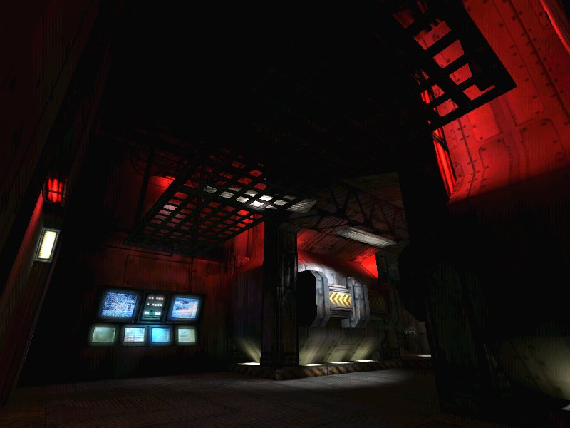
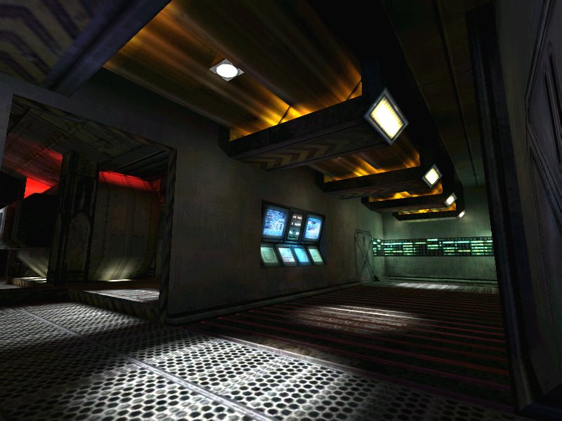
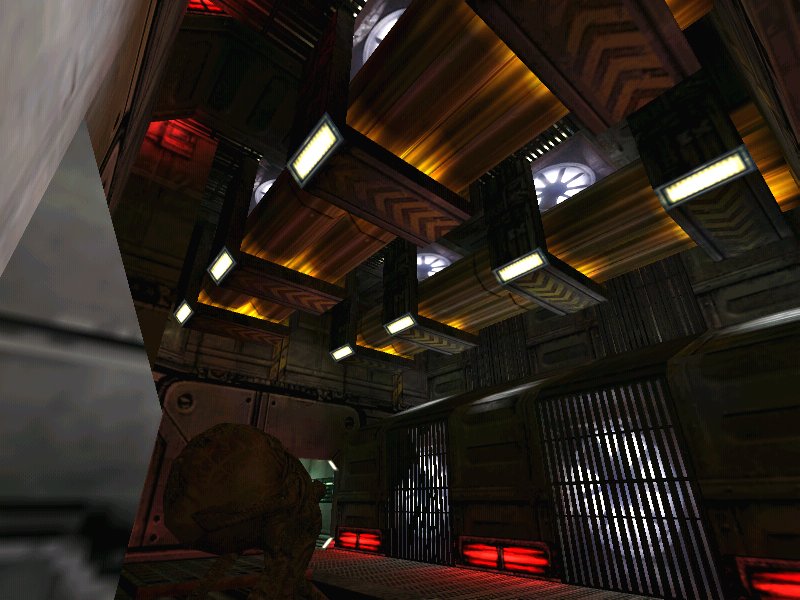
TBH I don't like it much except for these two shots. The first one of those two is just beautiful, but the second is good but not quite as cool as the other. The rest feels cramped and while the lighting is good, I'm seeing very little in the architecture department. It may just be that the screens were taken in an unflattering way, but that's what I see.
nice... first 4 pics are lighting and atmosphere the way its meant to be. the way you only once a while come across in other maps. you are imo obviously a great lighting artist, just verify that you match your architecture with your lighting. in pic 4 there is an asymmetric lighting, yet the ceiling show symmetrically placed lights
Really nice work, I agree the lighting is excellent. Also I like how much depth you've added to the ceilings. The last three screens (links) look pretty WIP and boxy, but I'm sure you'll fix that up. Hope it plays as good as it looks.
Posted by Forceflow on
Fri Oct 22nd 2004 at 9:28pm
as said, the lighting is fabulous. Keep up the good work
Nice I like the 3rd pic most of all. I have noticed that the gurders that are attached to the grating are just hanging right on to the grating itself. I suggest you have them attach to the edge or have a bar that goes under the grating and then attaches to the cables for more realism. Other than that it looks good. How long have you been working on it? I hope to play it good luck.
