So I was thinking to myself, "What theme can I whore out for this year?" And then it dawned on me - whore out my own theme from last year!... but this time with feeling! I'm kind of going for a semi-cartoony World of Warcraft look.
"Consider getting a job at Blizzard" :biggrin: You make it sound so easy! Not
to suggest that CJ hasn't got the skills of course :wink: If he'd actually
try learning to model that is :razz:
Maps looking not bad so far, but I preferred it in HL1. Back then it
was jaw dropping in scale and stature, but now it feels far less so.
Lighting could certainly use work - ambient light level seems a bit
high in that night shot, though the lamps look pretty nice. Overall
design is nice and I like the more exaggerated shapes you are working
in, with leaning walls and whatnot giving a nice imposing feel to the
place in a cartoony way. I'd be inclined to suggest losing some of the
detail in the textures that is creating repetition, as it is quite
noticeable at the moment. If you have access to it, play the Wind Waker
and check out the Forsaken Fortress near the start for perhaps some
more ideas, even if it doesn't quite match your theme.
I'm afraid I'm gonna have to echo the others thoughts about models -
this could really benefit from them. Having drapes between pillars that
are simply masked textures doesn't really cut it anymore, and while it
added some welcome detail to the map in HL1, it just looks out of place
in HL2. Grab milkshape and have a go - I'll bet you won't find it as
daunting or difficult as you seem to be expecting.
Campaignjunkie you should really consider getting a job at Blizzard as
a level designer. Your style fits Blizzard's type of levels. In fact I
think they are looking for level designers.
CJ, i could make you some models, if you tell me what you would like.
You'd have to skin them though :razz: Contact me through PM/Msn/Email and
i'll see what i can do :biggrin: Click here to see some
models i made. (NOTE: Ignore the garbage skin)
Posted by Campaignjunkie on
Sun Jun 26th 2005 at 11:53pm
[Author]
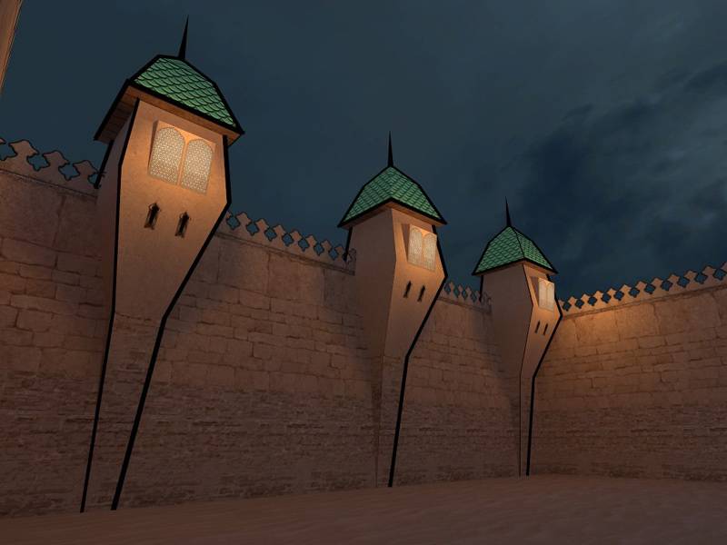
A night version. Not really liking how the torches came out, but oh well. Also threw together a three-dee skybocks for fun.
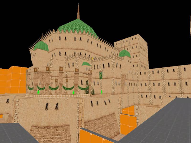
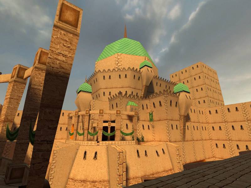
I think I'll distort the hell out of the indoor portion, but keep this
outdoor portion relatively normal so the player knows that it's
supposed to be some kind of palace.
I am glad you're making progress on this map. It used to be on my watchlist for a while, until I took it off a week ago. It has been dormant for so long that I thought you've given up on it.
Looking good so far. I am sure you're still tweaking the lighting, so I won't make any comments at this point. The architecture looks magnificent though.
Oops. Progress bar is more like 40 or 50, I forgot to update it. Which
actually brings me to one of my goals for this year's entry: don't make
it so damn big. I'm actually kind of proud of the restraint I'm showing
:wink:
Myrk: Good point. I'm still trying to decide what exactly I want to do.
But I have a few ideas though that should be "surreal" enough,
hopefully.
Everyone else: Sorry, I can't model, it's just going to be hardcore VM.
And thanks for that lighting tutorial (although I disagree with the
writer; we can't all make happy, sunlight-filled DM maps! it's like
that overused orange sunset skybox, too much of it already in the
community)