I realized tonight that this is your first critique done by yours truly. You might not be ready for one if, you haven't read very many of my others. They tend to focus on what I think needs changed. I do not waste a lot of time with placating authors for a job well done. I save those for when the map is released and the author needs them. An author needs his trophies more then than during. Anyway, to make a long story short: My critiques are 100% voluntary on my part. Nothing I suggest needs to be used. I donate my time without strings, so that the author has no room to complain if I inadvertently upset them in some way. I have been burned enough times to make that as clear as possible. This is why I no longer do a critique without the written consent of the author. I feel that if they asked, they cannot gripe.
Also, it takes me well over an hour to write a simple critique. One like this, takes much longer. Please remember that when you want to yell at me for anything.
________________________________________________________________
Now, onward:
This map tells me two things.
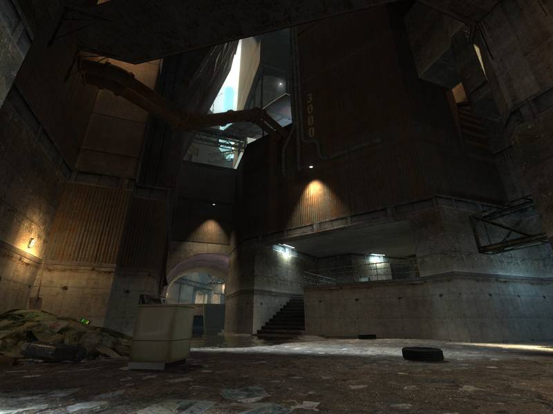
#1: Its size has gotten away from you and now you're scrambling to connect all the areas with tunnels and vents. Its big. It needs a bit more thought as to its layout. It either needs made smaller, or the connecting paths need more attention.
#2: Because of its size, its going to be hard to fill it with items, without making the items appear haphazardly strewn about. Item placement is going to be a bitch to get right. To little and people will be turned away from playing. To many, and you'll look like a n00b with the piles of them.
I also noticed that none of the doorways have thresholds. The map, just meanders from here to yon. You have distinctive areas, but nothing marking the beginning, or ends.
I liked the sounds, nothing needs done about them, but the sunlight is far to harsh. The sections with light from above is glaring. Toning this down, might be advised.
Anyway here are some pictures that might be of assistance.
 Now of course I could have missed something so if I did, disregard this. However, as near as I can tell, there is no way to get back out of that nook, without taking damage. You need to either: #1 Put something in there worth hurting for IE the RPG, or #2 Have an alternate way out than simply jumping off.
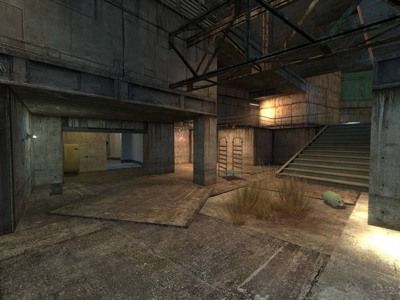
 This area. Its so out of theme from the rest of the map. It either needs a reason for all those pillars, or the style of construction needs altered to fit another area. I really don't know what you intended, but its the most out of place area in the whole map. I cannot suggest what to add/remove but its in dire need of something.
 That fencing. Nice addition to the map as far as creating scope. The field of view beyond make the map seem much bigger, and makes it feel like a city looking out. However, its to neat. Break it. Roll part of it down. Do something to get rid of the "Just installed" look. You could add a gate, one that cannot be opened, and add some platform outside. Perhaps a landing area for a chopper. Whatever you do, mess it up.

 These two shots. Notice the pillar across the way? It borks out at the base. Also, while I'm in this area, lose the girder crosswalk. You can extend the platform I am currently standing on to the point of a jump distance. The iron walkway doesn't fit. No one would add such a construct in a real world. However, you could add a jury-rigged something in the place of the walkway. Something a bum might use? A board set sideways, or broken a bit? The carpet needs to go as well. It doesn't fit the area.
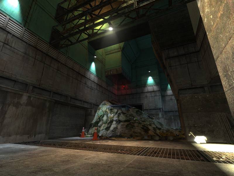
 That entire roof of sheet metal is held up by that one pole? Just one? And a chair? What's with the chair?
 That ramp. Its to neat and tidy. Extend it past the lip at the top. Make it look added, not built as if its supposed to be there. Its to wide and too thick. Its sheet metal, make it look like it.
 That, it doesn't belong. No where else within this map is there such a pillar. No architecture resembles it.
 No light source. Also, this area is a bit iffy. Its texture choices put it out of sync with the rest of the map. You have crete and steal, now suddenly, you have?? What is that? Sheetrock? Doesn't matter. Either make it seem like it belongs or, switch textures to fit the rest of the map.
 Another no light source? Also, assuming you want to keep this section as is and make it fit, alter the upper floor to another texture. One closely resembled, but definitely different than the floor below.
 I like the blue lights. I do not like them as blobs. Put a lightbar under there perhaps. The intensity is just to bright and focused. Dim it down and spread it out a bit.
 Another no light source. The trim on the floor looks strange too. Tile with metal. I don't know what to suggest, but one of them needs altered.
 Increase the depth, and place some sort of a light inside. Dimly lit alcoves add much to the ambiance.
 Yes, like this one. However, that glaring crack in the back ruins the effect. What is it by the way? My visuals or a defect in the map?
 This switch, although a wonderful trap, resets itself much to rapidly. Also, how can one enjoy the effect, if its around the corner. Traps are best when they can be seen trapping the prey.
 Another dark alcove that could benefit from a light.
 Hallways. Especially ugly ones like this should be no longer than a 3 second run. At least not without cover. The hall needs alcoves or widened so you can add cover of some artificial kind.
 That hole. It leads to the RPG. It needs more thought. Its just a hole leading to another place. I have no real idea how to alter it, but it needs done.
I hope there is something here of use.
Orph.