dm_3006 by reaper47

Map Rating

  • Star map!
  • 5
  • 1 rating / 5 stars

Map Download

Map Info

Map Description

Beta1 is out!

Changes in this version:
  • many, many minor fixes
  • removed the corridor that leads to the ladder (it's now outside)
  • finally did the proper texturing
  • refined brushwork at places
  • changed a few stairs and catwalks
  • added a few more connections
  • opened up the mall/underground area
  • tuned the RPG trap
  • added: numerous light fixtures - and lights!
  • added: physics props for better gravegun fights
The map is set in the slums and abandoned industrial areas of a kilometer-high, futuristic city. Corrugated sheet iron and concrete. Some parts stand underwater. Sunlight falls in small chasms but mostly stays a glow in the distance. HDR, mmmm.

Discussion

Posted by Naklajat on Tue Nov 21st 2006 at 4:15pm

I think it's a good decision to give the player somewhere else to go from that catwalk. I remember getting to that spot and then thinking "now where?"

Looking forward to the next release.
Posted by reaper47 on Tue Nov 21st 2006 at 11:24am
[Author]

Neither this map or films like the fifth element (which is a huge inspiration) will win any logic award, I just like the scale and monstrosity of the idea.

But thanks for having a look, anyway! :smile:
Posted by oskutin on Tue Nov 21st 2006 at 7:28am

Under kilometer high city? Maybe city builders destroy old building before start build the skycapers.And skycapers weight can crash the old building and city destroys."Sunlight falls in small chasms but mostly stays a glow in the distance"
But maybe builders build walk ways and foliage between skycapers enterances.
But this is good map.
Posted by reaper47 on Fri Nov 17th 2006 at 7:58pm
[Author]

Thanks Ballblue... (ball blue... I always read ballude! :biggrin: )

The upper parts (screen 3) are very basic yet. Very blocky. Also there is a lack of props (light-fixtures) ect. Lighting needs variation. HDR shots look incredibly dark in the shadows in screenshots, even more than in the game, which probably causes some of the extreme Quake 1/pitch black look.

Anti-confusion/landmark/texturing tweaks are on my list and screen two hasn't changed so far. :wink:

__________________________________________________

I carved my way through large blocks that were never meant to be hollow in order to add an additional staircase to the upper level. And I couldn't resist taking a screenshot. :smile: It's nothing but a teaser that wont mean much if anything to people who haven't played the map already but I post it anyway: The catwalk now connects two stairsways that go from the bottom to the very top parts of the map. This is a little outlook:

User posted image

See anything? Didn't think so. Anyway, now I have at least a screenshot in this chapter :smile:
Posted by reaper47 on Thu Nov 16th 2006 at 6:09pm
[Author]

Not that it's a big surprise but everything takes longer than I feared. Wheee!

I'm really thinking a lot about layout right now and that doesn't let me focus on eyecandy at all (not. at. all.). So no screenshots any time soon. I'd like, however, to get some ideas about the layout changes.

Especially Gwil's post was a huge help here and I'm trying to incorporate as much of the feedback as I can. Maybe there will be an unofficial release that's not meant to run on any server but is solely there to allow the layout experts to have a dry look at the changes.
Posted by midkay on Fri Nov 10th 2006 at 9:35pm

It's great to hear that, reaper47. Nice to have an update on this. :smile: Can't wait for an alpha2.

I think boosts in motivation are universal. Over the past few days I got done 75% of the work I needed to do in order to release a beta 2 of dm_residential (shhhh, let's keep this on the down-low). Hooray for productivity!
Posted by reaper47 on Fri Nov 10th 2006 at 6:41pm
[Author]

This version is outdated. For comments and suggestions see Alpha2a look here!

Check out the map profile for a changelog.
Posted by reaper47 on Wed Sep 13th 2006 at 3:16pm
[Author]

Wow, thanks Gwil! I will look at those tips very closely to incorporate them as much as I can.

PS: I like the tablet-writing. :biggrin:
Posted by Kasperg_JM on Wed Sep 13th 2006 at 1:07pm

I think those tips are great. The concrete textures work very well in the outside areas because of the light and contrast.

The same massive concrete surfaces seem to suffer in the interiors
because the size and lighting style are not enough to give them the
same value.

As Gwill said, you can either spice up the interiors or open up even
more shafts of light into these rooms (like the one in the fifth pic
Gwill posted). Everyone mostly agrees that the map could be a bit
brighter, but I don't know if it would take something away from
the map. The transitition is very nice with HDR.

Since it's a multiplayer map, I think you'll have to go with what's best for the gameflow and not the visuals. :sad:

Speaking of the underground rooms. Something that you could do is using
a lighting color code to make navigation easier. For example, you could
have your blue lights in the alcoves and beneath the pillars, while all
the exits would be lit with a green/othercolor hue. I think things like
that could make learning the map easier.
Posted by Gwil on Wed Sep 13th 2006 at 10:34am

Some images in this post have been automatically down-sized, click on them to view the full sized versions:

Some images in this post have been automatically down-sized, click on them to view the full sized versions:

Some images in this post have been automatically down-sized, click on them to view the full sized versions:

Some images in this post have been automatically down-sized, click on them to view the full sized versions:

Some images in this post have been automatically down-sized, click on them to view the full sized versions:

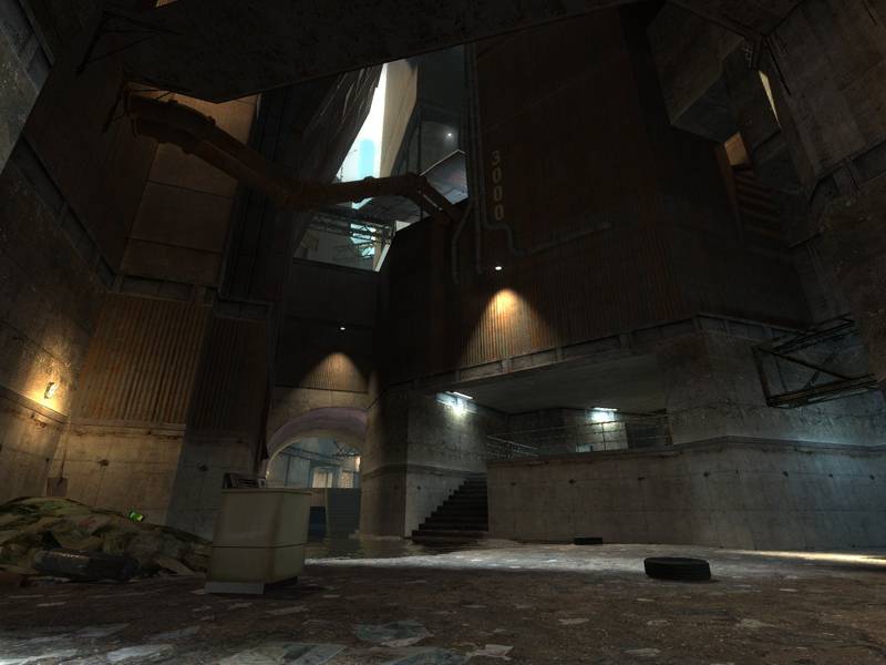
Here's some of the points I was talking about in my previous post, re - "one path" syndrome.

User posted image

This shot has been brightened (as have the others). The colour of that
ladder is a sticker for blending in with the concrete. A quick glance
makes it easy to miss. Stick in an emergency light or a recess to make
it more noticeable.

Also, the area with the crossbow and charger could be extended IMO -
another pathway, or perhaps access to ventilation systems, as seen in
the lower levels with the RPG/SLAM. Reward players with 2 Combine balls
  • the ones out at the moment are easy to get!
User posted image

One path syndrome. Such a large area, it is crying out for more escape
routes / entry routes. Adding a door in either location which could
lead either up or down gives opportunity to expand the Z-Axis, and
remove the feeling of a single path experienced in this areas.

Also, while I understand it is an alpha, there is nothing in terms of
detail or architecture to make this area identifiable as a "landmark".

User posted image

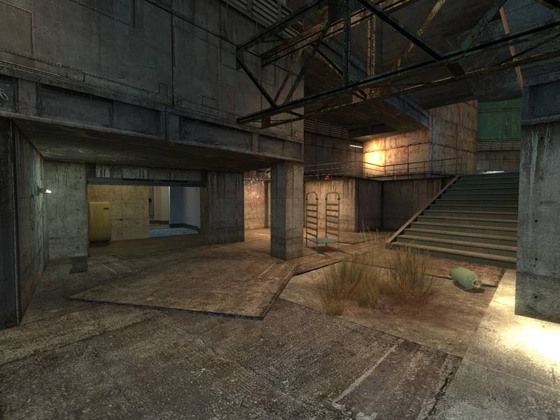
Similar points to the shot above. Behind me is a redundant alcove, in
front of me too! Are these going to be doors or stairs? There's a lot
of recesses or gaps in walls which look like doors that aren't yet.
Adding at least one in the blue pools areas will open up the dynamic so
much more.

User posted image

Similar points again. See how grey this area feels? There's no girders,
light variation or indeed changes in architecture. Cut some pipes into
those walls, vents, emergency lights, fencing, power boxes. Anything!
It helps us to navigate a level if we have objects serving as
landmarks. Also, it looks nice to have some variation in your brushes :wink:

User posted image

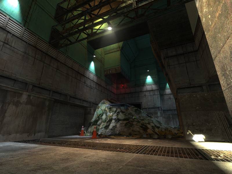
As above - also a prime culprit for "alcove syndrome". This area
needs doors and variation in the brushwork. The atmosphere is good, but
it's let down by seeming dull in terms of repeated shapes and flow.

User posted image

And here we have a fine example of what this map really does well. The
large jutted pillar, coupled with the light shaft coming down AND the
big pile of rubbish (nice touch with the falling bottles, BTW :smile: ) makes
us recognise and instantly assess which way to pursue or escape
via. While the right hand side is a little "grey", the rest is
excellent. Using the grating over to the far left along with green
lights is the quick and easy method of adding that landmarking,
variation and detail to the map.
  • Improve gameflow, especially in the flooded areas. It is too
    close to being a single track level when two large areas like that are
    sourced by only a handful of doors.</li>
  • Break up the architecture - add girders, work with some new
    shapes. Remebering a level by the idea of "the room with the pipes" or
    "ramp room" is classic navigation.

    </li>
  • Expand the z-axis play. Intergrate more venting and suspended
    walkways. With the extra doors added and layout reformed, there is
    plenty of scope for intergrating 1/2 new areas with a layout consistent
    with the current alpha.</li>
Everything else in this map, I love - the sounds are subtle but there
(perhaps have one big fan somewhere?) The light peeking through and
clever use of HDR add to the subterranean feel massively. With a few
tweaks of layout and polishing of architecture, this is all set to be a
classic. Good stuff man.

(I hope you can understand my scruffy Wacom handwriting :wink: )