Posted by
midkay on
Wed Aug 23rd 2006 at 1:59pm
Whoa. This map really blew me away.
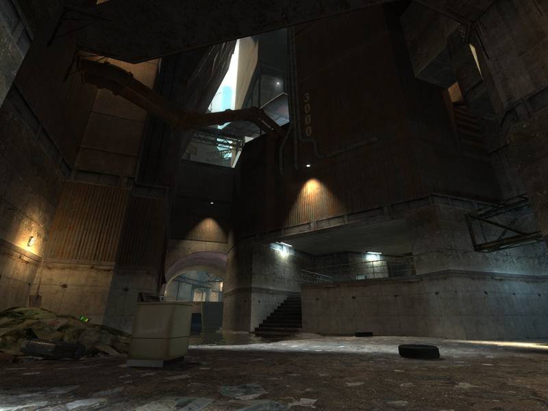
The first thing I noticed was the incredible contrast with the lighting. I spawned right by the toilet and garbage pile. The sunlight's extremely bright and its hotspots look sublime.
I began to walk around, and reached a point where I could look up into the sky - absolutely perfectly set-up sun (very bright; yellow-orange). I continued to admire the excellent lighting contrast. I wandered through some watery areas, and really liked the blue lights diffusing out from under some of the pillars (excellent idea, feel... perfect). The water was also perfect - clear and clean. I ducked underwater for a moment once, and I saw a floating ragdoll stuck under a grate - very nice touch. :smile:
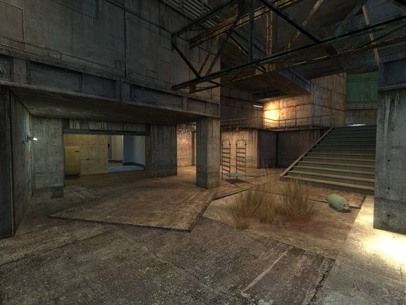
Continued to walk around, really enjoying the sights. I approached the area I'd seen in screenshots; the stairways leading up with a blue-lit passageway underneath. This on its own is most definitely the coolest lighting I've ever seen in Source and certainly one of the most atmospheric areas I've ever seen in Source as well. The sunlight filtering down, combined with a warm glow on the stairs and a blue glow underneath is indescribable (everybody reading - turn on HDR and poke around there, now). I hopped up on the corrugated metal sheets and really enjoyed the lighting up there. Lots of little touches like that catwalk were cool.
I headed around to an elevator; on my way I came back across the area I first saw the sun earlier, and I noticed a very cool bluish structure sticking up. When I reached the "edge" of the map near the top of the elevator, it was very "wow". The whole structure of the facility is so fascinating, it seems very alien and surreal with the fog (actually it reminded me strongly of Cube, if you've seen that film - some huge, weird location in somewhere impossible). I loved the architecture right there, and indeed all over the map. This whole.. facility.. an incredibly gritty-realistic feel.
I have two minor complaints. One is the lightmap sizing in some areas - it's too bad that you probably won't ever get very smooth lighting with such harsh contrast. :sad: I noticed you increased the lightmap size where I suggested and it was really necessary, although it could surely stand to be even smoother. All over I noticed that lightmap sizes should be much more dense (namely "sunspots" and under those blue pillars). You should cut out just the sections of brushes that are in bright sunlight and reduce the lightmap sizes on these sections to as low as possible - like 4 or even 2 if that's possible. The second complaint is the brightness overall. The indoor (read: far from sunlight) areas are too dark in some areas, especially in some of the places with those blue-lit pillars with low ceilings and water. I hope you add more lighting to these areas but whatever you do, I beg of you - do not touch your ambient lighting setting. The incredible contrast between light and dark in some areas is perfect. I don't want to see that lost.
I'd like to end this by saying that this is probably the most original and most hands-down cool layout, architecture, mood, feel and especially lighting I've ever seen in a Source map, and probably in any other level in any FPS, period. You've got a masterpiece on your hands, reaper47. I cannot wait to try actually playing on this. Bravo.
Posted by
reaper47 on
Wed Aug 23rd 2006 at 11:29am
[Author]
This version is outdated. For comments and suggestions see Alpha2a look here!
This is a first "preview" version of the map. I could list tons of "known issues" (the elevator is buggy, there's a lack of physics props, some parts are probably to dark... ) but see for yourself what you consider most urgent to be fixed and fine-tuned for the next release.
There are no lighting fixtures, only basic texturing and some parts are still very blocky. This version is meant as a play test to see how the map works on a server, find undiscovered bugs and balance basic gameplay. If you have a good idea regarding architecture or general asestetics feel free to post it too, I'm happy to hear how you see parts of the map I'm probably blind for myself.
If you know a server where I could host the map for a test or two that would be awesome. I try running it myself on my pathetic DSL line but I'm afraid this won't work very well.
Ok,
it's up. I hope the files are zipped correctly and that the download and the included files work.