removed the corridor that leads to the ladder (it's now outside)
finally did the proper texturing
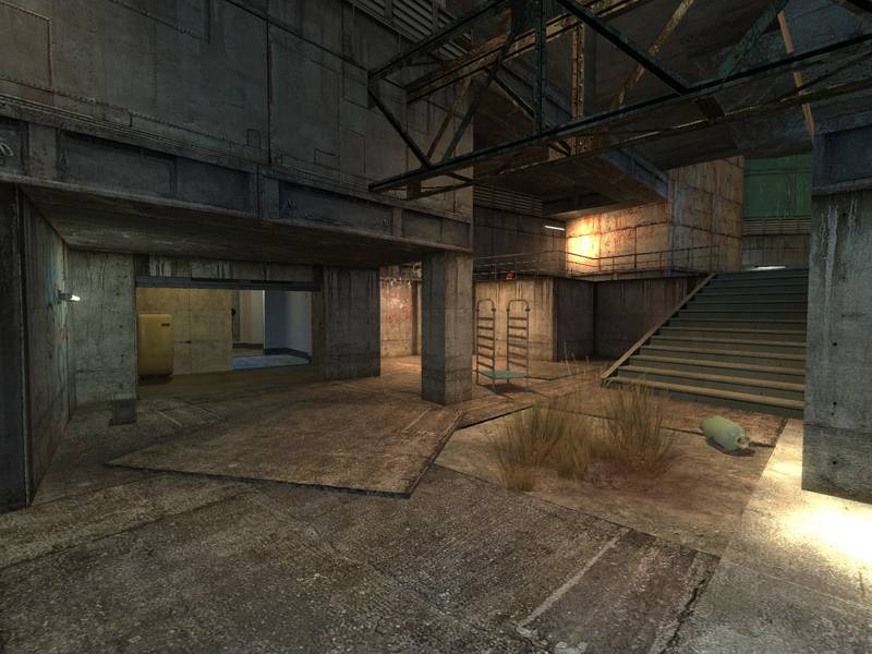
refined brushwork at places
changed a few stairs and catwalks
added a few more connections
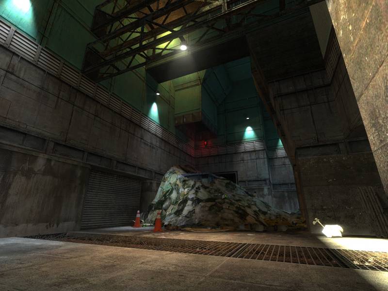
opened up the mall/underground area
tuned the RPG trap
added: numerous light fixtures - and lights!
added: physics props for better gravegun fights
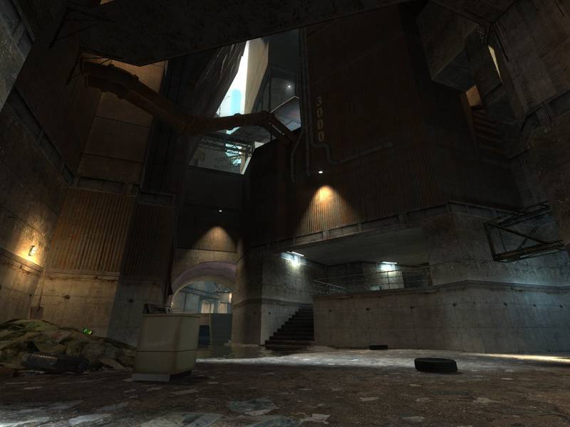
The map is set in the slums and abandoned industrial areas of a kilometer-high, futuristic city. Corrugated sheet iron and concrete. Some parts stand underwater. Sunlight falls in small chasms but mostly stays a glow in the distance. HDR, mmmm.
Thanks for an example of the right way to start a map with great lighting! I love the hint of the skyscraper through the glint of the sun. The ideas this map bring to mind would be to provide more glints of the future world built upon these lower recesses. Perhaps an occational passing of some futuristic hover vehicle (with audio effects), or more ominous patroling inforcement. Maybe some sign of commerce such as a distance antimated billboard. More glints of buildings showing the future is there but is out of reach. I think this would be really cool especially if you could just barely see it but realize its there but you still strain to see it, just like the glint of the building you already have.
I'm living in Europe (GMT+1 timezone that means I'm about 7-9 hours later). I have time tonight but almost anytime would be fine for me if it's later afternoon or evening here and not, say, 4 am :wink:
I'd love to see how the map plays with a few people (I'm not in a clan myself which makes it hard to get so many people to test a new map). Also if you're in the mood of having a 10-minute run of the map with whatever-many players or just for yourself it would be fine too if you just post what you'd like to see fixed/changed especially regarding gameplay.
Anytime you need a test server Reaper just let me know, as I run two, one in Dallas at 63.210.148.165:27015 and one in San Jose at 8.6.8.197:27015. I can usually pull in 10-14 [FF] members to support testing depending upon the time of day.
I threw it into my server rotation... You can bring it up with a rockthevote, or just catch myself or another admin on.
moto-games.squick.net ~ 70.91.205.205
In the HL2DM server browser it's;
~ ~ [EM] Emanon Systems - Santa Cruz CA - 150+ Custom Maps
-Mike- / [EM] Moike_the_Squid
Posted by 7dk2h4md720ih on
Thu Aug 24th 2006 at 12:02am
Host one anyway and I'll join you. The ping doesn't matter :smile:
I have a crappy server up at the moment. Pw is snarkpit. Just filter by mapname and you should find it. edit: server down
Posted by reaper47 on
Thu Aug 24th 2006 at 12:00am
[Author]
Oh, sorry. Yea, the 'pit doesn't like firefox very much. Nevermind.
I'm running a crappy server from time to time. I can't host much more than 3 players or so :sad: but there are a few basic things I'd love to test. So if you see a server running the map feel free to join. Unfortunately you live on the other side of the world almost literally. :smile:
Testing to see if this works, I hit reply in the Alpha chapter - as I did last time - and it didn't work.. maybe it's 'cause I always have to hit that "Can't see this box?" button, I guess since I use Firefox (Doesn't happen in IE).
Anyways, yeah.. I like the look of lightmaps a lot in most areas, but in some areas with such sharp contrast it's hard to deal with. :\
Regardless, it's not a huge deal - maybe you can try lowering it a bit more if possible and just get it to look as good as you can. I actually personally thought that the screenshot that I mentioned the lightmap scale on (default 16-size?) looked better than this, since the contrast is so high it looks worse with the current size (very steppy) versus at least the old one blended a bit more.. I'd just suggest trying it lower if that's possible, or going back to 16-scale.. unless you can get very precise lightmaps, fall back to the blurred-but-nicer-looking ones. :smile:
I'd like to wander around here again to let you know more what I think about the layout, once I get back from work - quite mazelike, in a cool way, but I need to get more familiar with it. :smile:
Posted by reaper47 on
Wed Aug 23rd 2006 at 11:00pm
[Author]
Hey, midk, thanks. You're making me blush a little as some of the areas are really rough, still. :smile:
You're right with the lightmaps. It is one of the few times where I wish HL2 had more Doom-3-ish real time lighting as even with a downscaled lightmap grid the edges look very unnatural. I knew I should have looked at the brightness levels more. The darkness of some of the areas is rather obvious and I could have fixed that quite easily.
I like the "Chapter" system of this board so, please, for further posts about the current alpha use this thread chapter.