dm_3006 by reaper47

Map Rating

  • Star map!
  • 5
  • 1 rating / 5 stars

Map Download

Map Info

Map Description

Beta1 is out!

Changes in this version:
  • many, many minor fixes
  • removed the corridor that leads to the ladder (it's now outside)
  • finally did the proper texturing
  • refined brushwork at places
  • changed a few stairs and catwalks
  • added a few more connections
  • opened up the mall/underground area
  • tuned the RPG trap
  • added: numerous light fixtures - and lights!
  • added: physics props for better gravegun fights
The map is set in the slums and abandoned industrial areas of a kilometer-high, futuristic city. Corrugated sheet iron and concrete. Some parts stand underwater. Sunlight falls in small chasms but mostly stays a glow in the distance. HDR, mmmm.

Discussion

Posted by Captain P on Tue Dec 12th 2006 at 6:32pm

Looks better lit now, me likes. :smile:
The 1st and 4th shot feature some rather empy-looking floors though, which is probably more obvious now that they're better lit. How about some extra grates in there, or some more materials to divide it up somewhat?

I forgot to mention the lack of light sources in the last alpha bytheway. Did you add light fixtures already? I can't see any in these shots.
Posted by reaper47 on Tue Dec 12th 2006 at 3:56pm
[Author]

The current build should be the next release. I only need a final compile. Also some HDR/LDR lighting checks are due. But all the architecture and entity work is finished for Alpha 2.

Here are some more screens. :smile:

User posted image

User posted image

User posted image

User posted image

User posted image

User posted image
Posted by reaper47 on Sun Dec 10th 2006 at 2:24pm
[Author]

I'd change the elevator buttons if I were you, though, because they're hard to notice (a green or red glow would be sufficient I think).
already done! :smile:
I'd also add some more ways to get up and down in the vertical shaft area, because the elevator currently is the only way (that I found :razz: ) to get up there.
done, too!
I also found some area's to feel a bit linear, some of the water area's especially. The one with the small bridge wasn't too easy to move around in, too, due to the small canal there.
errr... it's pretty much gone and replaced by what should later be replaced by stores and fast-food places. This needs some custom work to look good but the layout changes are done.

Thanks, Captain.

The LOD is rather low, still. That's the reason I prefer calling the next version an alpha, also. It's pretty tedious to work outside the Eastern European city theme with HL2. However, I won't accept this as an excuse to not come up with a bit of custom work and detailing for the next releases.

I'm adding some of the last chunks of brushwork right now. Let's see how much more polishing it will need then for the release.
Posted by Captain P on Sun Dec 10th 2006 at 1:18pm

I ran through the last alpha version today, and I must say, it's pretty athmospheric. It's too dark, yes, and there were some connectivity problems, but the main shaft area works well to keep the level together.

I'd change the elevator buttons if I were you, though, because they're hard to notice (a green or red glow would be sufficient I think). I'd also add some more ways to get up and down in the vertical shaft area, because the elevator currently is the only way (that I found :razz: ) to get up there. I liked how you placed a grenade in an alcove there bytheway. :smile:

I also found some area's to feel a bit linear, some of the water area's especially. The one with the small bridge wasn't too easy to move around in, too, due to the small canal there.
Oh, and I think that this unaccessible area, the one with the dim green lighting, attracts too much attention, compared to the much darker, but playable, area next to it. Personally I like to make important things brighter, for example to guide the player were to walk or to attract him to important places. You could distract players with lighting too, but I don't think that fits in here very well. :smile:

Anyway, I'm looking forward to the layout changes. This map looks promising. It may not be that super-detailed, but it gets the setting across nicely. Keep it up. :smile:
Posted by reaper47 on Sun Dec 10th 2006 at 11:18am
[Author]

I developed a little "darkness test" to look at the map in worst condition and compare it to others that I consider bright enough. Well, albeit I added all the extra lamps the thing is still terribly dark. I'll try and fix that.

Otherwise it's finished. If the mapping gods agree I'll release alpha2 next week.
Posted by reaper47 on Wed Dec 6th 2006 at 10:30pm
[Author]

Thanks for the thoughts!

The lack of trim textures is indeed concerning. :/ Many of the textures, especially in the shots here I only used with the idea of replacing them by something better in the future. I'd like to have more metal in here, more trims. And it's always good to have people reminding me because you get used to these dummy textures way too quickly.

Pipes and props should make their way into the level but with the underground section and other parts being constantly rebuild I don't want to fiddle around with all the prop details yet. Also many parts would require custom models which I cannot get done within any sane timeframe.

And Kasperg, thanks, I never though of the map as a singleplayer map :biggrin: I hope with the new layout changes people will instinctively try to get to the top parts and meet on the way. But maybe that's only something I like doing in maps myself... I start to feel like this could be the case. We'll see. It is pretty big. I can't think of much more to better connect the map right now. I'm quite happy with the way it feels in the current state. I'm looking forward to test the next version with some more players and see how it turns out!
Posted by G.Ballblue on Wed Dec 6th 2006 at 4:13pm

Here are my thoughts on the screens (I apologize if my thoughts seem a bit repetitive. I've got 2 minutes before class begins, so I have to bash this out rather quick.)

You've definitely got the architecture down, but there doesn't seem to be any trim in many of those concrete indoor areas. I realise that the HL2 materials pack has very little trim, but try to whip up something, since the constant generic-tileless concrete seems a bit used. To some extent, this "building" or structure that the map takes place in looks like something out of star wars, molded purely out of concrete :razz:

That 5th shot, specifically; the brown concrete is just being run into the ground with that cieling! :razz: Also, that center beam would look nice with some kind HL1-styled Silo trim around the tope, and the underside of it, where the blue lights are shining out, could use something other than concrete :razz: (at least, that what it looks like.)

I also noticed that there doesn't seem to be much of anything inside the map, other that archtecture and random metal planks. Pipes? Light fixtures? Seats? Signs of people using the place? What would normally "belong" in this structure?

Last shot: Very pretty, in my opinion. The blinding light on top of the harsh shadows actually looks real nice there :smile:
Posted by Kasperg_JM on Wed Dec 6th 2006 at 9:35am

Keep it up, lighting is looking better each time!!

Having played the alpha1 version, my only concern is that this map will
need a lot of players to provide a decent fragfest, since some areas
felt very far away from the others. Maybe it was just an optical effect
and the layout actually works, I can't really tell.

Anyway, if you ever decide to make a SP map based on this setting, I also think It could turn out absolutely stunning.
Posted by reaper47 on Mon Dec 4th 2006 at 5:12pm
[Author]

You want more? You'll get more!

I've spend a large portion of my Sunday finishing at least basic brushwork and layout for the new underground part. The random water/darkness/blue-light column area has been replaced completely. It should get a run-down shopping/fast-food/xxx area with neon signs and blinking lights. Right now it's only default storefront textures with some colorful lighting. I plan to flood the place with puddles of water like the outside area but it's still dry yet.

Everything still suffers from still-too-darkitis as well as chronical dummy-texturosis. But it's there. So here are a few screens:

User posted image
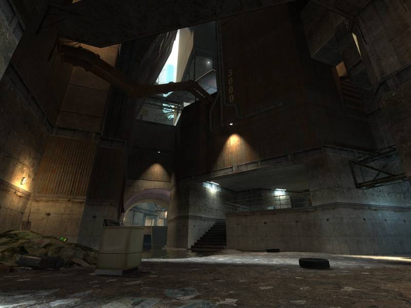
A view of the main area with the x-bow. The catwalk now serves as a connection for stairs that lead all the way up. Some changes to lights that make the place hopefully brighter. Brightness balance isn't done yet.

User posted image
The same place, only that you see less new. I like the POV, though :smile:

User posted image
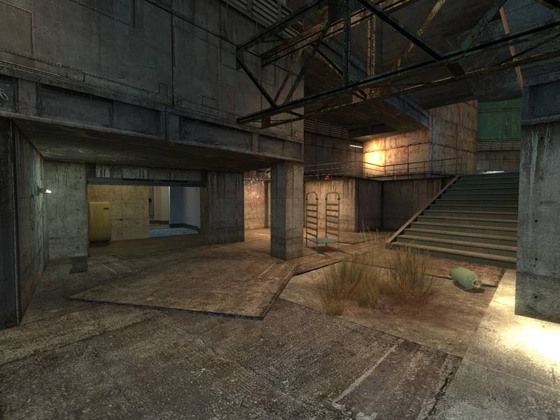
A little more purpose and lighting for this originally rather random spot.

User posted image
Those with good eyes see a little vent in the background. This is the shaft leading to the RPG. You can't get out to the area behind the grate, though, just a visual connection.

User posted image
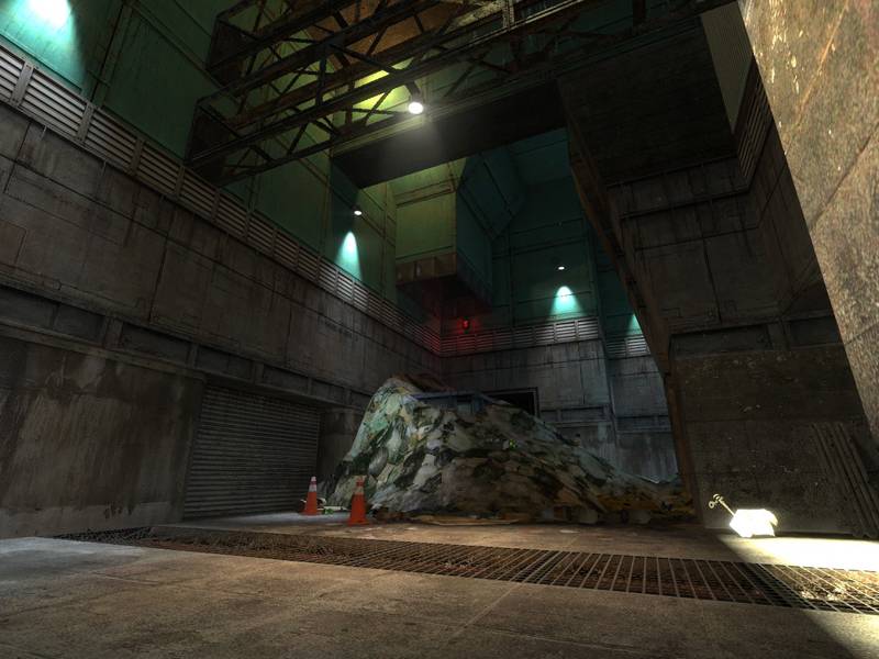
alright, the shopping district. Not much to see, except for the (yet again very basic) underground skybox in the background. This I added yesterday and should change heavily before the map leaves the alpha stages. But it's already a nice view.

User posted image
The nice view. Well, at least it's better than the black brush that was here before :heee:

So... No real magic but the most basic changes are done. If you manage to read anything out of the shots I'm thankful for comments. If not it's OK.

I guess, once I've build the opposite part of the underground with some half-way clean brushwork and got the lighting to acceptable brightness I'll release this as "Alpha 2". I hope to have no more excuses for not working on the finer eyecandy then. That'll be a lot of work :rolleyes:
Posted by Forceflow on Mon Nov 27th 2006 at 11:09pm

Mistery++

Me likey.