removed the corridor that leads to the ladder (it's now outside)
finally did the proper texturing
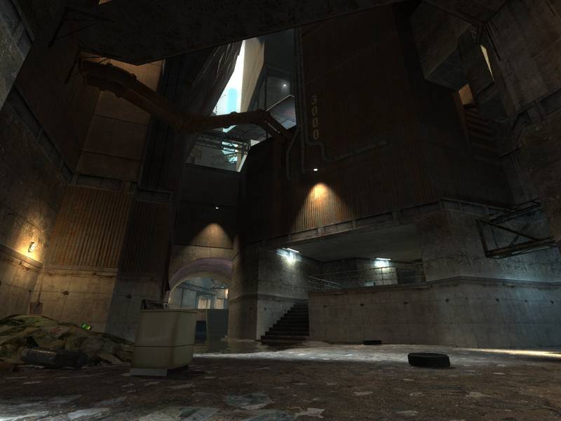
refined brushwork at places
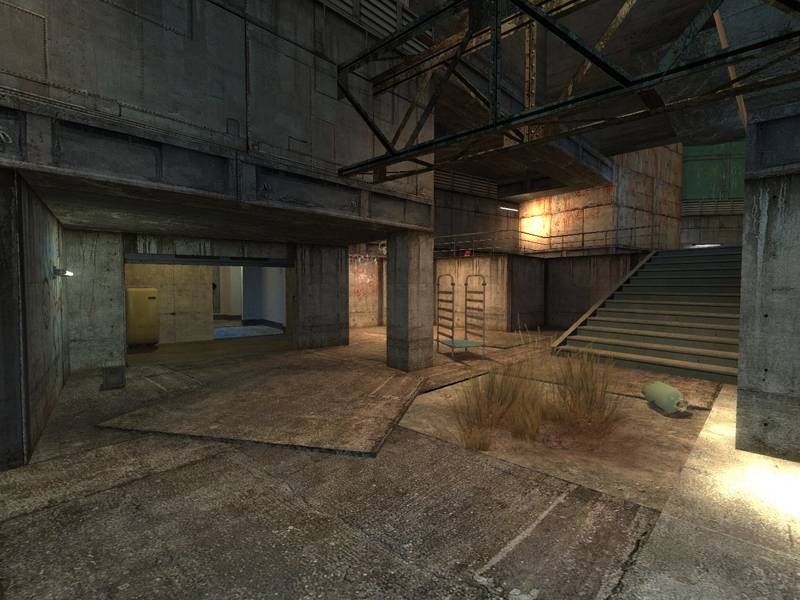
changed a few stairs and catwalks
added a few more connections
opened up the mall/underground area
tuned the RPG trap
added: numerous light fixtures - and lights!
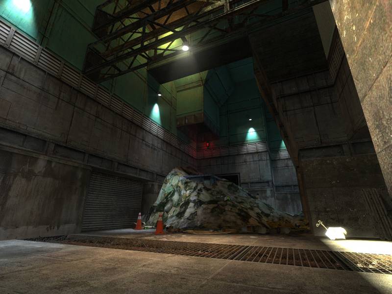
added: physics props for better gravegun fights
The map is set in the slums and abandoned industrial areas of a kilometer-high, futuristic city. Corrugated sheet iron and concrete. Some parts stand underwater. Sunlight falls in small chasms but mostly stays a glow in the distance. HDR, mmmm.
A lot of the lower water areas look more or less the same. There is not much variation in lighting, room shape or size to give people clear landmarks to play by. Perhaps you incorporate in more side details, like insets in the walls covered by grates. Wires and cables, red/green lights, giant fans or even a pile of rubbish or a distinctive poster can help landmark the map.
This is what I'm working on right now. The underwater-secion is the most random part of the map. Only there to get an alternate route between two of the main parts of the map. I'm trying hard to give this part more identity.
EDIT: Actually, I was surprised so few people complaint about this part lacking a thematical purpose (probably because it's too dark to see much anyway?). I almost thought that my time is spent better on other parts of the map, only lighting it up a bit and then moving on. Your post finally forced me to make what I think will turn out as the right decision: Trash the whole underground areas and replace them by something more interesting. The blue-light pillars and water will stay in one form or another because I like it. But I'll try to make this section look like some bar/restaurant/shopping area, a bit more open, with a nice view on some underground skybox-backgrounds. I'm glad I could overcome my fears and re-build the section completely. I can also think of better better connectivity down there as the whole underground part always felt a bit to linear to me.
My only other criticism would be that the layout also suffers from being too "circular". The escape opportunities from firefights tend to be limited to 2 exits at most, and only in a few areas is there z-axis incorporation. So far you have a good level but it needs refining and retuning in terms of gameplay mechanics. A good theme and good standard of construction is let down by an oversight of mechanics.
Thanks for pointing this out. I think I can "feel" the problem but it's hard to point a finger on the parts that need alternate routes ect. I'm a bit blind right now. Maybe you can name a few areas specifically that you think would need more escape opportunities?
The one overriding problem I can see with this map is a lack of
identity. The architecture and atmosphere are carried off well, but in
terms of having a clear and quickly understood layout, they do not
succeed.
A lot of the lower water areas look more or less the same. There is not
much variation in lighting, room shape or size to give people clear
landmarks to play by. Perhaps you incorporate in more side details,
like insets in the walls covered by grates. Wires and cables, red/green
lights, giant fans or even a pile of rubbish or a distinctive poster
can help landmark the map.
My only other criticism would be that the layout also suffers from
being too "circular". The escape opportunities from firefights tend to
be limited to 2 exits at most, and only in a few areas is there z-axis
incorporation. So far you have a good level but it needs refining and
retuning in terms of gameplay mechanics. A good theme and good standard
of construction is let down by an oversight of mechanics.
I'd list all the things I enjoy about the map, but that's already been done :wink: There is potential for a classic map here.
Even if those appendixes will make the gameflow less forced, you should
give them some sort of significance in terms of the theme, so they
don't feel architecturally forced. Closed doors, ventshafts, windows or
other things would be the natural way to solve it, I think.
Agreed, I'll think of something!
[FF]FNDR.Jake_Brake, thanks a lot for the feedback! My internet connection was kinda non-existent the last few days so I could neither join the server or answer your post.
Thanks to you guys I now have a rather clear idea of what to change for the next update! :smile:
Well, I have had this up and running for two days on my Dallas server. The reactions have been hot and cold. Those that love it state that it is a very unique layout, great textures, very good fps performance and really provides tremendous "atmosphere". Those that do not like it seem to point to one complaint: the lower levels being just too dark. I agree with Kasperg and Reapers points: More accessibility to the upper levels, and more weapon availability would add a lot. And, add at least one other spawn point up there. I also would lighten up the lower levels just a tad (not too much as I personally like the dark atmosphere as it adds a creepy feeling to the map)
BTW, I am in the camp that "loves" the map! Very clean, unique with crisp detail! I am going to keep the map in my rotation for awhile so keep up the great work!
Posted by Kasperg_JM on
Mon Aug 28th 2006 at 4:26pm
Even if those appendixes will make the gameflow less forced, you should
give them some sort of significance in terms of the theme, so they
don't feel architecturally forced. Closed doors, ventshafts, windows or
other things would be the natural way to solve it, I think.
Oh I get it. Well, they're appendixes of sort to give people cover when going around a corner. I always feel like straigth "L" shaped corridors make movement feel a bit "forced".
By "boxes" I meant tiny little rooms off the main map. Like you literally cut a hole in a wall and put an open box there for someone to walk into. No long corridors to walk down to hit a dead end; the dead ends are quite small and from what I recall simply box-shaped extrusions off the main level.