RELEASED AUGUST 2004. People's Choice of 2004 Snarkpit Competition. To install: open "persia" in the .zip, and extract the 5 or 6 folders into "valve". I don't know why it's even in "persia", I'm stupid.
When I played Prince of Persia, what really stuck out for me was the level design. All of it was very seamless and connected - you had a genuine feeling of where you were going throughout the palace and it all seemed like one place. Flash forward a few months. I slave away at the last second and barely pump out a map for the competition. I'm such an idiot!
Discussion
Posted by Crackerjack on
Mon Aug 9th 2004 at 1:10pm
Huge improvment on the windows, look alot better. But like Hugh said.. I expected more. But you did a real good job with what you have.
Well, I like the garden. :biggrin: The rest is pretty good but not up to my elevated Campaignjunkie standard, so yeah, good thing you want to spend more time on it.
Had to remove a lot of detail to get this baby to compile properly.
Lighting is very iffy, and I'm not happy with a lot of areas. But I
guess that's the price you pay for putting everything off until the
last minute, right? R_speeds are generally okay, except at certain
corners. Weapon placement is chaotic, I think. I'm not a very
experienced HLDM player to begin with, so I can't really figure out
placement too well. Should have had ReNo do it for me, eh? :smile:
Also made a bunch of cool ambient sounds, but forgot to use some of them. Crap!
I've done a fairly drastic remodel and retexture since the last update.
Not sure if it's better or worse. Though I'd like to think the hours I
slaved away at Photoshop were productive. Anyway, here are some screens:
Atrium redone for better r_speeds and flow. Don't like the lighting too much. I think it's okay considering I did it in 2 hours.
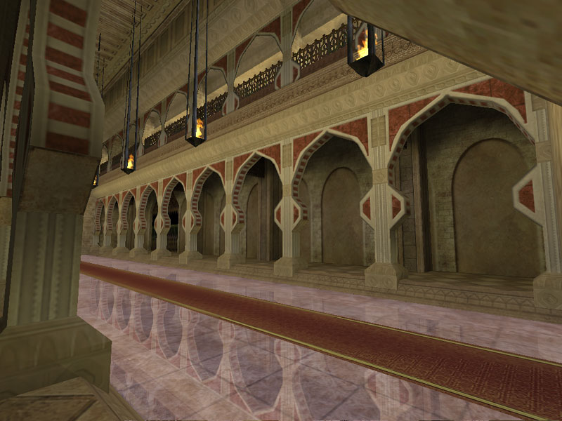
Slightly remodeled Library. Better, more recognizable windows.
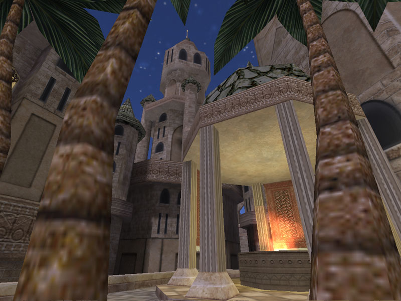
Gardens. I think this is one of the more polished areas.
The "Zoo". But I forgot to make a sign for it in the .wad! Oh well. The
doors are interactive, with levers at the top that control whether
they're open or closed. When open, people can pass underneath and
people can run across the top of the gate to get goodies.
Courtyard. Really too dark. The top area is fine, but the bottom area
really needs some torches. Was going for a nice "sieged palace" kind of
look, but I quickly realized I was running out of clipnodes and such.
So, I only did ruined-areas in 2 parts of the map. Oops.
Redone Patio area. Hurrah?
Another shot of the Library. Notice the pages on the
floor. The books are func_breakable, and you can shoot them apart and
have book gibs fly around. Desks and chairs in the Library are also
destructable. I was going to have more destructables throughout the
map... But again, I could barely get the map to compile as is.
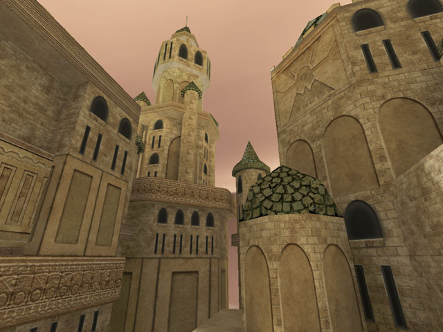
The overview for the map. Center atrium is messed up. Oops.
I'm probably going to polish this up later and re-release this at my
convenience. There's so many little errors and stuff plaguing the
map... Damn the 5 hours compiles! :smile:
That part is rather undetailed for a reason - high-traffic area
(although it doesn't look like it) and it's connected directly to the
Library portion. But I'll see what I can do anyways, you're all right.
About the windows - if I lose the crosshatching, it looks almost worse (it's more of a "hole in the wall" rather than a window)
Kind of at a loss of how to do this. Most of the windows in PoP had the
grating too, except it looked okay. I'm thinking of maybe getting a
circular-grating, making the glow 512x512, and scaling it down so it
looks sharper or whatever. Basically they need to stay recognizable as
windows and also match PoP's style of windows, so I'll pretty much need
some form of grating. Blargh.
Posted by -Stratesiz- on
Tue Jul 27th 2004 at 12:54pm
Agreed. The first shot does not do justice to the rest of the map. The ceiling feels artificial somehow. Why not make it similar to the other hallway shots?
I second all three of those suggestions - particularly the last as I've never been too fond of your windows :razz: Otherwise this is looking really cool, particularly screenshot 7 (second last one) which just owns.
Posted by Crackerjack on
Tue Jul 27th 2004 at 4:48am
The first pic looks quite empty and boring compared to rest of the map. Than your windows really need to lose the cross hatching.. HL is rendering them in a way that appears that if its more of a bug then just detail added to the texture. Other than that its looking pretty nice
pure sexy. I'd say more orange/yellows outside and more blues inside to balance your lighting. Also I'd like to see some of your weapon placements ;P
Posted by 7dk2h4md720ih on
Tue Jul 27th 2004 at 3:26am
A little texture strangeness in the top of screenshot four, but other
than that It looks awesome. :smile: Might want to add some torches outside
too, it looks a little grey.