CO_Uplink by Crackerjack

Map Rating

  • 0
  • unrated

Map Download

Map Info

Map Description

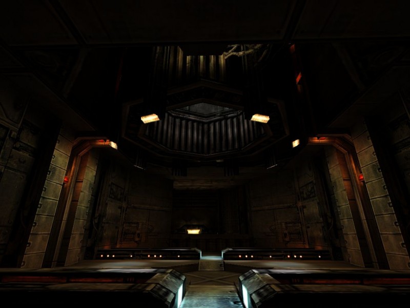
This a Combat map for the Half-Life modification, Natural Selection. Currently IR and I are making this map.

Discussion

Posted by Forceflow on Fri Mar 26th 2004 at 7:45am

Looking good :-)
Posted by Crackerjack on Fri Mar 26th 2004 at 5:07am
[Author]

Agreed, rooms are where it is at.. yo... but what i wanted from this.. was a style and lighting that I continue on with through out the rest of the map. Seeing how people like.. it seems to be that this style is a winner. Thanks alot guys...expect to see more soon. :smile:
Posted by esechre on Fri Mar 26th 2004 at 4:59am

<TABLE cellSpacing=2 cellPadding=2 width="95%" align=center bgColor=black>
<TBODY>
<TR>
<TD style="FONT-SIZE: 11px; COLOR: gold">? posted by esechre in map comments!!111</TD></TR></TBODY></TABLE>

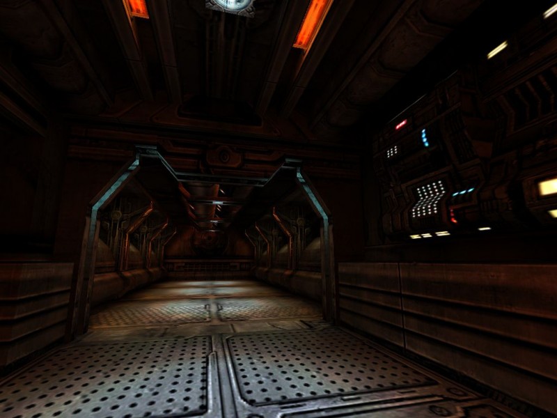
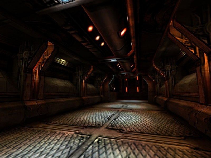
looking really nice so far. Good architecture and nice lighting. I think the ceilings are a little too dark (probably my monitor tho). Keep it up, i wanna see more :smile:

oh and yea, rooms are where its at, yo.

-BB
Posted by Campaignjunkie on Fri Mar 26th 2004 at 4:57am

Cassius said:
Nice hallway, but it's still one hallway.
Ditto. Focus less on hallways, more on rooms. :razz:
Posted by esechre on Fri Mar 26th 2004 at 4:51am

looking really nice so far. Good architecture and nice lighting. I think the ceilings are a little too dark (probably my monitor tho). Keep it up, i wanna see more :)
Posted by Cassius on Fri Mar 26th 2004 at 4:49am

Nice hallway, but it's still one hallway.
Posted by Yak_Fighter on Fri Mar 26th 2004 at 4:24am

It looks better than mine.
Posted by Tracer Bullet on Fri Mar 26th 2004 at 3:56am

Looks good. I like the second pic much better than the first. I really like the warm orange glow that comes from those supports. rallly blends nicely with the textures. I realize it's just two angles of the same thing but... I dono. I just don't think the hard edged blue light goes well with the rest of it.