WIP / Concept Area Screenshots

WIP / Concept Area Screenshots

Re: WIP / Concept Area Screenshots Posted by ReNo on Tue May 16th 2006 at 5:47am
ReNo
5457 posts
Posted 2006-05-16 5:47am
ReNo
member
5457 posts 1991 snarkmarks Registered: Aug 22nd 2001 Occupation: Level Designer Location: Scotland
I really like the atmosphere in this nooba - feels really cold and unwelcoming, where most other DoD:S maps seem relatively warm (mostly in terms of lighting). One thing that concerns me a little is the detail sprites though, particularly coming out of the road - I'd restrict them to the grass personally, or maybe look into alternative ones. They come off looking really 2D as they are really quite large yet sparse.
[img]http://card.mygamercard.net/sig/Default/reno84.png[/img]
Designer @ Haiku Interactive | ReNo-vation.net
Re: WIP / Concept Area Screenshots Posted by Juim on Tue May 16th 2006 at 11:08am
Juim
726 posts
Posted 2006-05-16 11:08am
Juim
member
726 posts 386 snarkmarks Registered: Feb 14th 2003 Occupation: Motion Picture Grip Location: Los Angeles
I agree that your on to something there nooba. Thats a good looking map. I would suggest another texture for the rooftop in that last shot though, or change the shape of the roof to match the clay tiles better. Otherwise it's looking awesome.
Re: WIP / Concept Area Screenshots Posted by Orpheus on Tue May 16th 2006 at 12:05pm
Orpheus
13860 posts
Posted 2006-05-16 12:05pm
Orpheus
member
13860 posts 2024 snarkmarks Registered: Aug 26th 2001 Occupation: Long Haul Trucking Location: Long Oklahoma - USA
I am experiencing serious side scrolling. :sad:

I also notice that DOD seems to have a much wider assortment of foliage available. Something I always felt lacking in anything built for HL2. Somehow plants alone set these map apart from anything thus far released.

The dismal atmosphere is superbly captured. I would try, if I were you, to have the sun vainly attempting to burn off that fog. If its possible, try to have tiny clear areas where the sun is succeeding but overall its failing. That would be perfect.

To add to Juims observation a bit. That style of roofing only works if you put endcaps upon the apex's. On each of the ridges, put a cap on them. The roof will look just fine then.

I dunno if its the angle, but I just don't like those sandbags much. Prolly just the angle though.

Nice work. :eek:

The best things in life, aren't things.
Re: WIP / Concept Area Screenshots Posted by Captain P on Tue May 16th 2006 at 11:33pm
Captain P
1370 posts
Posted 2006-05-16 11:33pm
1370 posts 1995 snarkmarks Registered: Nov 6th 2003 Occupation: Game-programmer Location: Netherlands
Yeah, I like the foggy cold feeling in that shot. Perhaps some smoke stacks in the background to indicate artillery impact, or craters and smoke in the map itself, as if the fog is caused by the bombardment?

About the rocks, they feel too 'leveled', if you know what I mean. As if there's several levels of play, with rock walls between them of more or less equal length. I don't know if that happens in reality, personally I'd be more impressed by some variation in height and some higher rock walls.

Also, I know those sandbag walls are standard props but they always felt so unnatural to me. Some loose sandbags here and there perhaps? And some sand walls to give them a more fortified look, rather than a single sandbag wall sticking out of the ground (which looks so unstable)? :smile:
Create-ivity - a game development blog
Re: WIP / Concept Area Screenshots Posted by Crono on Wed May 17th 2006 at 2:37am
Crono
6628 posts
Posted 2006-05-17 2:37am
Crono
super admin
6628 posts 700 snarkmarks Registered: Dec 19th 2003 Location: Oregon, USA
G.Ballblue, resize the image please. (You can put height and width parameters in the img tag)

nooba, bravo, man. Keep it up. While there are some obvious problems in some of the features so far, it looks really nice. The atmosphere is abundant. I'm curious what type of play dynamic you're going for. For instance, if the visibility was a bit lower, snipers would either be useless or more effective. It seems like there's a bit of varying gameplay too, from wide areas to cramped areas, but I don't see any real presence on the vertical gameplay. I think any and every map, at least in DoD, has been bettered by vertical gameplay, it's almost the staple of the game. Rarely are you going toe to toe with people on a level playing field. Which is something I personally like.

So, it'd be nice to see some stuff like that come into play. I'm also curious in how you plan on filling in those voids.

The only other thing I notice that I don't think has been mentioned is in the 3rd screenshot. What's the logic behind that building on the left being decimated and the one on the right being fine? If that was done by an attack it would surely damage the other structures nearby ... at least a little! Especially considering the amount of damage that building took. Is the screenshot misleading?

You might also want to look into burn marks in grassy areas. (Like, grass can no longer grow because the surroundings were taken out with fire, or something like that)

Keep it up.
Blame it on Microsoft, God does.
Re: WIP / Concept Area Screenshots Posted by nooba on Wed May 17th 2006 at 8:28am
nooba
146 posts
Posted 2006-05-17 8:28am
nooba
member
146 posts 104 snarkmarks Registered: Jan 20th 2004 Location: Australia
Thanks all! :smile:
"ReNo" said:
One thing that concerns me a little is the detail sprites
though, particularly coming out of the road - I'd restrict them to the
grass personally, or maybe look into alternative ones. They come off
looking really 2D as they are really quite large yet sparse.
I have removed the grass on the road, it was something I wasn't sure about :smile:
"Juim" said:
I would suggest another texture for the rooftop in that last shot
though, or change the shape of the roof to match the clay tiles better.
"Orpheus" said:
To add to Juims observation a bit. That style of roofing only works if
you put endcaps upon the apex's. On each of the ridges, put a cap on
them. The roof will look just fine then.
does this look any better?
"Orpheus" said:
I would try, if I were you, to have the sun vainly attempting to burn
off that fog. If its possible, try to have tiny clear areas where the
sun is succeeding but overall its failing. That would be perfect.
Nice suggestion. I'm not sure if its possible though, I'll look into it :smile:
"Captain P" said:
Perhaps some smoke stacks in the background to indicate artillery
impact, or craters and smoke in the map itself, as if the fog is caused
by the bombardment?
I'll be sure to add in some of that stuff into the 3D skybox
"Captain P" said:
About the rocks, they feel too 'leveled', if you know what I mean. As
if there's several levels of play, with rock walls between them of more
or less equal length. I don't know if that happens in reality,
personally I'd be more impressed by some variation in height and some
higher rock walls.
I'll try add in some variation in the rock walls :smile:
"Captain P" said:
Also, I know those sandbag walls are standard props but they always
felt so unnatural to me. Some loose sandbags here and there perhaps?
And some sand walls to give them a more fortified look, rather than a
single sandbag wall sticking out of the ground (which looks so
unstable)? :smile:
Sure :razz:
"Crono" said:
I'm curious what type of play dynamic you're going for. For instance,
if the visibility was a bit lower, snipers would either be useless or
more effective. It seems like there's a bit of varying gameplay too,
from wide areas to cramped areas, but I don't see any real presence on
the vertical gameplay. I think any and every map, at least in DoD, has
been bettered by vertical gameplay, it's almost the staple of the game.
Rarely are you going toe to toe with people on a level playing field.
Which is something I personally like.
With the fog I wanted to get rid of snipers, but it also might help
them by hiding them, I really need to test it with other players to
find out. There really is no vertical gameplay, atm. I'll get it added
in, don't worry :smile:
"Crono" said:
I'm also curious in how you plan on filling in those voids.
Trees, shrubs, rocks, rubble, etc..
"Crono" said:
The only other thing I notice that I don't think has been mentioned is
in the 3rd screenshot. What's the logic behind that building on the
left being decimated and the one on the right being fine? If that was
done by an attack it would surely damage the other structures nearby
... at least a little! Especially considering the amount of damage that
building took. Is the screenshot misleading?
I just slapped that blown-up building in really, didn't put much thought into it, I'll fix that up
"Crono" said:
You might also want to look into burn marks in grassy areas. (Like,
grass can no longer grow because the surroundings were taken out with
fire, or something like that)
Sure thing

Again, thanks all :smile:
Re: WIP / Concept Area Screenshots Posted by Orpheus on Sat May 20th 2006 at 12:33am
Orpheus
13860 posts
Posted 2006-05-20 12:33am
Orpheus
member
13860 posts 2024 snarkmarks Registered: Aug 26th 2001 Occupation: Long Haul Trucking Location: Long Oklahoma - USA
nooba said:
does this look any better?
Yes, and no.

It looks better but now it looks machine made.

Clay tiles are anything but perfect. Have the tiles on the caps jut out a bit so that they look "added" not "form fitted"

Your application, although a move in the right direction, looks to perfect.

I hope that made sense. If not, I will look up some pictorial examples.

Lemme know.

The best things in life, aren't things.
Re: WIP / Concept Area Screenshots Posted by nooba on Sat May 20th 2006 at 3:06am
nooba
146 posts
Posted 2006-05-20 3:06am
nooba
member
146 posts 104 snarkmarks Registered: Jan 20th 2004 Location: Australia
I think I understand what you mean, something similar to this?

http://www.salvoweb.com/images/userimgs/5843/16311_2.jpg

If you could provide some pictures that would be great :smile:
Re: WIP / Concept Area Screenshots Posted by Orpheus on Sat May 20th 2006 at 3:14am
Orpheus
13860 posts
Posted 2006-05-20 3:14am
Orpheus
member
13860 posts 2024 snarkmarks Registered: Aug 26th 2001 Occupation: Long Haul Trucking Location: Long Oklahoma - USA
This picture kinda shows what I want to illustrate. Problem is, nothing I search for in google is a close up shot. I fear its because "endcap" isn't the correct terminology for the item I am seeking.

Anyway, just add the caps, but do not connect them like a water pipe. the connections are more jagged in real life.

The best things in life, aren't things.
Re: WIP / Concept Area Screenshots Posted by G.Ballblue on Tue Jun 6th 2006 at 9:42pm
G.Ballblue
1511 posts
Posted 2006-06-06 9:42pm
1511 posts 211 snarkmarks Registered: May 16th 2004 Occupation: Student Location: A secret Nuclear Bunker on Mars
User posted image

Momma Mesa. Top down view of my current work. (Please note that
the entire grid is not shown. I have quite a bit more building
space.)
Breaking the laws of mapping since 2003 and doing a damn fine job at it
Re: WIP / Concept Area Screenshots Posted by Captain P on Thu Jun 8th 2006 at 9:04pm
Captain P
1370 posts
Posted 2006-06-08 9:04pm
1370 posts 1995 snarkmarks Registered: Nov 6th 2003 Occupation: Game-programmer Location: Netherlands
So, how does that look in-game, G.Ballblue? Looks like some nice rockwork going on in the lower left corner, but it's really hard to judge for obvious reasons... :wink:
Create-ivity - a game development blog
Re: WIP / Concept Area Screenshots Posted by G.Ballblue on Fri Jun 9th 2006 at 5:29am
G.Ballblue
1511 posts
Posted 2006-06-09 5:29am
1511 posts 211 snarkmarks Registered: May 16th 2004 Occupation: Student Location: A secret Nuclear Bunker on Mars
So, how does that look in-game, G.Ballblue? Looks like some nice
rockwork going on in the lower left corner, but it's really hard to
judge for obvious reasons... :wink:
User posted image

If that's the the left corner you're refering to: Kinda old,
first part I made. Whipped it up during a week of computer time
restrictions, and I didn't have the time to align the
textures. I'm hoping to get the edges to look smoother in
the future.

User posted image

User posted image
Breaking the laws of mapping since 2003 and doing a damn fine job at it
Re: WIP / Concept Area Screenshots Posted by Xen on Thu Jun 22nd 2006 at 2:31pm
Xen
10 posts
Posted 2006-06-22 2:31pm
Xen
member
10 posts 51 snarkmarks Registered: Jun 13th 2006 Location: Canada
Although I have a profile for this map, these are areas I'm looking for more harsh criticism and ideas so that I can detail it better and make it more lively...

The pics are pretty small sizewise (~20k) so I won't bother with thumbs

User posted image

User posted image

User posted image

User posted image

User posted image
Re: WIP / Concept Area Screenshots Posted by Stadric on Thu Jun 22nd 2006 at 6:39pm
Stadric
848 posts
Posted 2006-06-22 6:39pm
Stadric
member
848 posts 585 snarkmarks Registered: Jun 3rd 2005 Occupation: Slacker Location: Here
Some images in this post have been automatically down-sized, click on them to view the full sized versions:

I've been working on two mods, one longer than the other, here's some of my work so far, none of these are from finished maps.

From a forest:

User posted image

From my recreation of Hyperblast 2 from Unreal Tournament 2004

User posted image

From an underground chamber, for relaying power, blah, blah, blah, typical puzzle scenario

User posted image

From the central room of an underground complex, which is surprisingly small, or at least the part you get to see is.

User posted image

Completed work due at the end of summer.
Also change the texture of the dock. Docks are rarely tile. -Facepunch
As I Lay Dying
Re: WIP / Concept Area Screenshots Posted by BlisTer on Thu Jun 22nd 2006 at 10:31pm
BlisTer
801 posts
Posted 2006-06-22 10:31pm
BlisTer
member
801 posts 1304 snarkmarks Registered: Jun 10th 2004 Location: Belgium
Xen said:
Although I have a profile for this map, these are areas I'm looking for more harsh criticism and ideas so that I can detail it better and make it more lively...
well as i said the atmosphere and some details are nice for HL1 sp. On first glance of these pictures i have a few suggestions. in the 3rd and 4th pic you posted here, some textures seem overscaled though. Also, in the 3rd pic, maybe you could make the grate see-through, and add detail underneath it to boost overall detail and complexity. also in that pic, lighting could be improved in the far end, but i can't judge it 100% based on the pic.
These words are my diaries screaming out loud
Re: WIP / Concept Area Screenshots Posted by G.Ballblue on Sat Jun 24th 2006 at 2:18am
G.Ballblue
1511 posts
Posted 2006-06-24 2:18am
1511 posts 211 snarkmarks Registered: May 16th 2004 Occupation: Student Location: A secret Nuclear Bunker on Mars
User posted image
User posted image
Breaking the laws of mapping since 2003 and doing a damn fine job at it
Re: WIP / Concept Area Screenshots Posted by ReNo on Sat Jun 24th 2006 at 10:42am
ReNo
5457 posts
Posted 2006-06-24 10:42am
ReNo
member
5457 posts 1991 snarkmarks Registered: Aug 22nd 2001 Occupation: Level Designer Location: Scotland
The first screenshot looks pretty good G.Ball, the second makes it look really awkward. I can't quite get my head around how this architecture "works" if you know that I mean - the overhanging bit in particular I can barely make out what is going on.
[img]http://card.mygamercard.net/sig/Default/reno84.png[/img]
Designer @ Haiku Interactive | ReNo-vation.net
Re: WIP / Concept Area Screenshots Posted by G.Ballblue on Sat Jun 24th 2006 at 5:38pm
G.Ballblue
1511 posts
Posted 2006-06-24 5:38pm
1511 posts 211 snarkmarks Registered: May 16th 2004 Occupation: Student Location: A secret Nuclear Bunker on Mars
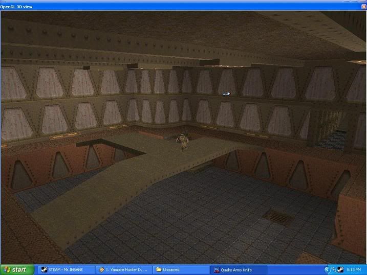
The overhanging bit is intended to be a sniper tower -- the niche is, is that the 3 other bases are manned via Half-Life AI. This meant that I had to make the sniper tower unsually "close" to the combat zone in order for the AI to see the players and other enemies running about.

I also feel/agree that it doesn't look all that structurely sound. The reason for that wall being placed there is to block the player's line of sight: That one base is equal to almost 500 brushes. 4 bases = roughly 2000 brushes D:

Hoping to get a profile for the map soon.
Breaking the laws of mapping since 2003 and doing a damn fine job at it
Re: WIP / Concept Area Screenshots Posted by G.Ballblue on Tue Jun 27th 2006 at 7:04pm
G.Ballblue
1511 posts
Posted 2006-06-27 7:04pm
1511 posts 211 snarkmarks Registered: May 16th 2004 Occupation: Student Location: A secret Nuclear Bunker on Mars
Sorry for the double post.

User posted image

I get to pimp off a new area, and I get to test out XAT :razz:
Breaking the laws of mapping since 2003 and doing a damn fine job at it
Re: WIP / Concept Area Screenshots Posted by Mr.INSANE on Wed Jun 28th 2006 at 6:39pm
Mr.INSANE
156 posts
Posted 2006-06-28 6:39pm
156 posts 86 snarkmarks Registered: Jan 29th 2006 Occupation: Student Location: California,USA
My Sad Sad attempt at quake

User posted image

ive started alot of quake maps but usually give up becuase the engine just cant do it without large errors

I plan on using a few areas from some of my other work to peice this thing together

G.BallBlue - For some reason i just hate that screenshot you posted it seems really off size wise
Why Do we all have to wear these ridiculous ties
Re: WIP / Concept Area Screenshots Posted by G.Ballblue on Wed Jun 28th 2006 at 7:39pm
G.Ballblue
1511 posts
Posted 2006-06-28 7:39pm
1511 posts 211 snarkmarks Registered: May 16th 2004 Occupation: Student Location: A secret Nuclear Bunker on Mars
I'm crouching :razz: That's actually number 1 on the "do not do" list when taking screenshots...

Also: I think I'll try out QuArK just for the Quake1 and 2 mapping. WC 1.6 is really difficult to use, and I have to compile Q1 maps with Nem's Batch compiler. Tricking Nem's Compiler to stoop down to the really old "light.exe" program isn't easy, and debugging errors isn't easy either.
Breaking the laws of mapping since 2003 and doing a damn fine job at it
Re: WIP / Concept Area Screenshots Posted by reaper47 on Tue Jul 11th 2006 at 3:32pm
reaper47
2827 posts
Posted 2006-07-11 3:32pm
reaper47
member
2827 posts 1921 snarkmarks Registered: Feb 16th 2005 Location: Austria
I'm trying a more futuristic Tokyo/Cyberpunk theme for my next map. All I have so far are layout scribbles and basic block/lighting/theme sketches. The map takes place in a slum in the lower levels of a kilometer-high city-scape. Corrugated sheet iron and concrete. Some parts stand underwater. Sunlight falls in small chasm but mostly stays a glow in the distance. HDR, hmmmm :biggrin:

User posted image
Re: WIP / Concept Area Screenshots Posted by Addicted to Morphine on Tue Jul 11th 2006 at 3:59pm
Posted 2006-07-11 3:59pm
3012 posts 529 snarkmarks Registered: Feb 15th 2005
I think everything in that shot looks great, except for the stairs which, in my opinion, look very awkward. If I were you, I'd either make the stairs extend all the way to the ground, or smooth out the underside. If you wanted, you could add a burning trashcan and some flattened cardboard boxes, like a hobo lives under the stairs :smile:

But seriously, I really do like the top half of your screenshot, especially.

Also, have you checked out the source mod Nuclear Dawn? Their neotokyo map is breathtaking, imo.
Re: WIP / Concept Area Screenshots Posted by reaper47 on Tue Jul 11th 2006 at 6:14pm
reaper47
2827 posts
Posted 2006-07-11 6:14pm
reaper47
member
2827 posts 1921 snarkmarks Registered: Feb 16th 2005 Location: Austria
I especially checked out the mod Neo Tokio :biggrin:

Not much content released on their side, but the idea is much older than any mod. I try to get reference from a couple of sources (including the back of my head) to make it look like a bit more unique.

This is a very early concept shot, btw. which should explain things like the stairs. I'm glad you like it already. I put a lot of emphasis on lighting here.
Re: WIP / Concept Area Screenshots Posted by Addicted to Morphine on Wed Jul 12th 2006 at 4:52am
Posted 2006-07-12 4:52am
3012 posts 529 snarkmarks Registered: Feb 15th 2005
Yeah, the idea of neotokyo has been around for ages, as has the cyberpunk genre right? I was just wondering what made you want to go for the theme.

Well if you haven't already, you really should google Nuclear Dawn and check out their media of their neotokyo map. I was very impressed.
Re: WIP / Concept Area Screenshots Posted by Captain P on Wed Jul 12th 2006 at 9:47pm
Captain P
1370 posts
Posted 2006-07-12 9:47pm
1370 posts 1995 snarkmarks Registered: Nov 6th 2003 Occupation: Game-programmer Location: Netherlands
Top part of that screenie looks good, bottom part not so. Yeah, there's some rough brushwork going on there and nothing much of interest, but it's mainly the lighting that's bad there. I don't think the drab greenish works well with the (nice) white light sipping in. The blueish around the corner works better I think.
I think the vertical composition is nice, the floor really lends itself to be even deeper - a endless dark shaft probably fits very well here. :smile:

Nice start, looking forward to how you're gonna work this out.
Create-ivity - a game development blog
Re: WIP / Concept Area Screenshots Posted by Orpheus on Wed Jul 12th 2006 at 11:17pm
Orpheus
13860 posts
Posted 2006-07-12 11:17pm
Orpheus
member
13860 posts 2024 snarkmarks Registered: Aug 26th 2001 Occupation: Long Haul Trucking Location: Long Oklahoma - USA
There are always going to be places in rooms that large where light just will not reach.

Work on those.

(If you wanna secret, put a black texture on bits you want to look like it goes on past the lights ability to reach, even when the area stops.)

The best things in life, aren't things.
Re: WIP / Concept Area Screenshots Posted by reaper47 on Thu Jul 13th 2006 at 11:58pm
reaper47
2827 posts
Posted 2006-07-13 11:58pm
reaper47
member
2827 posts 1921 snarkmarks Registered: Feb 16th 2005 Location: Austria
Alright, the green will be gone soon, at least the strongness of it. It was more of an experiment. I'll try something with this map, blocking out the basic shapes very quickly but making sure the proportions work well enough to add detail later without problems. I'm not sure if it will work as smoothly as I planned but hopefully I can present a gameplay dummy sooner and change parts more easily in that phase. This is far from final release quality.

I saw the neotokio pics of nuclear down. They have some awesome work on their site any you're right the map looks excellent.

What made me want to go for the theme? Well, I wanted to do a map in a big futuristic city for ages. Since I saw The Fifth Element in cinema. There's something almost natural about these huge cities that look like they grew bit for bit over hundereds of years. I find it a very interesting theme. This map actually neither takes place in Tokio nor does it follow the "cyperpunk" theme too closely. It's just a description that I think creates the right picture in people's heads of how I want it to look like in a finished version.

I'm still looking for elegant ways of making the lower floors bright enough. HDR might help here or there, otherwise I'll just have to put in some spotlights.
Re: WIP / Concept Area Screenshots Posted by Addicted to Morphine on Sun Jul 16th 2006 at 8:40am
Posted 2006-07-16 8:40am
3012 posts 529 snarkmarks Registered: Feb 15th 2005
Would it be possible to put large puddles in, or just wet concrete from dripping pipes etc, and fake light reflecting off the water somehow? That could work in one or two places maybe, where the light streaks directly down to the wet areas. Or that could be a terrible idea, who knows.
Re: WIP / Concept Area Screenshots Posted by Crono on Sun Jul 16th 2006 at 9:49am
Crono
6628 posts
Posted 2006-07-16 9:49am
Crono
super admin
6628 posts 700 snarkmarks Registered: Dec 19th 2003 Location: Oregon, USA
Would it be possible to put large puddles in, or just wet concrete from dripping pipes etc, and fake light reflecting off the water somehow? That could work in one or two places maybe, where the light streaks directly down to the wet areas. Or that could be a terrible idea, who knows.
Might want to look into custom shaders. They're not too complex and would add dramatic detail to areas.

Wet, is really something that lacks in almost any game. Sure, there's pretty water, but nothing really gets wet, or appears to do so. (I'm talking about concrete, for example. It's along the lines of people always making flat roads in maps. No sense.)
Blame it on Microsoft, God does.
Re: WIP / Concept Area Screenshots Posted by Mr.INSANE on Tue Aug 8th 2006 at 7:04pm
Mr.INSANE
156 posts
Posted 2006-08-08 7:04pm
156 posts 86 snarkmarks Registered: Jan 29th 2006 Occupation: Student Location: California,USA
Some images in this post have been automatically down-sized, click on them to view the full sized versions:

WoW i hate that thats the second time ive put up a screenshot with no replies

Well lets try this again

User posted image

Thats a very updated screenshot where i belive the map looks much better

Comments are much appreciated

Also whats a good way to get a good fog affect going and a snow falling thats some of the stuff i want.

and lastly are 3rd person cameras possible? maybe in Spirit
Why Do we all have to wear these ridiculous ties
Re: WIP / Concept Area Screenshots Posted by Addicted to Morphine on Thu Aug 10th 2006 at 6:30am
Posted 2006-08-10 6:30am
3012 posts 529 snarkmarks Registered: Feb 15th 2005
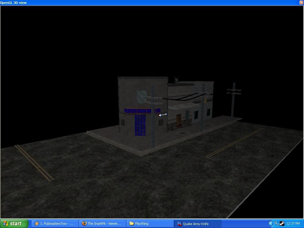
Not much to go on from that shot. It would really help if it were compiled, or at least closer to the buildings. I can't really tell how it'll look in game.

Although if I had to say something it'd be that the buildings all look too gray. Some texture variation wouldn't hurt.
Re: WIP / Concept Area Screenshots Posted by Gwil on Sun Aug 13th 2006 at 6:45pm
Gwil
2864 posts
Posted 2006-08-13 6:45pm
Gwil
super admin
2864 posts 315 snarkmarks Registered: Oct 13th 2001 Occupation: Student Location: Derbyshire, UK
User posted image

Still early - just gonna be a bog standard dreary brick industrial
facility. The lighting doesn't show up much, there's minimal detailing
as of yet.
Re: WIP / Concept Area Screenshots Posted by reaper47 on Sun Aug 13th 2006 at 11:27pm
reaper47
2827 posts
Posted 2006-08-13 11:27pm
reaper47
member
2827 posts 1921 snarkmarks Registered: Feb 16th 2005 Location: Austria
Looks very solid, I like that. I'd love to see it with some basic lighting and the sky closed off. So far only the theme shows. You're from the UK, right? I've been to London once and I remember feeling like there are nothing but brick walls wherever you look. That shot gives me some of that impression. I always thought the offical HL2DM brickwall maps look a bit fairy-tale which I'm not a big fan of. But this shot looks different somehow, more solid and real. Try to keep that feel!
Re: WIP / Concept Area Screenshots Posted by Gwil on Sun Aug 13th 2006 at 11:51pm
Gwil
2864 posts
Posted 2006-08-13 11:51pm
Gwil
super admin
2864 posts 315 snarkmarks Registered: Oct 13th 2001 Occupation: Student Location: Derbyshire, UK
Thanks reaper - the shot you see is actually (very loosely) based off a
photo, and as you saw - not too different from British industrial
architecture. I've done some more since this shot, so there will be
updated grabs coming soon.

The best thing is, I was inspired to pick up the proverbial pen and
paper after seeing your work above. I love the theme - it feels like
the enclosed space idea of Quake 3, but with the "realistic" theme of
HL2. Lighting is excellent - my only worry would be the stairs. The red
light is highlighting the clunky brushwork. As someone else pointed
out, why not make the bottom of the staircase an angle? Would look good
:smile:
Re: WIP / Concept Area Screenshots Posted by reaper47 on Mon Aug 14th 2006 at 12:05pm
reaper47
2827 posts
Posted 2006-08-14 12:05pm
reaper47
member
2827 posts 1921 snarkmarks Registered: Feb 16th 2005 Location: Austria
my only worry would be the stairs. The red
light is highlighting the clunky brushwork. As someone else pointed
out, why not make the bottom of the staircase an angle? Would look good :smile:
Already done. :wink:
Re: WIP / Concept Area Screenshots Posted by Gwil on Tue Aug 15th 2006 at 3:53pm
Gwil
2864 posts
Posted 2006-08-15 3:53pm
Gwil
super admin
2864 posts 315 snarkmarks Registered: Oct 13th 2001 Occupation: Student Location: Derbyshire, UK
Not much more to see, but I started a rebuild to tidy up the brushwork
and work on utilising the Z axis. This will be the focal area, all the
other parts of the level will use this as their focus. Had to brighten
up the images somewhat, sorry if they're overly bright on your screen!

User posted image

User posted image
Re: WIP / Concept Area Screenshots Posted by reaper47 on Tue Aug 15th 2006 at 6:13pm
reaper47
2827 posts
Posted 2006-08-15 6:13pm
reaper47
member
2827 posts 1921 snarkmarks Registered: Feb 16th 2005 Location: Austria
Worth it's own thread I would say.
Re: WIP / Concept Area Screenshots Posted by Addicted to Morphine on Tue Aug 15th 2006 at 6:44pm
Posted 2006-08-15 6:44pm
3012 posts 529 snarkmarks Registered: Feb 15th 2005
Gwil, the screenshot from your first post about this map changed, so now you have 2 of the same. I think you overwrote the original file or something.
Re: WIP / Concept Area Screenshots Posted by Gwil on Tue Aug 15th 2006 at 10:35pm
Gwil
2864 posts
Posted 2006-08-15 10:35pm
Gwil
super admin
2864 posts 315 snarkmarks Registered: Oct 13th 2001 Occupation: Student Location: Derbyshire, UK
Cheers for the heads up AtM - I did overwrite the original shot as it
happens :smile: Development has continued since then, and in response to
reaper - i will be starting a new thread when I have developed the
indoor areas and got some proper lighting in.
Re: WIP / Concept Area Screenshots Posted by Orpheus on Wed Aug 16th 2006 at 12:05pm
Orpheus
13860 posts
Posted 2006-08-16 12:05pm
Orpheus
member
13860 posts 2024 snarkmarks Registered: Aug 26th 2001 Occupation: Long Haul Trucking Location: Long Oklahoma - USA
@Gwil

whispers
Never overwrite. Not everyone has the luxury of being here every day. :sad:

As to the images.... My first thought is, "Gwil is stuck in the same rut I am in. It looks like 5 year old architecture with HL2 textures on them"

My second thought, and the one I am going to stick by for now, The map is way to young to have any discernible input of any value so I will shut up about its architecture. Consider my first impression a reflection of my own inadequacies.

The best things in life, aren't things.
Re: WIP / Concept Area Screenshots Posted by Gwil on Wed Aug 16th 2006 at 2:04pm
Gwil
2864 posts
Posted 2006-08-16 2:04pm
Gwil
super admin
2864 posts 315 snarkmarks Registered: Oct 13th 2001 Occupation: Student Location: Derbyshire, UK
That's fine Orph, I'll agree the architecture is a little lacking and
unoriginal, but that it is also too early to tell. When there is more
progress, i'll be back, but I want far more before my next updates.
Re: WIP / Concept Area Screenshots Posted by Mr.INSANE on Fri Aug 25th 2006 at 4:15am
Mr.INSANE
156 posts
Posted 2006-08-25 4:15am
156 posts 86 snarkmarks Registered: Jan 29th 2006 Occupation: Student Location: California,USA
Some images in this post have been automatically down-sized, click on them to view the full sized versions:

Well Anyways theres that reconstruct comp going on over at TWHL its for source but i figure id try my hand in classic HL1

User posted image

Its not much really but it was all done in quark everything was done brush by brush and im pretty damn proud of my vertex manipulation im going to give it some more work and see if i can get a good reconstruct map

Basicly IT WAS DONE IN QUARK

Comments are much appreciated
Why Do we all have to wear these ridiculous ties
Re: WIP / Concept Area Screenshots Posted by reaper47 on Fri Aug 25th 2006 at 10:57am
reaper47
2827 posts
Posted 2006-08-25 10:57am
reaper47
member
2827 posts 1921 snarkmarks Registered: Feb 16th 2005 Location: Austria
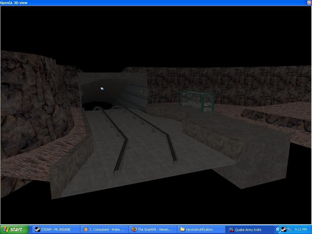
The rocks look like a good example of HL1 low polygon rock modeling. SOme height variation would be nice. I'm not sure about the tile textur at the bottom of the rails. SHouldn't that just be some dark concrete?
Re: WIP / Concept Area Screenshots Posted by Mr.INSANE on Sat Sep 2nd 2006 at 4:53pm
Mr.INSANE
156 posts
Posted 2006-09-02 4:53pm
156 posts 86 snarkmarks Registered: Jan 29th 2006 Occupation: Student Location: California,USA
Some images in this post have been automatically down-sized, click on them to view the full sized versions:

Thankyou for your reply Reaper47

I fixed up the ground added some background crap added in some power lines and gave the rocks some height variation

User posted image

Sadly i dont think the map is going anywhere but i had alot of fun with it
Why Do we all have to wear these ridiculous ties
Re: WIP / Concept Area Screenshots Posted by G.Ballblue on Mon Sep 25th 2006 at 3:33pm
G.Ballblue
1511 posts
Posted 2006-09-25 3:33pm
1511 posts 211 snarkmarks Registered: May 16th 2004 Occupation: Student Location: A secret Nuclear Bunker on Mars
I think it's got potential -- don't entirely know where you'd go with it, but keep at it :razz: Needs some null texturing though, some of those textured areas aren't going to be seen at all. Also, do some clipping on it if you have any intention on not filling your clipping hulls :razz:
Breaking the laws of mapping since 2003 and doing a damn fine job at it
Re: WIP / Concept Area Screenshots Posted by Atrocity on Wed Oct 11th 2006 at 12:12pm
Atrocity
221 posts
Posted 2006-10-11 12:12pm
Atrocity
member
221 posts 152 snarkmarks Registered: Sep 1st 2003 Occupation: Level Designer/Student Location: Toronto Ohio
Some images in this post have been automatically down-sized, click on them to view the full sized versions:

Some images in this post have been automatically down-sized, click on them to view the full sized versions:

Some images in this post have been automatically down-sized, click on them to view the full sized versions:

Some images in this post have been automatically down-sized, click on them to view the full sized versions:

User posted image

User posted image

User posted image

User posted image
Re: WIP / Concept Area Screenshots Posted by Dark_Kilauea on Wed Oct 11th 2006 at 8:52pm
Dark_Kilauea
629 posts
Posted 2006-10-11 8:52pm
629 posts 123 snarkmarks Registered: Apr 15th 2005 Occupation: Fast Food Location: USA
Very nice.

The first thing I notice is that the ceiling looks a bit bland, made add some duct work or supports up there.
Dark_Kilauea
DVS Administration
http://www.dvstudio-production.com/
Re: WIP / Concept Area Screenshots Posted by Crono on Wed Oct 11th 2006 at 9:19pm
Crono
6628 posts
Posted 2006-10-11 9:19pm
Crono
super admin
6628 posts 700 snarkmarks Registered: Dec 19th 2003 Location: Oregon, USA
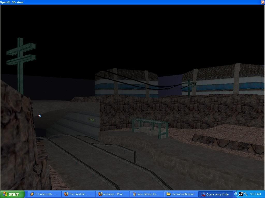
I think it might benefit, in visual appeal, if the skylight windows' grates cast shadows on the floor. (through whatever means)
Blame it on Microsoft, God does.
Re: WIP / Concept Area Screenshots Posted by Addicted to Morphine on Wed Oct 11th 2006 at 10:15pm
Posted 2006-10-11 10:15pm
3012 posts 529 snarkmarks Registered: Feb 15th 2005
Maybe instead of having actual ducts or supports up on the roof (that seems pretty cliche at this point) you could use a dark texture to highlight certain areas or trim the windows.