Test

Test

Re: Test Posted by Flynn on Sat Feb 3rd 2007 at 10:46am
Flynn
454 posts
Posted 2007-02-03 10:46am
Flynn
member
454 posts 695 snarkmarks Registered: Oct 1st 2004 Location: England
Behold:

User posted image

The fence.
Just Kidding

Just Kidding
Re: Test Posted by Flynn on Tue Feb 6th 2007 at 6:34pm
Flynn
454 posts
Posted 2007-02-06 6:34pm
Flynn
member
454 posts 695 snarkmarks Registered: Oct 1st 2004 Location: England
Okay, well today I have decided to delve back into the dark and murky world that is mapping. At the moment I feel that the map is too "improvised" looking. I'm sure all mappers have to improvise at some point, but they cover it up considerably better than I can at the moment. Here are some screenshots of the first area:

User posted image

User posted image

Once you guys are happy with this I'll post some screenies of the next two areas :smile:
Just Kidding

Just Kidding
Re: Test Posted by Andrei on Tue Feb 6th 2007 at 7:06pm
Andrei
2455 posts
Posted 2007-02-06 7:06pm
Andrei
member
2455 posts 1248 snarkmarks Registered: Sep 15th 2003 Location: Bucharest, Romania
wow this is starting to look very promising. I love those hexagonal (or perhaps octagonal?) buildings in the background.
I agree about the fence, the prop one looks much better. Much less "claustrating" than the massive concrete one.
Re: Test Posted by Flynn on Wed Feb 7th 2007 at 6:48pm
Flynn
454 posts
Posted 2007-02-07 6:48pm
Flynn
member
454 posts 695 snarkmarks Registered: Oct 1st 2004 Location: England
<DIV class=quotetext>
<DIV class=quote>
<DIV class=quotetitle>? quoting Reaper47</DIV>
<DIV class=quotetext>Well, then I have told you everything I can think of. :smile:
I?ll come back for the first downloadable version.</DIV>

</DIV></DIV>

Okay well I have been experimenting on this map by myself for the best part of yesterday and when I do that I have been known to go off the rails a little :biggrin:

In my opinion it lacks that certain "Flare" that I notice on Valve maps.

I've made the latest .bsp available for download, so I would be really greatful if you could take a look at it :smile:
Just Kidding

Just Kidding
Re: Test Posted by Stadric on Thu Feb 8th 2007 at 12:10am
Stadric
848 posts
Posted 2007-02-08 12:10am
Stadric
member
848 posts 585 snarkmarks Registered: Jun 3rd 2005 Occupation: Slacker Location: Here
I'll take a look at it and tell you what I think.

(Why is it that when I finally have free time, I fill it?)

EDIT
The download isn't working, winzip says it isn't a valid archive.
Also change the texture of the dock. Docks are rarely tile. -Facepunch
As I Lay Dying
Re: Test Posted by Flynn on Thu Feb 8th 2007 at 10:19am
Flynn
454 posts
Posted 2007-02-08 10:19am
Flynn
member
454 posts 695 snarkmarks Registered: Oct 1st 2004 Location: England
I'm sorry Stadric but I'm going to have to disagree with you there. I download the file and then the Winzip box comes up and then I click open and inside the Winzip file lies a "test.bsp" file. So I dunno what's up if it doesn't work for you. I can't think of anything else, I dunno if anyone else can...
Just Kidding

Just Kidding
Re: Test Posted by FatStrings on Thu Feb 8th 2007 at 3:00pm
FatStrings
1242 posts
Posted 2007-02-08 3:00pm
1242 posts 144 snarkmarks Registered: Aug 11th 2005 Occupation: Architecture Student Location: USA
I'm sorry...I...don't...quite...get...what...you...mean...Fatstringz...dying...
User posted image
Re: Test Posted by Flynn on Thu Feb 8th 2007 at 4:15pm
Flynn
454 posts
Posted 2007-02-08 4:15pm
Flynn
member
454 posts 695 snarkmarks Registered: Oct 1st 2004 Location: England
Holy crap ofcourse!!! I really like that design. I dunno what the other guys would say about it though. It looks interesting enough without being over revealing. Thanks for the visual prompt:p
Just Kidding

Just Kidding
Re: Test Posted by FatStrings on Thu Feb 8th 2007 at 10:03pm
FatStrings
1242 posts
Posted 2007-02-08 10:03pm
1242 posts 144 snarkmarks Registered: Aug 11th 2005 Occupation: Architecture Student Location: USA
no charge, it didn't take much time and a picture is worth a thousand words :razz:
Re: Test Posted by Riven on Thu Feb 8th 2007 at 11:27pm
Riven
1640 posts
Posted 2007-02-08 11:27pm
Riven
Wuch ya look'n at?
super admin
1640 posts 1266 snarkmarks Registered: May 2nd 2005 Occupation: Architect Location: Austin, Texas, USA
I get the same problem:

"The compressed (zipped) Folder is invalid or corrupted."

maybe just upload the .bsp uncompressed; its not that big.
Blog: www.playingarchitecture.net
LinkedIn: Eric Lancon
Twitter:@Riven202
Re: Test Posted by Flynn on Fri Feb 9th 2007 at 9:39am
Flynn
454 posts
Posted 2007-02-09 9:39am
Flynn
member
454 posts 695 snarkmarks Registered: Oct 1st 2004 Location: England
Okay I'm gonna just upload the .bsp now. The reason I didn't do that in the first place was because last time I forgot to zip the .bsp file it went into a text file and I didn't know what to do :redface: But I guess you guys know how to deal with it so here it is. Hopefully it works this time :smile:
Just Kidding

Just Kidding
Re: Test Posted by G.Ballblue on Fri Feb 9th 2007 at 2:15pm
G.Ballblue
1511 posts
Posted 2007-02-09 2:15pm
1511 posts 211 snarkmarks Registered: May 16th 2004 Occupation: Student Location: A secret Nuclear Bunker on Mars
You could try putting it in a WinRar file if zips don't work -- I've noticed .zip files to exhibit strange errors for no reason. For the most part, .rars open up perfectly almost every time.
Re: Test Posted by Flynn on Fri Feb 9th 2007 at 3:22pm
Flynn
454 posts
Posted 2007-02-09 3:22pm
Flynn
member
454 posts 695 snarkmarks Registered: Oct 1st 2004 Location: England
Okay the file has been compressed with winrar and is available for download :smile:
Just Kidding

Just Kidding
Re: Test Posted by Stadric on Sat Feb 10th 2007 at 3:31am
Stadric
848 posts
Posted 2007-02-10 3:31am
Stadric
member
848 posts 585 snarkmarks Registered: Jun 3rd 2005 Occupation: Slacker Location: Here
Okay downloading...
Telling winrar I won't want to buy the full version...
Replacing the bsp file test.bsp with yours.

I'll tell you what I think in a little bit.

and that time has come.

Here's my analysis:

-In the beginning, the combine fencing is detached from the base concrete.
-Since the helicopter rotors are a blur by design, they could be a prop_dynamic idling, to increase realism?
-The textures on most, if not all, of the sliding doors don't line up.
-This roof has got to go,
User posted image
It could use something more /||||\ shaped, IMO.
-Small lighting discrepancy here:
User posted image
-There's a ladder that's unusable, it's part of a prop, you should make it inaccessible.
-With the gunships and dropships, you can add a metal apparatus underneath that gives off light (I'm thinking light-ish blue) to get rid of the reflections that seem out of place.

Overall, aside from the lack of an adequate skybox (but hey, it's a pre-alpha), it's a solid map, just fix those things I mentioned and continue.
Also change the texture of the dock. Docks are rarely tile. -Facepunch
As I Lay Dying
Re: Test Posted by Flynn on Sat Feb 10th 2007 at 9:11am
Flynn
454 posts
Posted 2007-02-10 9:11am
Flynn
member
454 posts 695 snarkmarks Registered: Oct 1st 2004 Location: England
<DIV class=quote>
<DIV class=quotetitle>? quoting Stadric</DIV>
<DIV class=quotetext>Okay downloading...
Telling winrar I won't want to buy the full version...
Replacing the bsp file test.bsp with yours.

I'll tell you what I think in a little bit.

and that time has come.

Here's my analysis:

-In the beginning, the combine fencing is detached from the base concrete.
-Since the helicopter rotors are a blur by design, they could be a prop_dynamic idling, to increase realism?
-The textures on most, if not all, of the sliding doors don't line up.
-This roof has got to go,
User posted image
It could use something more /||||\ shaped, IMO.

</DIV></DIV>

If you mean the one on the left then yeah, I didn't notice that because I was looking at it from the front when I went to open the door.

Nope, unfortunately there is only one chopper model which is the one that has the rotor as though it's spinning around extremely fast.

I musta missed that. I went back in Hammer and lined 'em up :biggrin:

Again, I went back in Hammer and changed that. Now the roof is white and a different shape :lol:

<DIV class=quote>
<DIV class=quotetitle>? quoting Stadric</DIV>
<div class="quotetext">-Small lighting discrepancy here:

User posted image
-There's a ladder that's unusable, it's part of a prop, you should make it inaccessible.
-With the gunships and dropships, you can add a metal apparatus underneath that gives off light (I'm thinking light-ish blue) to get rid of the reflections that seem out of place.

Overall, aside from the lack of an adequate skybox (but hey, it's a pre-alpha), it's a solid map, just fix those things I mentioned and continue.

</DIV></DIV>

By the looks of it that is part of the shadow from the Combine wall, no?

Yup, I've filled that ladder in somehow :razz:

I'm not quite sure what you mean, is it the thrusters that give off the light-blueish light that you say looks out of place? Maybe the Combine were testing it when Gordon came like when humans do with a rolling road.

Yeah, I couldn't really be arsed to fill the skybox with buildings and stuff at this point, as we can see, theres still alot of work that needs to be done with the normal map.

Again, thank you for your help Stadric, I very much appreciate it :sailor:

EDIT: I decided I should add some pictures:

Is this the reflection you mean?:

User posted image

I've changed the r00f:

User posted image

And I've aligned the door texture:

User posted image

Sorry I can't figure out how to do thumbnails :cry:

</div>
Just Kidding

Just Kidding
Re: Test Posted by Stadric on Sat Feb 10th 2007 at 10:55pm
Stadric
848 posts
Posted 2007-02-10 10:55pm
Stadric
member
848 posts 585 snarkmarks Registered: Jun 3rd 2005 Occupation: Slacker Location: Here
thumbnail code:
(replace carrots with square brackets)
<url=Full-sized image url><img>Thumbnail image url</img></url>

For the reflection, I was talking about the one on the bottom of all the combine ships (excluding the helicopter), it looks pretty bad, if you but some blue lighting underneath each of the ships by way of some sort of electronics, then the reflections will be much improved.
Also change the texture of the dock. Docks are rarely tile. -Facepunch
As I Lay Dying
Re: Test Posted by Flynn on Sun Feb 11th 2007 at 12:00am
Flynn
454 posts
Posted 2007-02-11 12:00am
Flynn
member
454 posts 695 snarkmarks Registered: Oct 1st 2004 Location: England
Meh, I'm not too keen on that idea. I am probably biased because I don't have much of an eye for cubemaps. Hang on a minute- cubemaps...when I add them the reflection will go away, no? Really I still think the overall map needs something but I'm not too sure what exactly...
Just Kidding

Just Kidding
Re: Test Posted by Stadric on Sun Feb 11th 2007 at 2:05am
Stadric
848 posts
Posted 2007-02-11 2:05am
Stadric
member
848 posts 585 snarkmarks Registered: Jun 3rd 2005 Occupation: Slacker Location: Here
Do you or do you not have cubemaps in your map?
If you don't that would explain the reflections on the ships.

Cubemaps are easy, all you have to do is place them and build them once when you open the map for the first time. Not only that, they're essential for any map.
Also change the texture of the dock. Docks are rarely tile. -Facepunch
As I Lay Dying
Re: Test Posted by fishy on Sun Feb 11th 2007 at 2:49am
fishy
2623 posts
Posted 2007-02-11 2:49am
fishy
member
2623 posts 1476 snarkmarks Registered: Sep 7th 2003 Location: glasgow
most combine props and materials have reflective surfaces, so cubemaps will be essential if you want your map to look right.
i eat paint
Re: Test Posted by Orpheus on Sun Feb 11th 2007 at 9:35am
Orpheus
13860 posts
Posted 2007-02-11 9:35am
Orpheus
member
13860 posts 2024 snarkmarks Registered: Aug 26th 2001 Occupation: Long Haul Trucking Location: Long Oklahoma - USA
This map has received an amazing amount of feedback. Nice to see SP rally again. :smile:

My only thought at this moment: Those windows in the building are way to repetitive. See if you can find 3 distinct ones to replace them with.

The best things in life, aren't things.
Re: Test Posted by Flynn on Sun Feb 11th 2007 at 12:37pm
Flynn
454 posts
Posted 2007-02-11 12:37pm
Flynn
member
454 posts 695 snarkmarks Registered: Oct 1st 2004 Location: England
<DIV class=quote>
<DIV class=quotetitle>? quoting Stadric</DIV>
<DIV class=quotetext>Cubemaps are easy, all you have to do is place them and build them once when you open the map for the first time. Not only that, they're essential for any map.</DIV></DIV>

Yup, cubemaps added :smile:

<DIV class=quote>
<DIV class=quotetitle>? quoting Fishy</DIV>
<DIV class=quotetext>most combine props and materials have reflective surfaces, so cubemaps will be essential if you want your map to look right. </DIV></DIV>

Again, cubemaps added :razz:

<DIV class=quote>
<DIV class=quotetitle>? quoting Orpheus</DIV>
<DIV class=quotetext>This map has received an amazing amount of feedback. Nice to see SP rally again. :smile: </DIV></DIV>

Yes that's something I've noticed in the past two and a half moons. The people at SnarkPit are always very consistent with feedback :smile:

<DIV class=quote>
<DIV class=quotetitle>? quoting Orpheus</DIV>
<DIV class=quotetext>My only thought at this moment: Those windows in the building are way to repetitive. See if you can find 3 distinct ones to replace them with.</DIV></DIV>

Yup, changed them.

And lastly, here is the .bsp with cubemaps.
Just Kidding

Just Kidding
Re: Test Posted by FatStrings on Mon Feb 12th 2007 at 2:49pm
FatStrings
1242 posts
Posted 2007-02-12 2:49pm
1242 posts 144 snarkmarks Registered: Aug 11th 2005 Occupation: Architecture Student Location: USA
ok, i checked out the new download and here's what stuck out at me

first of all, the movement is very restricted and everything's really tight, if this is a dm map i'm thinkin you might want a little more movement allowed

your walker looks like it's having seizures, it shakes, you might want to make it a prop_static

i believe it's been mentioned, but your rotors on your helicopter are in motion, which just looks odd

User posted image
this fence just seems odd to me, the whole chain link doesn't seem like combine to me, at least not in a military facility

User posted image
this door just doesn't work with the tower in front of it

User posted image
this ramp is odd and steep making it seem unuseable by machinary, you might just make some steps to a basement door

one other thing, you might think about a barracks or some facilities for the soldiers as well [/2cents]
Re: Test Posted by Flynn on Mon Feb 12th 2007 at 8:25pm
Flynn
454 posts
Posted 2007-02-12 8:25pm
Flynn
member
454 posts 695 snarkmarks Registered: Oct 1st 2004 Location: England
<DIV class=quote>
<DIV class=quotetitle>? quoting FatStrings</DIV>
<DIV class=quotetext>first of all, the movement is very restricted and everything's really tight, if this is a dm map i'm thinkin you might want a little more movement allowed </DIV></DIV>

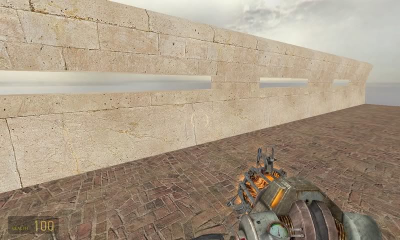
Well it's not a D.M. map but I still think you have a point. When I make the actual map I will make it slightly bigger.

Only slightly albeit, because I don't want to run into problems populating it, thus making it look far too far too far too empty :biggrin:

<DIV class=quote>
<DIV class=quotetitle>? quoting FatStrings</DIV>
<DIV class=quotetext>your walker looks like it's having seizures, it shakes, you might want to make it a prop_static </DIV></DIV>

O' rly? I dunno about this one- I would say the animation is quite subtle.

<DIV class=quote>
<DIV class=quotetitle>? quoting FatStrings</DIV>
<DIV class=quotetext>i believe it's been mentioned, but your rotors on your helicopter are in motion, which just looks odd </DIV></DIV>

Unless there is a texture that makes the stuff it surrounds invisible, I don't know what to do about this one.

The maps I make always have problems like this; they seem too improvised 8=\
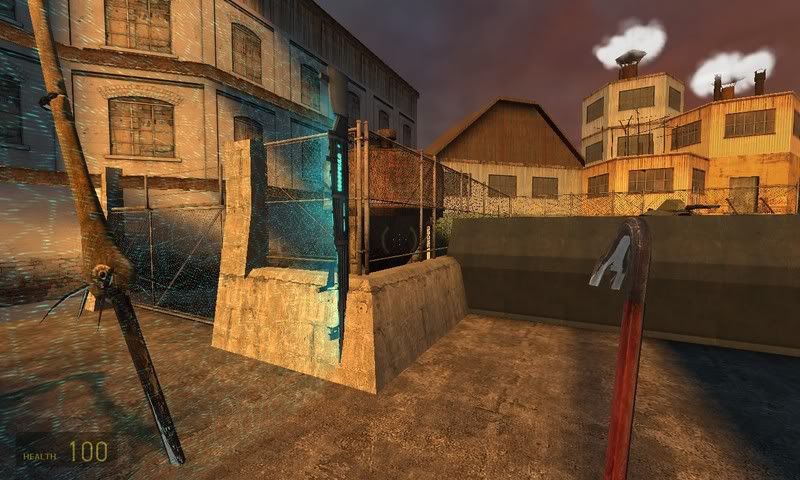
<DIV class=quote>
<DIV class=quotetitle>? quoting FatStrings</DIV>
<DIV class=quotetext>this fence just seems odd to me, the whole chain link doesn't seem like combine to me, at least not in a military facility </DIV></DIV>

Well number one the Combine have taken this facility over, and number two this is inside the confines of the facility; so, there you go, that's my excuse for that one :razz:
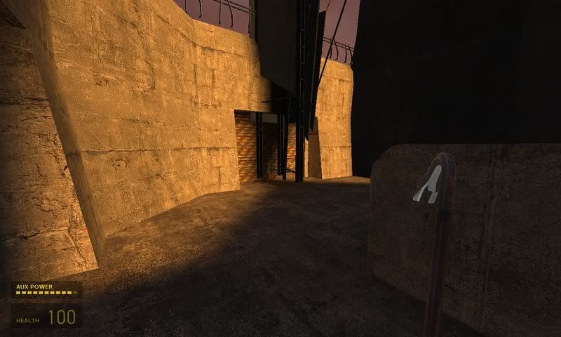
<DIV class=quote>
<DIV class=quotetitle>? quoting FatStrings</DIV>
<DIV class=quotetext>this door just doesn't work with the tower in front of it </DIV></DIV>

The impression I'm try'na give here is that the Combine do whatever they want, they don't give a phuck about blocking off a door or two.

It just shows how the Combine stuff is forced up on the human race.

Well the last bit was there just to sound good...but, well, yeah, you get the idea :biggrin:

<DIV class=quote>
<DIV class=quotetitle>? quoting FatStrings</DIV>
<DIV class=quotetext>this ramp is odd and steep making it seem unuseable by machinary, you might just make some steps to a basement door </DIV></DIV>

The Snarks have smiled upon us. I have made the ramp shallower, and the door wider.

<DIV class=quote>
<DIV class=quotetitle>? quoting FatStrings</DIV>
<DIV class=quotetext>one other thing, you might think about a barracks or some facilities for the soldiers as well </DIV></DIV>

Meh, I would like to think about sticking to my theme!

lol, j/k.

Really I would like to improve the first bit first...and...well...you know the rest :kitty:

Thank you very much for taking the time to download it and have a walk around, I see you've even donned the crowbar!

I dunno what it is with that thing, whenever I walk around a map I seem to end up with it as well.

I know it's quite alot of hassle to download a map and then put it in the right folder and then fire up H-L 2 and play it etc, but I really appreciate the help.

Thank you :smile:

On a side note, here's the new map with a wider mouth and more skybox objects.

Any comments are welcome; especially tips on how to make it like a Valve map.

Or even close, as Valve tend to rely upon props for alot of their custom content so creating something they haven't isn't as easy as creating...say...another part of City-17 for instance.
Just Kidding

Just Kidding
Re: Test Posted by fishy on Mon Feb 12th 2007 at 8:47pm
fishy
2623 posts
Posted 2007-02-12 8:47pm
fishy
member
2623 posts 1476 snarkmarks Registered: Sep 7th 2003 Location: glasgow
<DIV class=quote>
<DIV class=quotetitle>? quoting FatStrings</DIV>
<DIV class=quotetext>one other thing, you might think about a barracks or some facilities for the soldiers as well
Meh, I would like to think about sticking to my theme!</div></div>

i think he meant combine soldiers. :/
i eat paint
Re: Test Posted by FatStrings on Mon Feb 12th 2007 at 9:26pm
FatStrings
1242 posts
Posted 2007-02-12 9:26pm
1242 posts 144 snarkmarks Registered: Aug 11th 2005 Occupation: Architecture Student Location: USA
yep, but it's his map and i understand if he doesn't want to go w/ some of my suggestions
Re: Test Posted by reaper47 on Mon Feb 12th 2007 at 9:56pm
reaper47
2827 posts
Posted 2007-02-12 9:56pm
reaper47
member
2827 posts 1921 snarkmarks Registered: Feb 16th 2005 Location: Austria
Very, very nice for a start. Obviously a "test" still... but you're starting cleanly from the ground up which I think will help you a lot as you add more.

My only complaints are these:
  • Unlocked doors should be distinguished, so you know what's decoration and what?s usable (the same goes for this little (unusable) ladder near a combine structure)
  • You forgot the cubemaps. They're easy to add and important.
I think as you turn this "test" map into a full map you should start with a layout and gameplay idea in mind. And a little background story. You can use most things in the map but I wouldn't stick to the current layout and start from scratch with some gameplay ideas in mind from the beginning. That sounds like more work but in the long term it should save you a lot of shoving around brushes in the current map.

Try sketching something out on paper. A simple, ugly up-down view of a possible layout. Currently everything feels a bit claustrophobic and linear. Try adding more open, larger places here and there and height variation wherever you can. You can also use this phase to plan out the structure of the base (barracks here, heli-pad there, all the vehicles there, kitchen here ect., ect.) That could also help to get the more sophisticated feel of the Valve maps.

Maybe show us the sketch for some feedback. I find sketches very helpful in the planning phase.
Why snark works.
Re: Test Posted by Flynn on Mon Feb 12th 2007 at 10:30pm
Flynn
454 posts
Posted 2007-02-12 10:30pm
Flynn
member
454 posts 695 snarkmarks Registered: Oct 1st 2004 Location: England
Heck I wasn't expecting three replies this fast :shocked:
Fishy said:
i think he meant combine soldiers. :/
Oh yeah don't get me wrong there are gonna be Combies in the watch towers.

<DIV class=quotetext>
<DIV class=quotetext> [quote=Reaper47]- Unlocked doors should be distinguished, so you know what's decoration and what?s usable (the same goes for this little (unusable) ladder near a combine structure) [/quote]</DIV>
<DIV class=quotetext> </DIV>
<DIV class=quotetext>Well I stated earlier that the ladder had been nerfed somehow;)</DIV>
<DIV class=quotetext> So now it is not visible. </DIV>
<DIV class=quotetext>The only door that is locked is the door that in the full version the player will emerge from. </DIV>
<DIV class=quotetext>Or did you mean the whole "use" thing that I've got going? There are three openable doors in the map. </DIV>
<DIV class=quotetext> </DIV>
<DIV class=quotetext>[quote=Reaper47]- You forgot the cubemaps. They're easy to add and important. [/quote]</DIV>
<DIV class=quotetext>No I did not forget them, it was just my retarded way of thinking. </DIV>
<DIV class=quotetext>Do you remember when I thought you guys could give me tips on how to make the walls look better when the map was on fullbright?</DIV>
<DIV class=quotetext> </DIV>
<DIV class=quotetext> Back then someone said that Cubemaps aren't as important for screenshots. </DIV>
<DIV class=quotetext>The cubemaps issue arouse from when Stadric had a look at the map ingame and noticed some bizarre reflections.</DIV>
<DIV class=quotetext> The cubemaps where added in the last but one update.</DIV>
<DIV class=quotetext>[quote=Reaper47]- You forgot the cubemaps. They're easy to add and important. [/quote]</DIV>
<DIV class=quotetext> </DIV>
<DIV class=quotetext>Don't worry; I've got that covered. All I need to do is come up with a decent "Staging area".
</DIV>
<DIV class=quotetext>[quote=Reaper47]That sounds like more work but in the long term it should save you a lot of shoving around brushes in the current map. [/quote]</DIV>
<DIV class=quotetext> </DIV>
<DIV class=quotetext>[quote=Reaper47]Well that's what this map is for :smile: </DIV>
<DIV class=quotetext>I've been taking so many short cuts it's disgraceful.</DIV>
<DIV class=quotetext> It's a mess in Hammer :shocked: Once I've got a nice layout and s**t with this map I'll make a tidy one :biggrin: </DIV>
<DIV class=quotetext> </DIV>
<DIV class=quotetext>[quote=Reaper47]Currently everything feels a bit claustrophobic and linear. Try adding more open, larger places here and there and height variation wherever you can. You can also use this phase to plan out the structure of the base (barracks here, heli-pad there, all the vehicles there, kitchen here ect., ect.) That could also help to get the more sophisticated feel of the Valve maps. [/quote]
</DIV>
<DIV class=quotetext>Well I've already got a fairly clear plan of the base. </DIV>
<DIV class=quotetext>I have the Strider standing behind the force field, the A.P.C.s behind the barricades(the player is supposed to jump over the barricades from the chopper with the H.E.V. suit). And then two seperate areas for the two flying insect thingys.</DIV>
<DIV class=quotetext>This "height variation" you speak of.</DIV>
<DIV class=quotetext> Tell me more :biggrin: Seriously now, this seems to be the point at which I am struggling as a mapper. </DIV>
<DIV class=quotetext>I've made some tall buildings in the world; and made two tall Combine builds in the 3dskybox.

[/quote]</div></div>
Just Kidding

Just Kidding
Re: Test Posted by reaper47 on Mon Feb 12th 2007 at 10:49pm
reaper47
2827 posts
Posted 2007-02-12 10:49pm
reaper47
member
2827 posts 1921 snarkmarks Registered: Feb 16th 2005 Location: Austria
Height variation in layout means a higher (or lower) place the player can walk or climb up (or down) to.

If you play any HL2 map you quickly see that the player isn't in the same level all the time. Of course if he just walks up some stairs and never has to look back that's not really exciting.

Good use of height variation makes it possible to look down at places you've been before or that you're going to visit later. It gives you cover from enemies on other levels and forces the player to think up/down as opposed to simple left/right movement in flat maps. The Nova Prospekt levels are a good example as well as most Ravenholm maps. But pretty much every HL2 map has some sort of height variation in it. It's about fully using 3D space.

PS: Try doing the sketch. It takes 3 minutes and you'll see how many problems and possibilities you see before even starting the actual map. It was an enlightening experience for me when I first started mapping based on simple layout-sketches.
Why snark works.
Re: Test Posted by Flynn on Mon Feb 12th 2007 at 11:59pm
Flynn
454 posts
Posted 2007-02-12 11:59pm
Flynn
member
454 posts 695 snarkmarks Registered: Oct 1st 2004 Location: England
Well that makes things complicated because the other 2 portions of the map are shut off by areaportals so it would be noticeable if the player was up a high place and could not see the other areas. I think the player would notice this indescreprency 8=/
Just Kidding

Just Kidding
Re: Test Posted by Stadric on Tue Feb 13th 2007 at 4:55am
Stadric
848 posts
Posted 2007-02-13 4:55am
Stadric
member
848 posts 585 snarkmarks Registered: Jun 3rd 2005 Occupation: Slacker Location: Here
Not necessarily that high.
But your areaportals shouldn't be a problem for that, since the player could "see" the leaf he's looking at, regardless of the areaportal if that areaportal was blocking that leaf in a different leaf.
Also change the texture of the dock. Docks are rarely tile. -Facepunch
As I Lay Dying
Re: Test Posted by Riven on Tue Feb 13th 2007 at 5:59am
Riven
1640 posts
Posted 2007-02-13 5:59am
Riven
Wuch ya look'n at?
super admin
1640 posts 1266 snarkmarks Registered: May 2nd 2005 Occupation: Architect Location: Austin, Texas, USA
I love the combine tower in the background, and the buildings placed in the third gunship bay (the barn-shaped building) are quite nice.

I think you may have forgotten to build the cubemaps in-game after compiling.
Their there, you just need to type: buildcubemaps in the console and let the screen flash the six pictures for each, and then you'll see the difference. Thats what i had to do on that latest dl.

One problem I have with the map, is that I don't really feel the combine atmosphere. Really the only thing going for it are the combine models and the tower in the background. I'm thinking it would be neat to make some sections of the concrete wall replaced by combine brush-based walls (shape them however you like). You could make one of the gunship bays completely combine built, as if grafted on to the rest of the facility. [/2cents]
Blog: www.playingarchitecture.net
LinkedIn: Eric Lancon
Twitter:@Riven202
Re: Test Posted by reaper47 on Tue Feb 13th 2007 at 5:09pm
reaper47
2827 posts
Posted 2007-02-13 5:09pm
reaper47
member
2827 posts 1921 snarkmarks Registered: Feb 16th 2005 Location: Austria
The areaportals are hiding some architecture that should be visible, resulting in some missing polygons anyway. I'd get rid of them for the outside portions. I don't think you need them.

Again, I think you're one of the few mappers who understood the performance issues from the beginning. I think you can build much more freely now without having to fear about performance at all. Don't let this get in the way of trying out different layouts and height variation.
Why snark works.
Re: Test Posted by Flynn on Wed Feb 14th 2007 at 12:56am
Flynn
454 posts
Posted 2007-02-14 12:56am
Flynn
member
454 posts 695 snarkmarks Registered: Oct 1st 2004 Location: England
<DIV class=quote>
<DIV class=quotetitle>? quoting Reaper47</DIV>
<DIV class=quotetext>The areaportals are hiding some architecture that should be visible</DIV></DIV>

Yes well let's just hope people ignore that for the next proposal I am going to make :razz: : How about making the bit above the concrete walls another visleaf so then the player can see everything he should when he is in a part of the map where he should be able to see the next area.

This would solve the problem of the area portals hiding the other areas when the player could see over the concrete wall. If I'm not explaining it clearly, then it is in the "hints" chapter in the "Weeble & Bob" part of that rather good optimization tut that is floating around...
Just Kidding

Just Kidding
Re: Test Posted by reaper47 on Wed Feb 14th 2007 at 5:15pm
reaper47
2827 posts
Posted 2007-02-14 5:15pm
reaper47
member
2827 posts 1921 snarkmarks Registered: Feb 16th 2005 Location: Austria
Hmm, just don't let all these advanced optimization methods get in your way. Building your layout in some slopes and with larger areas not directly visible to each other and even the automatic vbsp/vvis process will do all the optimization you'll ever need. Manually placed Hints and Portals are for very special occasions, and I wouldn't necessarily include anything you build in this map so far in this category.

Maybe a giant Hint brush sealing up the top parts of the concrete walls because it's so easy. But otherwise your map should work fine without any Hinting so far.

Layout is more important now, even for performance! :wink:
Why snark works.
Re: Test Posted by Flynn on Fri Feb 16th 2007 at 11:42pm
Flynn
454 posts
Posted 2007-02-16 11:42pm
Flynn
member
454 posts 695 snarkmarks Registered: Oct 1st 2004 Location: England
Well I've added some height variation in between parts.

I also (albeit unknowingly) added that boring "walled in" feel to the map again.

I've made the chopper on a raised part of ground for height variation(that looks very unnatural).

And also a Combine platform thingy.

The pathways connecting the areas go up and down, etc.

There are also some "issues" that I have not corrected because it would sacrifice alot in performance.

I would be very greatful if fellow 'piters could voice their opinions on how I could make the map own.

I realise this must be getting kinda boring right now so I won't insist. Here is the updated .bsp file.

Edit: I have not added a 3d sky box. When the layout has been approved I will do :smile:
Just Kidding

Just Kidding
Re: Test Posted by Flynn on Sun Feb 18th 2007 at 12:15pm
Flynn
454 posts
Posted 2007-02-18 12:15pm
Flynn
member
454 posts 695 snarkmarks Registered: Oct 1st 2004 Location: England
Okay, I've had time to get some screenshots up and show some of the visual glitches that accur during the map:

On this section of wall; now you see the Combine tower and the walls:

User posted image

On the same section, nothing more than a few steps further back, you don't see the tower and Combine walls:

User posted image

These lights look kinda outta place but I added then anyway:

User posted image

The Combine crushing walls look odd with nothing behind them:

User posted image
Just Kidding

Just Kidding
Re: Test Posted by Flynn on Mon Feb 26th 2007 at 5:53pm
Flynn
454 posts
Posted 2007-02-26 5:53pm
Flynn
member
454 posts 695 snarkmarks Registered: Oct 1st 2004 Location: England
reaper47 said:
Hmm, just don't let all these advanced optimization methods get in your way. Building your layout in some slopes and with larger areas not directly visible to each other and even the automatic vbsp/vvis process will do all the optimization you'll ever need. Manually placed Hints and Portals are for very special occasions, and I wouldn't necessarily include anything you build in this map so far in this category.

Maybe a giant Hint brush sealing up the top parts of the concrete walls because it's so easy. But otherwise your map should work fine without any Hinting so far.

Layout is more important now, even for performance! :wink:
Okay, I have heeded your advice and removed the skybox brushes from blocking buildings that should be visible.

Albeit at the cost of several dozen framerates :biggrin:

I did this a long time ago but I was just waiting for the other mappers threads to die down :heee:

lol, j/k, they are my buddies really :smile:

Albeit at the cost of several dozen framerates :biggrin:

I have added several non-reachable areas for detail to try and get shot of the walled in level feeling that hada come back to haunt me.

For example, this is the bit after the chopper bay:

User posted image

And again, behind the gunship:

User posted image

And there is another un-reachable section in the hallway before the dropship bay:

User posted image

The reason for me not adding a 3 dimensional skybox is because if my map layout is to constantly change, the reference geometry in the skybox would need manual positional updates, along with a new set of reference walls :smile:

So if this map is to be approved for shipment in the current layout, then a fully functional 3 dimensional skybox shall be added.
Just Kidding

Just Kidding
Re: Test Posted by reaper47 on Mon Feb 26th 2007 at 7:45pm
reaper47
2827 posts
Posted 2007-02-26 7:45pm
reaper47
member
2827 posts 1921 snarkmarks Registered: Feb 16th 2005 Location: Austria
mmm, I like the contrast between the warm and cold lighting now.

Several dozen framerates you say? I think a percentage would be more interesting as a drop from 160 to 120 isn't all that bad, for example. Please don't blame me for tricking you into overly high frame rates. Although I doubt you're near any performance issues that people would complain about, I want to say that I don't think fps should be ignored, no, the opposite is the case.

There are just a lot of things you can do with layout to make sure any bigger parts of the map aren't visible to each other. This is possible even with open layouts, you just have to make sure to get some bigger buildings in the middle so you have a nice visibility blocker you can build your map around.

I still think, by the way, that drawing a flat layout sketch on paper would help you the most right now. :wink:
Why snark works.
Re: Test Posted by Stadric on Tue Feb 27th 2007 at 1:30am
Stadric
848 posts
Posted 2007-02-27 1:30am
Stadric
member
848 posts 585 snarkmarks Registered: Jun 3rd 2005 Occupation: Slacker Location: Here
Those striders look out of place to me, how about instead of them standing free, you have them folded up and attached to a wall. I know they can do that, they do it when dropships carry them.
This will give some more space for the player to walk around in, too.
Also change the texture of the dock. Docks are rarely tile. -Facepunch
As I Lay Dying
Re: Test Posted by Flynn on Mon Mar 5th 2007 at 9:36am
Flynn
454 posts
Posted 2007-03-05 9:36am
Flynn
member
454 posts 695 snarkmarks Registered: Oct 1st 2004 Location: England
Okay I have made the Striders folded up. Originally I wanted to mount them upwards but now it was nigh-on-impossible to do so.

The reason for this is that I am unable to line them up because I need a scripted_sequence to keep them in the "carried" position.

When I set the model animation to "carried" in Hammer it does not synchonise with the scripted_sequence's carried position.

Here are some photographs of the Striders in the Combine frame:

User posted image

User posted image

Edit: B.T.W., Reaper I get the feeling that you are trying to subtley hint at something by suggesting that layout is important :wink: I just can't figure out what that might be... I'm hoping that you will be completely honest with me regarding this issue :razz:
Just Kidding

Just Kidding
Re: Test Posted by Stadric on Tue Mar 6th 2007 at 1:38am
Stadric
848 posts
Posted 2007-03-06 1:38am
Stadric
member
848 posts 585 snarkmarks Registered: Jun 3rd 2005 Occupation: Slacker Location: Here
I like the concept of the frame, but it doesn't look very combine. Make it metallic, and add wires that will give the appearance that the strider is hanging from them. I think that would look really cool.
Also change the texture of the dock. Docks are rarely tile. -Facepunch
As I Lay Dying
Re: Test Posted by reaper47 on Tue Mar 6th 2007 at 9:53am
reaper47
2827 posts
Posted 2007-03-06 9:53am
reaper47
member
2827 posts 1921 snarkmarks Registered: Feb 16th 2005 Location: Austria
Ok, I'll put it that way: I think there's not much we could help you with at this state.

I could say a thing or two about the parts you added but doing that with every little step would turn this map into a 6-years project which isn't very reasonable IMO. Just look at maps you like (a few HL2 single player ones for example). Look at them with noclip, fly around a bit and get some ideas and then either expand your map or build it from scratch with the ideas and techniques you got from this one.

I think you know the basics now but the map still has the "test map" feeling. Try think of a little more advanced background story, add some bigger, more free areas, think of some gameplay ideas, ect. There's no "tip" I can give you for that, just experiment, try to find as many interesting or cool ideas to fit into the level as you can.

I think you should look at the map as a whole now, from start to end. You're fiddling around with details again which I wouldn't even think about in this state. Think less about decoration and more gameplay. Don't force the player to walk a single path also. At least give him the illusion of choice, add some bigger, freer areas, multiple pathways. Make him search for where to go next by subtly placing a few obstacles here and there and an interesting way to pass them. ect. ect.

I doubt there's "one thing" you could do now. Just add variety.
Why snark works.
Re: Test Posted by Flynn on Tue Mar 6th 2007 at 1:00pm
Flynn
454 posts
Posted 2007-03-06 1:00pm
Flynn
member
454 posts 695 snarkmarks Registered: Oct 1st 2004 Location: England
Don't worry Reaper47 I am pretty confident that I understand what you are saying.

Basically you mean stuff like instead of having one hallway out of the main area(s) have two or three where one goes into the true hallway and the other has a door blocking it or something, right?

I added the "hight veriation" by making the hallways go up and down and stuff. The question is, was it actually worth it?

The next map I do of this staging area is gonna be the actual "one" from scratch.

I would like to know if I got it spot on with the height variation or not, I've got the feeling you might have meant something a on smaller scale.

May I just tempt you with the .bsp? :razz: There have been alot of changes before man last set foot in it :biggrin:

Oh, and Stadric, I realised something was missing from the look of those frames I guess that must have been it, cheers bud.
Just Kidding

Just Kidding
Re: Test Posted by reaper47 on Tue Mar 6th 2007 at 4:45pm
reaper47
2827 posts
Posted 2007-03-06 4:45pm
reaper47
member
2827 posts 1921 snarkmarks Registered: Feb 16th 2005 Location: Austria
Well, height variation doesn't come from corridors going up or down only. It's more about giving the player a choice. Like a bridge you can walk on - or jump down on the side. Or a chasm you can look down and see some action underneath. Or having a little catwalk far above your head you see some combine running over to the stairway in front of you where they later will come down through and you can take them out before they even reach you because you see them coming in above you...

Well, I'm more the HL2DM guy anyway, I'm afraid. To see some excellent use of vertical viewpoints check out this map. It's HL2DM but you'll see what I mean about height variation quickly. HL2SP is the same with combines, striders and zombies instead of HL2DM players.
Why snark works.
Re: Test Posted by Flynn on Thu Mar 8th 2007 at 12:05pm
Flynn
454 posts
Posted 2007-03-08 12:05pm
Flynn
member
454 posts 695 snarkmarks Registered: Oct 1st 2004 Location: England
What, you mean like this:

User posted image

HAHAHAHAHAHAHAHAHAHAHAHA! :lol: :lol: :lol:

All credits go to me, ofcourse :cool:

I'll make a thread in General Banter to get help with my layout making skillz :cool:
Just Kidding

Just Kidding
Re: Test Posted by reaper47 on Thu Mar 8th 2007 at 3:37pm
reaper47
2827 posts
Posted 2007-03-08 3:37pm
reaper47
member
2827 posts 1921 snarkmarks Registered: Feb 16th 2005 Location: Austria
Why a new thread?
Why snark works.
Re: Test Posted by Natus on Thu Mar 8th 2007 at 4:45pm
Natus
570 posts
Posted 2007-03-08 4:45pm
Natus
member
570 posts 76 snarkmarks Registered: Jan 28th 2005 Location: Denmark
Re: Test Posted by Flynn on Thu Mar 8th 2007 at 7:15pm
Flynn
454 posts
Posted 2007-03-08 7:15pm
Flynn
member
454 posts 695 snarkmarks Registered: Oct 1st 2004 Location: England
Yo thanks Natus, I already extracted everything useful from that topic.
Reaper47 said:
<DIV class=quotetext>Why a new thread?
</DIV> <DIV class=quotetext> </DIV>
<DIV class=quotetext>Alright then I'll use this one. But they won't know what it's about...</DIV>
Just Kidding

Just Kidding
Re: Test Posted by reaper47 on Thu Mar 8th 2007 at 7:21pm
reaper47
2827 posts
Posted 2007-03-08 7:21pm
reaper47
member
2827 posts 1921 snarkmarks Registered: Feb 16th 2005 Location: Austria
You can have new chapters within a map thread. Open up one for "layout ideas" or something.
Why snark works.
Re: Test Posted by Flynn on Fri Mar 9th 2007 at 12:18pm
Flynn
454 posts
Posted 2007-03-09 12:18pm
Flynn
member
454 posts 695 snarkmarks Registered: Oct 1st 2004 Location: England
Okay I've got no idea how to go about this so I've decided on the rather time-consuming idea of drawing it in Paint and then WINRARing it and uploading it to somewhere. I want this world to feel like there are things...BIG THINGS. BIG MACHINARY THAT IF YOU GET IN THE WAY IT WILL STOMP YOU. I WANT IT TO FEEL THAT THERE ARE OTHER AREAS WITH PPL GOING ABOUT THEIR BUSINESS AND DOING THINGS PURPOSEFUlLY. I WANT IT TO FEEL LIKE IF YOU SEE WATER IN THE WORLD AND FEEL THIRSTY THAT WATER WILL CRUNCH YOUR THIRST. I WANT IT TO FEEL LIKE THE BIG METAL DOORS HAVE A PHYSICAL WAY OF WORLKING. I WANT THIS WORLD TO FEEL ALIVE. u kno like da tram bit of halfl1fe1. like when u see a scientist tryin 2 get a soda? I want it 2 feel like dat. Like there are lots of things going on like in da real world.

Edit: Sorry if I got abit carried off there, I just feel rly strongly about dis pointz. Here iz da file: http://www.online-storages.com/540270
Just Kidding

Just Kidding