Flatshaded by ReNo

Map Rating

  • 0
  • unrated

Map Download

Map Info

Map Description

Snarkpit 2004 "Original theme" mapping contest entry.

This map placed joint third in the voted category despite very stiff competition. Its a tad too large and open for the aging HL engine, with the skybox using about 99% of the x/y grid in hammer, and most of that being taken up by a giant fully viewable volcano island. That said, it does run and can be fun with 3 or 4 people running around. Weapons and armour are dished out when you spawn as the map is pushing the engine enough as it without placing loads of items around.

Discussion

Posted by half-dude on Tue Apr 27th 2004 at 4:30pm

Can you go into the light houses?
Posted by Mr.Ben on Sat Apr 24th 2004 at 2:12pm

Absolute pwnage. I love it!
Posted by ReNo on Sat Apr 24th 2004 at 12:19pm
[Author]

Pretty daft :D To be fair I've not placed any items yet and I've not played with anyone else, it could be ok it could be terrible. The best indication I've had is just by using "thirdperson" in the console. I guess its always gonna be a problem with this sort of cartoon map in a realistic game though. Don't know what to do about the sun really, it does look a bit woky as you say - perhaps if I build a sort of elongation into it in the image files it will cancel out the stretching in game and make it more round. The fades wen't in when the map was set at night and I just haven't got rid of them. I plan to keep them there, just reduce the intensity by a load.
Posted by esechre on Sat Apr 24th 2004 at 12:01pm

Looks fantastic, very tempting, but i wont turn to the dark side. Your sun looks a bit wonky, and i dont think the fades look very realistic as its a sunny day. (still not much about it is realistic) I love the highlighting and also the depth youre giving to the water. Looks fantastic keep up the good work. A concern i mentioned in the competition thread is the models will look really silly running around in a flatshaded world. I may be wrong, how does it look ingame?
Posted by |=Tarosek=| on Fri Apr 23rd 2004 at 9:44pm

Hmmm...reminds me of The Legend of Zelda: The Wind Waker for GCN...pretty damn cool!
Posted by ReNo on Fri Apr 23rd 2004 at 3:34pm
[Author]

Naturally, I wouldn't have put it up otherwise :) Its nothing special though, just a bunch of flat colours with a common prefix so they can all be viewed together easily.
Posted by Forceflow on Fri Apr 23rd 2004 at 3:22pm

Are we allowed to use that texture set ?

Good look, Reno ... I love the island view.
Posted by Crono on Fri Apr 23rd 2004 at 2:07am

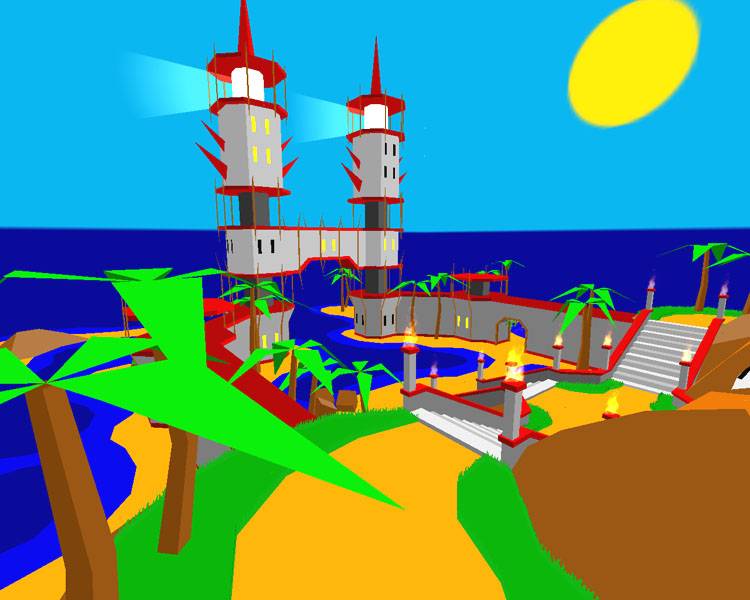
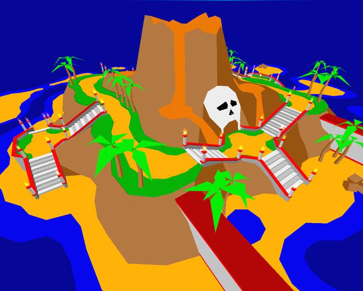
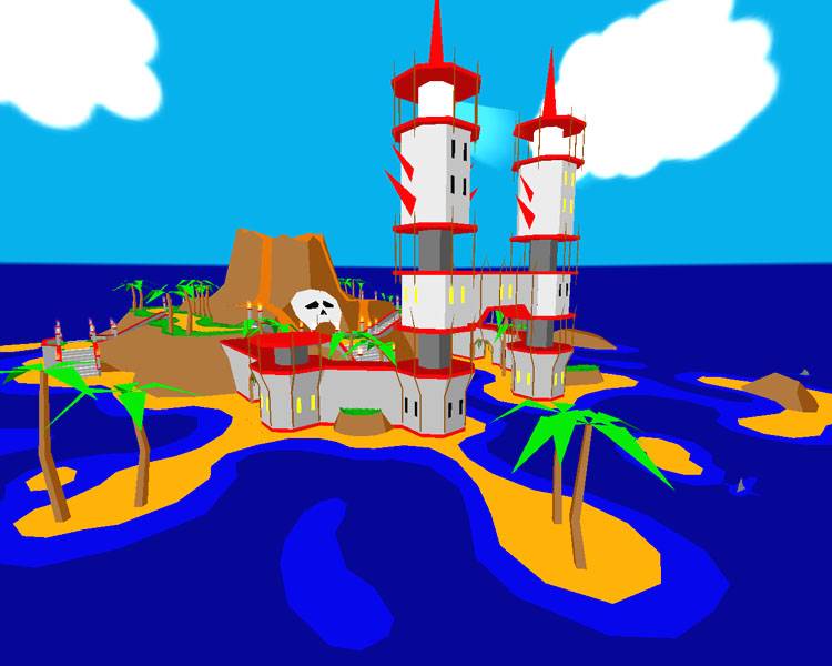
I'm getting a 3D Mario vibe from how this map is turning out.

It has the pallette of Mario 64, but looks like the gameplay of Mario Sunshine.

In any case it looks pretty awesome. It's very interesting the way it's turning out. Something I think would be cool is if once you were done you retextured it, so there'd be two versions. Because it would feel and look like an entirly different map with a different texture set.

Keep it up :)
Posted by 7dk2h4md720ih on Fri Apr 23rd 2004 at 12:58am

This is the texture set he's using. http://www.snarkpit.com/pits/alien_sniper/flatshaded.zip
Posted by half-dude on Fri Apr 23rd 2004 at 12:44am

Great maping Reno, but do think that you should use those cool textures you use on others, just to make the full effect. :)