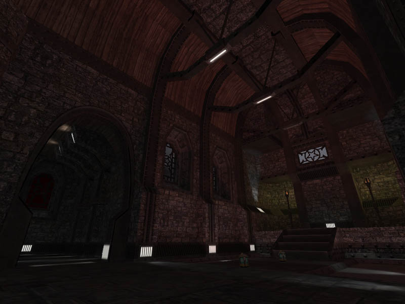
i like the outside scene best, but that could change with the inside getting some new lighting. a couple of big gothic spotlights on the floor pointing up, throwing shadows of the beams onto the roof, maybe, and highlighting the wall supports. the lighting atm seems to make the inside look flatter than it could be. in shape as well as contrast.
still very nice though.
Posted by Gorbachev on
Tue May 11th 2004 at 8:24pm
It's cut off caldera style-ish. Doesn't need to be aligned.
Posted by Forceflow on
Tue May 11th 2004 at 8:17pm
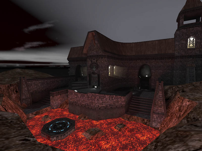
I love that dramatic light coming through the windows :smile:
Posted by asterix_vader on
Tue May 11th 2004 at 8:15pm
err..... are you sure it is a "quick" deathmatch map!?
Posted by Adam Hawkins on
Tue May 11th 2004 at 11:32am
Reminds me of the game Enclave Very nice looking from the screenies!
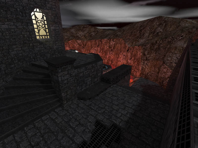
Cass, I'd pin that line down to being a harsh difference in the planes of those parts of the rock, and the resulting difference in the lighting - its too small to really make out any obvious discrepancies in texture alignment.
Cassius said: Well, Orph, there also weren't a great many castles built over a lava lake.
very true, but i actually wasn't talking to you cass, possibly indirectly i was but mainly i was referring to the repeated references to the sameness in the walls and floors..
i was not siding with anyone in other words, just tossing a bit of info around... more less thinking out loud.