The Snarkpit Relaunch

The Snarkpit Relaunch

Re: The Snarkpit Relaunch Posted by G4MER on Sat Oct 18th 2008 at 10:04am
G4MER
2460 posts
Posted 2008-10-18 10:04am
G4MER
floaty snark rage
member
2460 posts 360 snarkmarks Registered: Sep 6th 2003 Location: USA
Thats nice.. I like the idea.. but what is the blue was ribbed like the old green BG was.. and then the SnarkPit logo was under glass.. Let me see if I can work something up. You really did not like the Orange.. wow a talked to a few people and they all dug it.. said it gave the site pop! But ok.. I will try some new ideas.. =)

Ok so everything else was a no go then.. let me try some other ideas.
Re: The Snarkpit Relaunch Posted by larchy on Sat Oct 18th 2008 at 4:24pm
larchy
496 posts
Posted 2008-10-18 4:24pm
larchy
fluffy teim
super admin
496 posts 87 snarkmarks Registered: Jan 14th 2008 Occupation: kitten fluffer Location: UK
Would be good to get some feedback from other ppl really as something like this is so subjective its tough to know what the best way is to go.

Orange/blue/grey is a pretty standard color combination, and you're right it could maybe do with a bit of orange in there... I just personally thought the contrast was a bit too strong using a big solid block of the colour. I think a bold highlight colour like that should be used a bit more sparingly.. if you did little orange icons on the navbar like that home one I did then it might look quite good. Then again, maybe it would look better using orange for the rollover colour instead of the light blue... but its all subjective really.

Maybe something like this?
User posted image
I tend to be pretty conservative when it comes to fonts because, honestly, the complaints you get about legibility when you stray from arial or verdana... I'm using Calibri for the main text on the blue theme, dunno if you've noticed that (you may need to download Calibri if you're not running Vista or a modern version of Office), but for the logo/nav I wanted something a bit snazzier but still nice and bold and clear. I think maybe that Bauer is a good tradeoff though...

Its all just ideas though and seeing what works... I'd like to get as much feedback as possible from ppl tbh before making any decisions. It'll be a while before the theme gets more work done anyway so plenty of time to mess around with layout/colors/fonts etc :)
Update:

The new dynamically generated thumbnails seem to be working ok (no complaints so I hope thye're ok for everyone!), but browsing through them was a bit laggy so I've developed the code a bit further and all the images now preload, making browsing through the thumbnails quite a lot quicker :)
Re: The Snarkpit Relaunch Posted by Le Chief on Sat Oct 18th 2008 at 9:05pm
Le Chief
2605 posts
Posted 2008-10-18 9:05pm
Le Chief
member
2605 posts 937 snarkmarks Registered: Jul 28th 2006 Location: Sydney, Australia
I'm liking this one you posted larchy:
User posted image
This one:
User posted image
I feel that the menu is a little difficult to read in this one, maybe due to the background for the menu and the menu's font. Although I probably do like the orange/white fade better than a solid colour.

This one:
User posted image
works in my opinion but its going to come down to personal preference if they like the colours or not.

As for your menu/logo muhnay, they are good but a little too "80's/90's retro sci-fi" for my liking. In fact I'm not sure if we should be messing with the logo.

I feel we need a more modern interface with nice clear fonts, and a soft colour scheme with low contrast and perhaps smoothed corners, although I know smoothed corners is a huge pain in the ass.
Re: The Snarkpit Relaunch Posted by G4MER on Sat Oct 18th 2008 at 10:45pm
G4MER
2460 posts
Posted 2008-10-18 10:45pm
G4MER
floaty snark rage
member
2460 posts 360 snarkmarks Registered: Sep 6th 2003 Location: USA
Good Points Aaron.. Yeah I have to admit the new font and logo are spot on and work well. I don't think we need to mess with it at all. I have been using the new blue scheme and it looks great the only problem with it is the green buttons in the text editor and other areas that had the green buttons.

I too like the sharp contrast of the Orange Blue.. it could be an option for people to select. Have 4 small snarks.. like you have the large one up there now.. One Black for a dark theme, one orange for the orange theme, one silver for a lite theme, and one blue for the standard theme.
Re: The Snarkpit Relaunch Posted by Riven on Sun Oct 19th 2008 at 2:48am
Riven
1640 posts
Posted 2008-10-19 2:48am
Riven
Wuch ya look'n at?
super admin
1640 posts 1266 snarkmarks Registered: May 2nd 2005 Occupation: Architect Location: Austin, Texas, USA
I'm not sure if you guys are talking about the original font from the first green style or the new blue style Larchy made for us?:
aaron_da_killa said:
As for your menu/logo muhnay, they are good but a little too "80's/90's retro sci-fi" for my liking. In fact I'm not sure if we should be messing with the logo.
Muhnay said:
Yeah I have to admit the new font and logo are spot on and work well. I don't think we need to mess with it at all.
Are you guys talking about the same thing here?

Before I speak, I must say I'm a little biased towards the original layout from Leperous and prefer black, so regardless what you make here, I'm probably gonna stick with the new dark layout made by Larchy.

With that being said, I'll have to say, the blue doesn't look half-bad. Although, no matter what you do, I think you should leave the original logo alone. For me, it represents the messy, dirty, artsy side to mapping with its grungy look. It lets people know this is a raw website where they will be able to get passionate feedback from passionate people. + A lot of websites that link here with an image still use the old logo. I think keeping it will allow us to retain our old visitors.
Here's a good description about us: here.

But beyond that, the new colors (orange and blue) do go together well, just don't leave at just blue and orange. There should probably be a transition of some sort. Also, the orange may be a little bright and could be dulled down a bit. The white of course fits in well, but the gray is a little weird to me.

I like the regular font TBH. The snazzy italicized font is a little much and makes it seem like we're trying to be like Mapcore or something else. We lose our uniqueness with that.

So all-in-all I'm saying, the blue looks cool, with a less brighter orange, and smooth transitions with small rounded edges (to mimic the headers of forums and such.) And the white everywhere else will keep it clean.
Blog: www.playingarchitecture.net
LinkedIn: Eric Lancon
Twitter:@Riven202
Re: The Snarkpit Relaunch Posted by G4MER on Sun Oct 19th 2008 at 3:01am
G4MER
2460 posts
Posted 2008-10-19 3:01am
G4MER
floaty snark rage
member
2460 posts 360 snarkmarks Registered: Sep 6th 2003 Location: USA
RIVEN Thank You, I was looking for the old site.. so I could try to modernize it but keep with the old feel.

I did make a new Orange header larchy..

[IMG]http://i26.photobucket.com/albums/c149/MuhnayShot/Web%20Design/sp_orange.png[/IMG]

Photobucket keeps compressing the image, so here is a zip you can download and look at it first hand.

http://rapidshare.com/files/155379946/sp_orange.zip.html
Re: The Snarkpit Relaunch Posted by G4MER on Sun Oct 19th 2008 at 4:11am
G4MER
2460 posts
Posted 2008-10-19 4:11am
G4MER
floaty snark rage
member
2460 posts 360 snarkmarks Registered: Sep 6th 2003 Location: USA
I think Riven is onto something I think we need to embrace our roots.. so I have started on some old school Snark graphics, but with a updated look. that can embrace the new code.

Here is a logo I think should be used.

[IMG]http://i26.photobucket.com/albums/c149/MuhnayShot/Web%20Design/snark_oldschool_logo.png[/IMG]

[IMG]http://i26.photobucket.com/albums/c149/MuhnayShot/Web%20Design/sp_oldschool.png[/IMG]

[IMG]http://i26.photobucket.com/albums/c149/MuhnayShot/Web%20Design/sp_oldschool2.png[/IMG]
Re: The Snarkpit Relaunch Posted by Le Chief on Sun Oct 19th 2008 at 4:55am
Le Chief
2605 posts
Posted 2008-10-19 4:55am
Le Chief
member
2605 posts 937 snarkmarks Registered: Jul 28th 2006 Location: Sydney, Australia
Did you make that logo muhnay? That looks really nice!

Edit: You edited your post on meh :P.

Anyway, that third image you posted with the logo, menu and the wireframe image, that looks quite nice :). I'd be quite happy if I could use that as part of a continued "black theme".
Aaron's Stuff
Re: The Snarkpit Relaunch Posted by G4MER on Sun Oct 19th 2008 at 5:03am
G4MER
2460 posts
Posted 2008-10-19 5:03am
G4MER
floaty snark rage
member
2460 posts 360 snarkmarks Registered: Sep 6th 2003 Location: USA
Yes I did thank you Aaron. Every time you ask me that I think your surprised I did it.. lol.
Re: The Snarkpit Relaunch Posted by Crono on Sun Oct 19th 2008 at 6:09am
Crono
6628 posts
Posted 2008-10-19 6:09am
Crono
super admin
6628 posts 700 snarkmarks Registered: Dec 19th 2003 Location: Oregon, USA
Far Cry font huh?

Personally, I'm a big fan of designing for common font families and using the least number of images as possible.
Re: The Snarkpit Relaunch Posted by larchy on Sun Oct 19th 2008 at 7:44am
larchy
496 posts
Posted 2008-10-19 7:44am
larchy
fluffy teim
super admin
496 posts 87 snarkmarks Registered: Jan 14th 2008 Occupation: kitten fluffer Location: UK
That black logo looks really excellent Muhnay, fantastic work! I think it works really well with the silver curve too. I'm not 100% convinced about the two-tone color or fancy font on the nav bar - as people have mentioned above a more readable font might be better - but tbh even so it still looks good, and the dark red highlight color for links will work well.

I think I'll work on a black theme more akin to the original site using the images you posted.

Do you have an original psd/png of sp_oldschool.png & sp_oldschool2.png please?

larchster AT gmail.com if thats easier than linking.
Re: The Snarkpit Relaunch Posted by G4MER on Sun Oct 19th 2008 at 8:39am
G4MER
2460 posts
Posted 2008-10-19 8:39am
G4MER
floaty snark rage
member
2460 posts 360 snarkmarks Registered: Sep 6th 2003 Location: USA
Thanks Larchy. I sure do. I will zip them up and send them off to you. I will also include the fonts I used... is there anything else you need in the zip?

The Fonts are nothing special on the nav bar.. I just did a gradient.. you can remove that and it would be less extravagant.

As you can see here:

[IMG]http://i26.photobucket.com/albums/c149/MuhnayShot/Web%20Design/sp_oldschool3.png[/IMG]
Re: The Snarkpit Relaunch Posted by tnkqwe on Sun Oct 19th 2008 at 9:14am
tnkqwe
560 posts
Posted 2008-10-19 9:14am
tnkqwe
member
560 posts 684 snarkmarks Registered: Mar 31st 2007 Occupation: High school student Location: Bulgaria
I prefer the normal logo.The original one.
But i'm still not seeng the Single Player map archive.
PS
I dont want the oginal Pit to be replased with another one.
Any way,the new ideas are very nice.The logos are nice,dut the orinal is nicer for me.
PPS
Put the new themes,without...mmm...(I cant find the word)...mmm...deleting the original themes.
Never think about bad things!
TNKqwe:The New Killer qwe
[img]http://images.quiz.wegame.com/production/personalities/22/badge.jpg[/img]
I am Engineer - Play Free Online Games
[img]http://media.moddb.com/images/global/moddb_88x31_v12.png[/img]
Citizen Arms
Re: The Snarkpit Relaunch Posted by G4MER on Sun Oct 19th 2008 at 10:25am
G4MER
2460 posts
Posted 2008-10-19 10:25am
G4MER
floaty snark rage
member
2460 posts 360 snarkmarks Registered: Sep 6th 2003 Location: USA
The Original is dead.. the sooner you all come to grips with that the better off you'll be. We are trying to give the look and feel of the old PIT with the new template. Please give Larchy some credit here.. he is working very hard to give us an improved PIT. You can't hold off progress. So I think you all need to learn to :wcc: change.
Re: The Snarkpit Relaunch Posted by tnkqwe on Sun Oct 19th 2008 at 12:27pm
tnkqwe
560 posts
Posted 2008-10-19 12:27pm
tnkqwe
member
560 posts 684 snarkmarks Registered: Mar 31st 2007 Occupation: High school student Location: Bulgaria
I know that he is working on the site.The Pit Today is very nice,but the old Pit is beter for me.I would be hapy to see a theme like the old Pit's theme.
I think that Larchy have forgot to put the handy Check Speling button.I will be happy to see that too.
OH!And Muhnay,your last theme idea is very good!I like it alot.

Just to ask one thing:
Are the faling Christmas snarks working?
PS
All I wanet to tell was the site to have more than two diferent themes.
And I noticed the SP map archive
Never think about bad things!
TNKqwe:The New Killer qwe
[img]http://images.quiz.wegame.com/production/personalities/22/badge.jpg[/img]
I am Engineer - Play Free Online Games
[img]http://media.moddb.com/images/global/moddb_88x31_v12.png[/img]
Citizen Arms
Re: The Snarkpit Relaunch Posted by G4MER on Sun Oct 19th 2008 at 11:33pm
G4MER
2460 posts
Posted 2008-10-19 11:33pm
G4MER
floaty snark rage
member
2460 posts 360 snarkmarks Registered: Sep 6th 2003 Location: USA
Larchy,

The stuff has been emailed. Let me know if you need anything else. I also included that 8x10 glossy of me naked that you requested. Just kidding. :lol: :lol:

TNKQWE, well then I am sorry man the old is gone. On the Spell checker, most browsers have one built in now, so there is no need for one in the coding of the PIT. If you can, get Firefox it has a great spell checker... that is if you need help with that sorta thing. Thank you, I am glad you like it. It is sometimes hard for me to get what is in my head to come out on paper or in this case digital paper. I have so many ideas that they get mixed up sometimes, and I have to work though them. I think this one will be spot on, and something we all will enjoy. I must give RIVEN some credit here.. it was his link to the past that helped me clear the cobwebs and go in the right direction. So thank you RIVEN for your beckoning of the past.

I think the new pit is much nicer.. easier to navigate.. and I think in time grow on all of us. I know Larchy is working hard to give us the functionality we had in the old pit with the new. I also hope the snowing Snarks make a come back.. they were lots of fun.
Re: The Snarkpit Relaunch Posted by RedWood on Mon Oct 20th 2008 at 3:35am
RedWood
719 posts
Posted 2008-10-20 3:35am
RedWood
member
719 posts 652 snarkmarks Registered: Sep 13th 2006
Muhnay said:
[IMG]http://i26.photobucket.com/albums/c149/MuhnayShot/Web%20Design/sp_oldschool3.png[/IMG]
I thing this looks grate.
Reality has become a commodity.
Re: The Snarkpit Relaunch Posted by larchy on Wed Oct 22nd 2008 at 1:06pm
larchy
496 posts
Posted 2008-10-22 1:06pm
larchy
fluffy teim
super admin
496 posts 87 snarkmarks Registered: Jan 14th 2008 Occupation: kitten fluffer Location: UK
The snarks live :)
User posted image
tnkqwe - the single player halflife section is here

I didn't include the spell checking script because every modern browser has an inline spell checker built in or as an add-on.
Re: The Snarkpit Relaunch Posted by larchy on Wed Oct 22nd 2008 at 4:26pm
larchy
496 posts
Posted 2008-10-22 4:26pm
larchy
fluffy teim
super admin
496 posts 87 snarkmarks Registered: Jan 14th 2008 Occupation: kitten fluffer Location: UK
larchy do good?
User posted image
Re: The Snarkpit Relaunch Posted by G4MER on Wed Oct 22nd 2008 at 9:52pm
G4MER
2460 posts
Posted 2008-10-22 9:52pm
G4MER
floaty snark rage
member
2460 posts 360 snarkmarks Registered: Sep 6th 2003 Location: USA
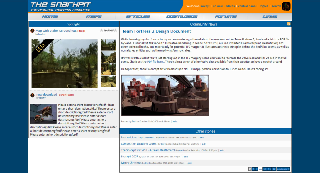
Yeah Larchy I like it. I want to see a live test to know for sure.. but from the screen cap.. Yeah Man I like that a lot! I like having the 2 sample maps up top like that. If you have the other stuff there like Downloads it should be below the two sample maps. I also like the new theme switch button.. lets people know what it is and does. On the blue one the orange in the text up top really looks good too, and HIP HIP HOORAY! THE SNARKS ARE BACK!

On the dark theme the huge snark coming out of the BG and onto the bar looks cool, gives depth. I think his one back leg though should be off the bar, either erase it some, or pull the snark back some, so it looks more like he is coming from the darkness, and not just sitting on top of the image. I am not crazy about your curve, but it does look sharp and crisp.

I think it is a major improvement over the dark theme we have now, and hearkens back to the SnarkPit past. Good Job.
Re: The Snarkpit Relaunch Posted by fishy on Thu Oct 23rd 2008 at 12:04am
fishy
2623 posts
Posted 2008-10-23 12:04am
fishy
member
2623 posts 1476 snarkmarks Registered: Sep 7th 2003 Location: glasgow
Very nice. Looks much more like home. :D
Re: The Snarkpit Relaunch Posted by Le Chief on Thu Oct 23rd 2008 at 2:56am
Le Chief
2605 posts
Posted 2008-10-23 2:56am
Le Chief
member
2605 posts 937 snarkmarks Registered: Jul 28th 2006 Location: Sydney, Australia
Larchy said:
larchy do good?
Yes, Larchy did very good. I also need to mention Muhnay for designing that sexy navigation bar. How does it feel that something you created can be seen/used on the Snarkpit?

Its also awesome how we have the falling snarks back, can we bring that back on christmas day for the front page :D? And can it actually work for people logged in aswell? Last year, you had to log out for it to be seen.
Aaron's Stuff
Re: The Snarkpit Relaunch Posted by G4MER on Thu Oct 23rd 2008 at 4:46am
G4MER
2460 posts
Posted 2008-10-23 4:46am
G4MER
floaty snark rage
member
2460 posts 360 snarkmarks Registered: Sep 6th 2003 Location: USA
Thanks Aaron. How does it make me feel you ask.. Well I have to say I am stoked, I feel very proud to have the PIT use something I have designed. I want to give some props to RIVEN for the idea though. He posted a link to the old SnarkPit and talked about the past glory we had here. That gave me a clear idea on where to go with the design. I hope it goes live soon, and I hope you all enjoy it as much as I do. I want to thank LARCHY for all his hard work on the code... and for allowing me a chance to come up with a new design.
Re: The Snarkpit Relaunch Posted by Riven on Thu Oct 23rd 2008 at 5:31am
Riven
1640 posts
Posted 2008-10-23 5:31am
Riven
Wuch ya look'n at?
super admin
1640 posts 1266 snarkmarks Registered: May 2nd 2005 Occupation: Architect Location: Austin, Texas, USA
:D

-no, seriously, That new site design has got me excited! Awesome work there guys!
Blog: www.playingarchitecture.net
LinkedIn: Eric Lancon
Twitter:@Riven202
Re: The Snarkpit Relaunch Posted by larchy on Thu Oct 23rd 2008 at 1:31pm
larchy
496 posts
Posted 2008-10-23 1:31pm
larchy
fluffy teim
super admin
496 posts 87 snarkmarks Registered: Jan 14th 2008 Occupation: kitten fluffer Location: UK
Please to be previewing an early version of sp_oldschool here

sp_blue has also been updated with some new graphics and stuff.

Again, neither theme has any Internet Explorer code done yet, so don't expect them to work properly in that.

I will wait until there is a bit of feedback, and then move to complete the themes if everything is happy enough with them. This may take a little while as there is still quite a bit to do with them, but hopefully we're heading in the right direction.
Re: The Snarkpit Relaunch Posted by larchy on Thu Oct 23rd 2008 at 1:48pm
larchy
496 posts
Posted 2008-10-23 1:48pm
larchy
fluffy teim
super admin
496 posts 87 snarkmarks Registered: Jan 14th 2008 Occupation: kitten fluffer Location: UK
Muhnay said:
I like having the 2 sample maps up top like that. If you have the other stuff there like Downloads it should be below the two sample maps.
This is just down to the order things have been added via the admin panel.
aaron_da_killa said:
Its also awesome how we have the falling snarks back, can we bring that back on christmas day for the front page :D? And can it actually work for people logged in aswell? Last year, you had to log out for it to be seen.
I had to change the code a bit as it wasn't parsing properly as xml and there are still a few errors in there even though it seems to be working...

But, yeah I can just bung it in prettymuch anywhere... (er, so to speak). No reason why the login should affect it in any way.

They will magically appear on Christmas day, or if you can't wait until then add "&snow=1" to the end of the URL in your address bar :) (like so)
Re: The Snarkpit Relaunch Posted by G4MER on Thu Oct 23rd 2008 at 10:26pm
G4MER
2460 posts
Posted 2008-10-23 10:26pm
G4MER
floaty snark rage
member
2460 posts 360 snarkmarks Registered: Sep 6th 2003 Location: USA
I really don't like the yellow green color you used on the mouse over on oldschool.. or the color of the buttons on the nav-bar, when moused over. Can we adjust that some? Looks too much like baby poo, or barf. I think a nice gray like in the blue would work just fine.. or have them go black sine the BG is a gray color already.. yeah, Black would work well. Also where you have SPOT LITE & COMMUNITY NEWS and the like headers, I think you should use that bar I sent you.. it would look better than the current fade you have. It would also herald back to the old pit.

Also the different sections need some padding, they are butting up to one another, and that looks unfinished and unclean.

I think there should be a Map Spot lite, and then a Download Spot lite, that way you can keep the maps on top and the Downloads below. You could have 2 big map previews and 4 small 2 side by side that equal the size of the map image above download previews. Does that make sense?
Re: The Snarkpit Relaunch Posted by larchy on Fri Oct 24th 2008 at 7:52am
larchy
496 posts
Posted 2008-10-24 7:52am
larchy
fluffy teim
super admin
496 posts 87 snarkmarks Registered: Jan 14th 2008 Occupation: kitten fluffer Location: UK
Muhnay said:
I think there should be a Map Spot lite, and then a Download Spot lite, that way you can keep the maps on top and the Downloads below. You could have 2 big map previews and 4 small 2 side by side that equal the size of the map image above download previews. Does that make sense?
You're talking about changing the actual content here, not just the theme - so bear in mind such a change would be reflected across all the themes, some of which might not have as much space to play with.
Re: The Snarkpit Relaunch Posted by larchy on Fri Oct 24th 2008 at 11:52am
larchy
496 posts
Posted 2008-10-24 11:52am
larchy
fluffy teim
super admin
496 posts 87 snarkmarks Registered: Jan 14th 2008 Occupation: kitten fluffer Location: UK
Muhnay said:
I really don't like the yellow green color you used on the mouse over on oldschool..

Also the different sections need some padding, they are butting up to one another, and that looks unfinished and unclean.
I wasn't too sold on it either tbh, was just trying something different. Same reason I decided to see how no padding between elements would look... but didn't really work.

Made some change, check things out now and see what you think.
Re: The Snarkpit Relaunch Posted by Le Chief on Fri Oct 24th 2008 at 12:02pm
Le Chief
2605 posts
Posted 2008-10-24 12:02pm
Le Chief
member
2605 posts 937 snarkmarks Registered: Jul 28th 2006 Location: Sydney, Australia
Larchy said:
Made some change, check things out now and see what you think.
Oh yes, the changes are certainly an improvement, looks really good.
Aaron's Stuff
Re: The Snarkpit Relaunch Posted by G4MER on Fri Oct 24th 2008 at 12:24pm
G4MER
2460 posts
Posted 2008-10-24 12:24pm
G4MER
floaty snark rage
member
2460 posts 360 snarkmarks Registered: Sep 6th 2003 Location: USA
Ahh yes that red lined headers is So F'in Nice.. I really like that, and it reminds me of the old pit!

The Padding is also nice, and the blackout on mouse over is PERFECT!

The Red Submit button and Preview I am not crazy about... The Yellow Numbers in the lower right corner are not bad, and they draw attention to them so people know there are many more pages.

I LOVE the new Black/Yellow change theme logo.. great work on that!

I think were getting there LARCHY! its looking very good. The more yellow buttons over the green is so much better! The bits in Red and yellow all start to work together and we have a more unified look! Love the yellow link text too..

Over all FANTASTIC! just a few minor color fixes and I think you can call it done. There maybe some coding options on your end that need a little tweaking but so far its looking great! :D :D :D :D :D

P.S. I really do think you need to address the left side though.. it makes the page off balance. Could you list a couple maps on the left and stick the download previews along the bottom of the page? I know it will change some of the other themes.. but I was under the impression that you were moving to the wider Blue and oldschool themes and dropping the green/dark thin themes? think that way you could do 3 of each. If not I think having the larger images on the left side and the smaller download previews along the bottom would work with all theme templates. But your the code expert and know better than I what works and what doesn't.. so I leave that to your expertise.
Re: The Snarkpit Relaunch Posted by larchy on Fri Oct 24th 2008 at 12:50pm
larchy
496 posts
Posted 2008-10-24 12:50pm
larchy
fluffy teim
super admin
496 posts 87 snarkmarks Registered: Jan 14th 2008 Occupation: kitten fluffer Location: UK
The red submit buttons are just an oversight... they should be yellow like the other stuff.

When I can I'll do black/yellow/red themed graphics rather than just re-using the dark green ones.

I've modified the spotlight script so that maps always appear at the top - hopefully there are no objections to that.

I wasn't planning on dropping any of the current themes, just adding the new ones to the rotation. I could make the oldschool theme the default one though once its finished.
Re: The Snarkpit Relaunch Posted by larchy on Fri Oct 24th 2008 at 4:47pm
larchy
496 posts
Posted 2008-10-24 4:47pm
larchy
fluffy teim
super admin
496 posts 87 snarkmarks Registered: Jan 14th 2008 Occupation: kitten fluffer Location: UK
Further progress is being made...

In a break from style-associated news I have modified the [ mapthumbs ][ /mapthumbs ] output so it uses the new auto-resize thumbnail do-widdlyness. Thumbnails which were previously generated when a map was uploaded are now redundant and are no longer created. The maximum map screenshot width has been increased to 1680 pixels (ie 22" widescreen resolution which should improve screenshot quality a lot), although all images will still be resampled at a jpeg quality of 80 (which is the best filesize/quality tradeoff).
Re: The Snarkpit Relaunch Posted by tnkqwe on Sat Oct 25th 2008 at 6:40am
tnkqwe
560 posts
Posted 2008-10-25 6:40am
tnkqwe
member
560 posts 684 snarkmarks Registered: Mar 31st 2007 Occupation: High school student Location: Bulgaria
I think you have waisted a little bit too much space for the "Recent Forum Posts" and the "Recent Updates".The cp_oldschool and the cp_blue are "longer" than the the black and green theme.
But the cp_oldschool it's really like thinks in the past.
OH!And does any body knows what hapened with Leperous?
Never think about bad things!
TNKqwe:The New Killer qwe
[img]http://images.quiz.wegame.com/production/personalities/22/badge.jpg[/img]
I am Engineer - Play Free Online Games
[img]http://media.moddb.com/images/global/moddb_88x31_v12.png[/img]
Citizen Arms
Re: The Snarkpit Relaunch Posted by Gwil on Sat Oct 25th 2008 at 9:51am
Gwil
2864 posts
Posted 2008-10-25 9:51am
Gwil
super admin
2864 posts 315 snarkmarks Registered: Oct 13th 2001 Occupation: Student Location: Derbyshire, UK
Leperous is busy with real life (tsk!). I don't think he plays many games any more bar perhaps Civilization IV/Colonization.

He is studying for a PhD in stellar collapse (astronomy) at the University of Southampton is the last I heard from him. Knowing graduate students, he will be there for some time...
Re: The Snarkpit Relaunch Posted by larchy on Sun Oct 26th 2008 at 9:26am
larchy
496 posts
Posted 2008-10-26 9:26am
larchy
fluffy teim
super admin
496 posts 87 snarkmarks Registered: Jan 14th 2008 Occupation: kitten fluffer Location: UK
Would there be any objections if the new sp_oldschool theme was the only theme available for a little while?

The reason I ask is that I'm recoding & improving quite a few things on the backend, but I'm going to have to make changes to all the themes to accomodate some of them.
It would help me get things finished and uploaded for everyone quicker if I only had the one theme to worry about, and since the new sp_oldschool theme does look good and is more akin to the original site I thought I'd make the suggestion...
Re: The Snarkpit Relaunch Posted by Gwil on Sun Oct 26th 2008 at 12:38pm
Gwil
2864 posts
Posted 2008-10-26 12:38pm
Gwil
super admin
2864 posts 315 snarkmarks Registered: Oct 13th 2001 Occupation: Student Location: Derbyshire, UK
If it makes your work more efficient and easily completed please go ahead and use it as the default!
Re: The Snarkpit Relaunch Posted by G4MER on Sun Oct 26th 2008 at 9:40pm
G4MER
2460 posts
Posted 2008-10-26 9:40pm
G4MER
floaty snark rage
member
2460 posts 360 snarkmarks Registered: Sep 6th 2003 Location: USA
You have my vote on it Larchy. I am already using it.. so it wont effect me at all. So please do.
Re: The Snarkpit Relaunch Posted by Riven on Mon Oct 27th 2008 at 5:27am
Riven
1640 posts
Posted 2008-10-27 5:27am
Riven
Wuch ya look'n at?
super admin
1640 posts 1266 snarkmarks Registered: May 2nd 2005 Occupation: Architect Location: Austin, Texas, USA
I'm cool with it.
Blog: www.playingarchitecture.net
LinkedIn: Eric Lancon
Twitter:@Riven202
Re: The Snarkpit Relaunch Posted by Le Chief on Tue Oct 28th 2008 at 4:40am
Le Chief
2605 posts
Posted 2008-10-28 4:40am
Le Chief
member
2605 posts 937 snarkmarks Registered: Jul 28th 2006 Location: Sydney, Australia
:imwithstupid:

Might be a good idea to make a news post about this so that the visitors and new/old members won't be confused, I know that the "Old Skool Snarkpit" theme is a bit buggy in parts, making some things hard to read.
Aaron's Stuff
Re: The Snarkpit Relaunch Posted by Cash Car Star on Thu Oct 30th 2008 at 2:57am
Cash Car Star
1260 posts
Posted 2008-10-30 2:57am
1260 posts 345 snarkmarks Registered: Apr 7th 2002 Occupation: post-student Location: Connecticut (sigh)
Neat, this thing actually happened. I sort of miss the old version, but this is pretty nice too!
Re: The Snarkpit Relaunch Posted by Gwil on Thu Oct 30th 2008 at 2:55pm
Gwil
2864 posts
Posted 2008-10-30 2:55pm
Gwil
super admin
2864 posts 315 snarkmarks Registered: Oct 13th 2001 Occupation: Student Location: Derbyshire, UK
Hi there CCS! Nice to see you and the bouncing DK around these parts. How's life in Connecticut (sigh) ? I see you're now a "post student".. does this mean you've entered the murky world of post-grad?

aaron, i'll stick something on the news in a bit.. i've been neglecting the old pit lately in favour of procrastinating on my ever increasing pile of papers that need to be written and digging up oldies like Unreal Tournament.
Re: The Snarkpit Relaunch Posted by larchy on Thu Oct 30th 2008 at 5:25pm
larchy
496 posts
Posted 2008-10-30 5:25pm
larchy
fluffy teim
super admin
496 posts 87 snarkmarks Registered: Jan 14th 2008 Occupation: kitten fluffer Location: UK
OK, new update is up.

The new black theme is the only theme currently available to all users. It should be largely error free, and I have taken extra time to ensure that it works exactly the same with Internet Explorer as with other browsers. Hopefully it should be good for everyone, but do please let me know any issues so I can fix them.

Front page has been modified a bit - the spotlight layout has changed slightly to what I feel is a cleaner display of information. A small list of latest maps is also now present underneath the main news.

User profiles have changed slightly, and I have some plans on how to develop them into useful portfolio pages - do please check them out and provide any constructive feedback you may have. There is a new option in the edit profile menu to allow you select your main featured map, otherwise the latest map you uploaded will be used. tnkqwe you may want to explore this as your profile could currently cause heart attacks for the unprepared :P

The code for posting in the forums has been rewritten from scratch. You shouldn't notice any major effects from this, although the actual posting page has been improved. For example caret focus is now stored properly so tags/smilies will be added at the point of the cursor whereas they were always added at the end of the text you had typed so far. A few new tags are supported too, such as the youtube tags. Topic review has been improved, and there is an easy to use quote button alongside each post too. Post preview has changed too to allow you to edit alongside the preview display. All in all I hope things are a good improvement for people.

Probably a few other things in places too... anything you spot that is out of place let me know so I can fix it please.

I haven't forgotten about things like adding a view of a user's posting history or actually making the search worth a damn - I will get them sorted in the not too distant future.

cheers.

NB - remember to CRTL+F5 refresh your browser to clear its cache of old stylesheet versions and older javascript files if you experience any issues.
Re: The Snarkpit Relaunch Posted by Riven on Thu Oct 30th 2008 at 6:43pm
Riven
1640 posts
Posted 2008-10-30 6:43pm
Riven
Wuch ya look'n at?
super admin
1640 posts 1266 snarkmarks Registered: May 2nd 2005 Occupation: Architect Location: Austin, Texas, USA
Wow, super sexy there Larchy! I love the pop-up panels when hovering over the front-page map thumbnails. -Could we implement that feature elsewhere?

The 'about us' page is very nice, and I would give you an A+ for your addition :D

I don't have time now, but I want to try that new flash button you've added!

looking pretty swell there. It's got me pumped. I'll be sure to post later about what else I've discovered.

When I get time....

Until then, Woot Woot; the awesome train is now boarding, all aboard?
Blog: www.playingarchitecture.net
LinkedIn: Eric Lancon
Twitter:@Riven202
Re: The Snarkpit Relaunch Posted by G4MER on Thu Oct 30th 2008 at 6:53pm
G4MER
2460 posts
Posted 2008-10-30 6:53pm
G4MER
floaty snark rage
member
2460 posts 360 snarkmarks Registered: Sep 6th 2003 Location: USA
HELL YEAH! Dude this is AWESOME! I am so stoked.. everything looks great. I love the new posting appearance.. and the map highlights. Are you going to remove the two maps from the side bar and just leave that as the preview for downloads? I think they should be separate.. if you want to high-lite the maps then have them on the side, and the other downloads like models and such along the bottom under everything. But yeah man.. I LOVE THE NEW LOOK.. you really pulled it all together!
Re: The Snarkpit Relaunch Posted by larchy on Thu Oct 30th 2008 at 7:28pm
larchy
496 posts
Posted 2008-10-30 7:28pm
larchy
fluffy teim
super admin
496 posts 87 snarkmarks Registered: Jan 14th 2008 Occupation: kitten fluffer Location: UK
Thanks guys :)

Riven - the overlays are pretty trivial to implement now I've done the main code for them. I created them because I wanted to make the front page map images seem less cluttered while retaining salient information about the map.

The problem with them is that they cover up part of the thumbnail image. This is why they have an 80% opacity value until you rollover them so that the full image can still be partially seen... (I settled for 80% after experimenting as any lighter was unreadable while still obscuring the image).

I didn't implement them in the maps section because I felt there was more space to play with and they would just obscure images unnecessarily... making them completely transparent until mouseover would mean you could no longer simply look at a big list of all the maps and quickly see ratings/games/mods etc without mousing over each one.

Does that reasoning make sense?

There are some cool places they can still be good to use though, like on the featured map on a user's profile for instance (where some of the description text can be shown too, which looks pretty good).

Muhnay - aaaages ago I started out with the spotlight area of the front page being just a 'latest maps' section. That got modified after ppl discussed it a bit to a section that a) included new articles and downloads too and b)wasn't simply a list of latest updates, but was controlled by admins so we could maybe show some older content or 'hidden gems' if we wanted.

Then people wanted a place for latest forum posts and whatnot .... I think there have been so many changes that maybe the focus has been lost a little bit on what content we're trying to show where.

Maybe we could do maps down the side with big thumbs... articles and downloads little thumbs under the news... then under that some bigger thumbs going across for any spotlight content?

Then again I think it's kinda good as it is...

Pff I dunno, go make a new site layout in Photoshop :P
Re: The Snarkpit Relaunch Posted by haymaker on Thu Oct 30th 2008 at 11:55pm
haymaker
439 posts
Posted 2008-10-30 11:55pm
haymaker
member
439 posts 921 snarkmarks Registered: Apr 1st 2007 Location: CAN
Very cool look :)

Im viewing this on a friend's machine running ffox 2.0.0.4, desktop res 1024x768...I'm getting lots of orientation/space strangeness
  • front page displays "community news" vertically underneath "spotlight", where it was to the right before
  • front page map thumbs are weird, first two are hard right, next two are hard left as if they are after a line break
  • this forum topic is too wide for the screen, have to use scrollbar hard right to see a reply in its entirety
  • looking at a map in "maps" gives me what looks like old-style frames around the text, forcing the use of scrollbars
I'll check my own version of FFox later.
Re: The Snarkpit Relaunch Posted by G4MER on Fri Oct 31st 2008 at 1:30am
G4MER
2460 posts
Posted 2008-10-31 1:30am
G4MER
floaty snark rage
member
2460 posts 360 snarkmarks Registered: Sep 6th 2003 Location: USA
Larchy Will do.. :lol:

It maybe his screen size.. I am seeing everything just fine. I am at 1400x1050 and have Fire Fox 3.03
Re: The Snarkpit Relaunch Posted by Le Chief on Fri Oct 31st 2008 at 3:43am
Le Chief
2605 posts
Posted 2008-10-31 3:43am
Le Chief
member
2605 posts 937 snarkmarks Registered: Jul 28th 2006 Location: Sydney, Australia
:scream: Looks niiiice!
Aaron's Stuff
Re: The Snarkpit Relaunch Posted by Natus on Fri Oct 31st 2008 at 7:49am
Natus
570 posts
Posted 2008-10-31 7:49am
Natus
member
570 posts 76 snarkmarks Registered: Jan 28th 2005 Location: Denmark
I liked the old theme better to be honest, the current menu buttons and the whole gradient thing just looks a bit too "I just got photoshop"-ish, besides, it isn't displayed correctly on lower resultions, I can see just about 4/5 of the page in FF3 on my EEE (1024x600).