Say hi to our newest member, RichardELDEN!
Its comming along very nice, I just added the kitchen and it has a niceGotta love the doubling damage type :smile:
little trap. There is a freezer door that is opened by turning a
switch, in side the freezer is an AR2, plasma balls, and alot of
health. But the longer the player stays in the freezer the more
damage he takes, and the door shuts after a few seconds.
DrGlass said:Open door + grav pull all of it = trap subverted.
Its comming along very nice, I just added the kitchen and it has a nice little trap. There is a freezer door that is opened by turning a switch, in side the freezer is an AR2, plasma balls, and alot of health. But the longer the player stays in the freezer the more damage he takes, and the door shuts after a few seconds.
just using the screens as a reference: you are falling into theI'm having a huge problem compiling my map, once I do I'll post some
trap of giving more attention in detail to one area, and ignoring
another.
the outside shows much more detail than the inside portion. give equal time to each.
did you look at the example map i posted? its all or mostly all
outside, but the attention to detail extended from top of cliff to
bottom. equal details were displayed throughout the map.

DrGlass said:it shows. it's looking better than your city map.
money: thats about 5-6 years of mapping right there, I've been doing this for quite some time and only recently have I gotten any good at it.
thank you.DrGlass said:it shows. it's looking better than your city map.
money:
thats about 5-6 years of mapping right there, I've been doing this for
quite some time and only recently have I gotten any good at it.
great work
DrGlass said:it shows. it's looking better than your city map.
<DIV class=quote>
<DIV class=quotetitle>? quote:</DIV>
<DIV class=quotetext>
<DIV class=quote>
<DIV class=quotetitle>? quoting DrGlass</DIV>
<div class="quotetext">money: thats about 5-6 years of mapping right there, I've been doing this for quite some time and only recently have I gotten any good at it.
hey! I thought the city map looked pretty good, sure it didn't run wellDrGlass said:except, the city map wasn't 5-6 years ago..
thank you.DrGlass said:it shows. it's looking better than your city map.
money: thats about 5-6 years of mapping right
there, I've been doing this for quite some time and only recently have
I gotten any good at it.
great work
/runs very fast
DrGlass said:5 whole days huh
hey! I thought the city map looked pretty good, sure it didn't run well and the wepon placment was crappy and the skybox sucked... and other stuff but in my defence that was like 5 days worth of mapping for an engin I didn't understand yet :wink:
/throws rotten fruit

I have high hopes for this map, if I can work out the kinks...DrGlass said:5 whole days huh
hey! I thought the city map looked pretty good, sure it
didn't run well and the wepon placment was crappy and the skybox
sucked... and other stuff but in my defence that was like 5 days worth
of mapping for an engin I didn't understand yet :wink:
/throws rotten fruit
No_Patience took me in excess of 6 weeks workin on it steady to perfect it, and it still was released with a couple bugs.
at the time, I had ... 3+ years worth of WorldCraft experience.
5 days.. /me giggles
Nice pictures!Effects folder. Turn off shadows and collision. they self animate.
Oh who am I kidding they are the BEST! I AM GONNA CRY EVERYTIME I LOOK AT MY MAPS!!!
Anyway can you help me master!
I noticed the light rays and I
need to know what folder they are in and if they can be resized etc
because the ones I use don't fit my map!
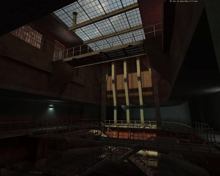
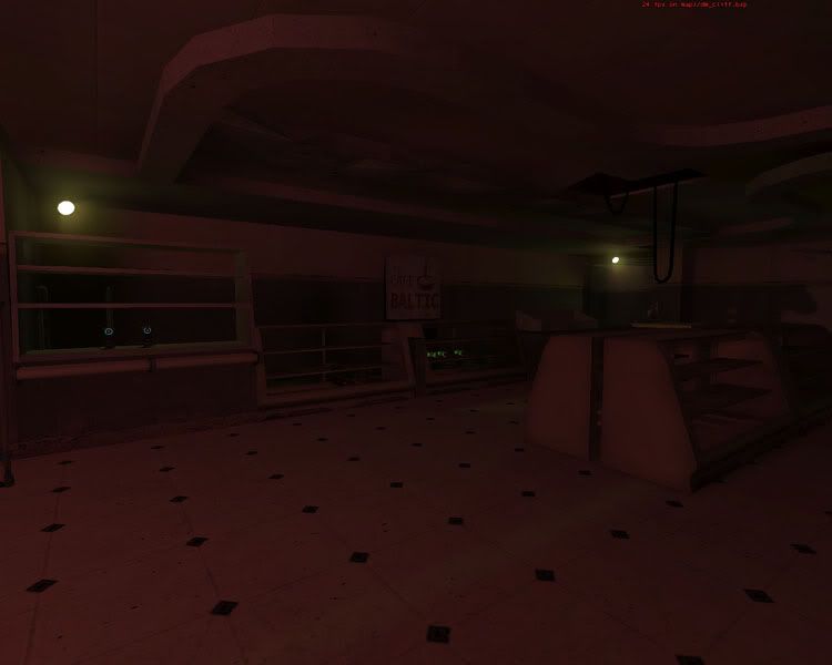
I did a quick run-through. I'm going to be fairly blunt:I can only think of two places with red lights. I used more dark yellow/env_light than anything.
- There are light-colors other than red! Use them!
- Framerate is terrible. 20-30 FPS averages in main fighting areas!
It'll get even worse when there are actually other players. This is
probably the biggest problem right now, and was a big problem with
dm_park. (note that I have a fairly high-spec system, and average about
80 FPS on Overwatch)
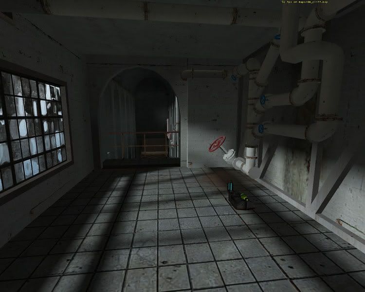
</li>- Lack of landmarks in the hallways. No idea where I was in the
context of the rest of the map. The rooms are all similar - pipes,
machine soundscape, red lighting. Dedicate more resources to big
details that are memorable... In the big picture, all of those little
brush details don't really matter. (especially when framerate is
suffering so much!)\</li>- Less
hallways! They aren't very interesting to fight in. There's two ends
and a long stretch of floor in between; not very special.
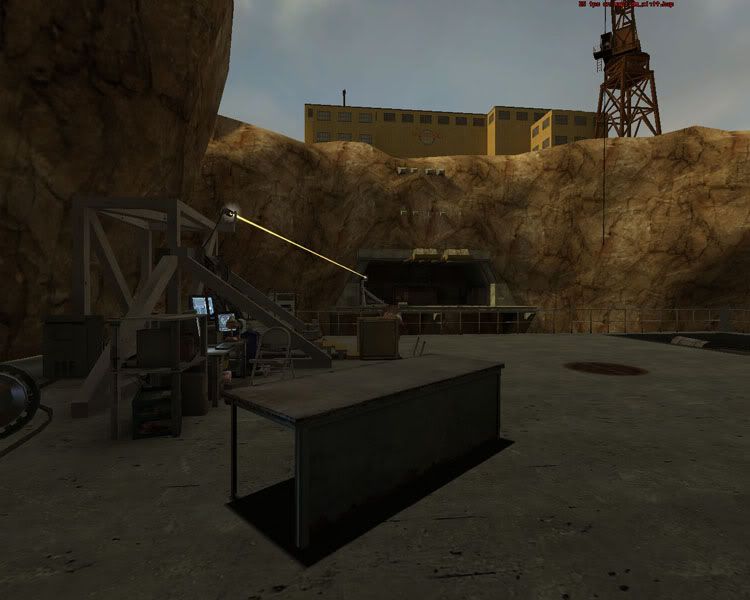
</li>- Cliff texture was missing.
</li>
eeh, i still get the missing cliff texture checkboard thing, are you using a texture from hl2 or hl2dm?try it again.


Don't be afraid to lower lightmap scales.I did, I hand most wall and floor light maps at 4 and I think that
Don't just leave it! This map is cool! Sure the lighting could be improved etc. But that isn't too big a change is it?Thanks for the intrest =) I think I'll come back to this map later, but right now other projects are more important.
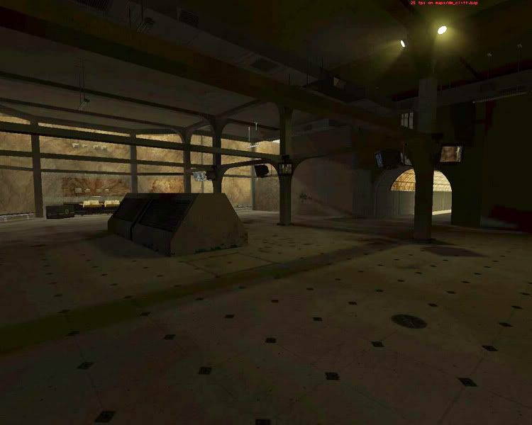
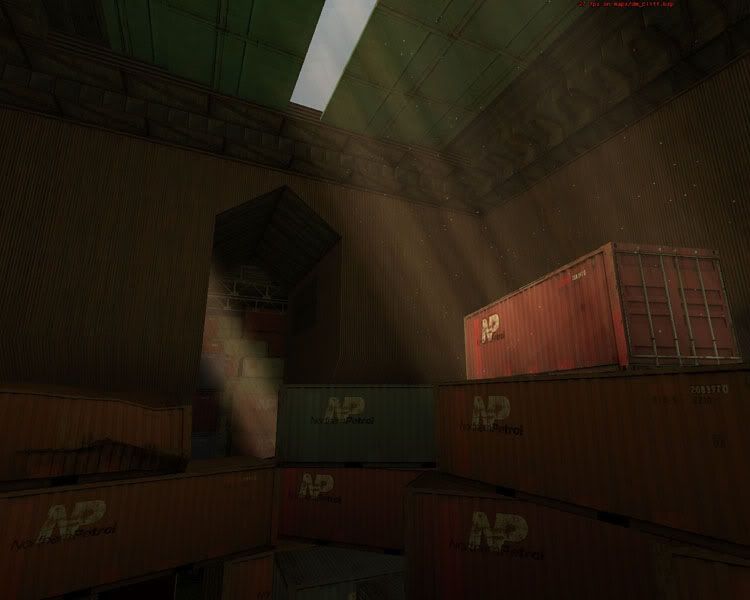
In the Freightbox room could you lift the clip up so I could snipe from the tops of the boxes? And add a window maybe....
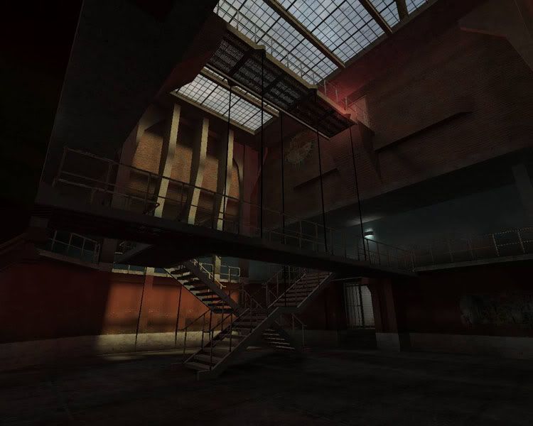
A very cool map.