
Re: 2D/3D art
Posted by Orpheus on
Fri Apr 14th 2006 at 1:29am
 Orpheus
member
13860 posts
2024 snarkmarks
Registered:
Aug 26th 2001
Occupation: Long Haul Trucking
Location: Long Oklahoma - USA
I wasn't trying to be mean, or funny. The only thing that looks good is the pillars.
The rest looks awful.
My point was simply to encourage you to invest enough time into your area to not detract from the goal, which is to promote your models.
Sorry if that sounded cruel.
The best things in life, aren't things.
Re: 2D/3D art
Posted by fishy on
Fri Apr 14th 2006 at 1:43am
 fishy
fishy
member
2623 posts
1476 snarkmarks
Registered:
Sep 7th 2003
Location: glasgow
making pillars of various lengths, and arches of various spans, and leaving them as seperate models, would give more mapping options than having the pillars and arches tied together. it would also let some people use only the bits they liked/wanted. :rolleyes:
the tricky bit with that, is getting the models to have origins that will let them easily line up with each other.
i eat paint

Re: 2D/3D art
Posted by nooba on
Fri Apr 14th 2006 at 3:05am
 nooba
nooba
member
146 posts
104 snarkmarks
Registered:
Jan 20th 2004
Location: Australia
Alright, so.. there is no way of unyuckifying it?
Re: 2D/3D art
Posted by Dr Brasso on
Fri Apr 14th 2006 at 1:57pm
1878 posts
198 snarkmarks
Registered:
Aug 30th 2003
Occupation: cad drafter
Location: Omaha,NE
nooba, if i may, the thing that throws me about it, is the singularity of it....as jon said, theres nothing to make it look as if its "built up" as a real arch would be....now, thats not to say that there is no such thing as a single facad arch, but they are much more modern in design, (stucco in south cali comes to mind)...and the visual is almost amplified by the shading....it gives it a convex look, like a rounded stone helmet...i dont know if the skinning is the problem in that context, but i think it well worth looking into....
btw sir.....yer tenacity is admirable, as i see an excellent modeller emerging in the future.....keep it up dude, gj.... :wink:
Doc B... :dodgy:

Re: 2D/3D art
Posted by Orpheus on
Fri Apr 14th 2006 at 10:33pm
Posted
2006-04-14 10:33pm
 Orpheus
member
13860 posts
2024 snarkmarks
Registered:
Aug 26th 2001
Occupation: Long Haul Trucking
Location: Long Oklahoma - USA
@nooba. As I said before, you are restricting the users to what you decided was best. You need to make your arch in such a way as to allow the user to incorporate it how "THEY" want to use it. You will limit your users by adding walls/upper areas.
Make your arch with nothing above it.
@ Fisheye... Nice. I like planes. I like ships more but planes are sweet.
The best things in life, aren't things.

Re: 2D/3D art
Posted by Orpheus on
Sat Apr 15th 2006 at 11:20am
Posted
2006-04-15 11:20am
 Orpheus
member
13860 posts
2024 snarkmarks
Registered:
Aug 26th 2001
Occupation: Long Haul Trucking
Location: Long Oklahoma - USA
Yes/No.
Its your model, so its your choice. I would never tell you what you need to release or not.
Release a version that you worked so hard on to complete. That way, you have it out there. The problem is, now someone will have to build architecture that you picked out. It should be the other way around. Models should compliment the architecture, not dictate its pattern. Remember, people cannot retexture your model to fit.
Then edit the model so that you have something more similar to the tiny screen I posted. You want arches... Upside down "U" above the pillars.. Narrow pieces of rock forming the "U"
The best things in life, aren't things.

Re: 2D/3D art
Posted by nooba on
Tue May 16th 2006 at 4:20am
 nooba
nooba
member
146 posts
104 snarkmarks
Registered:
Jan 20th 2004
Location: Australia
That's very good for a first model :smile:

Re: 2D/3D art
Posted by Gollum on
Tue May 16th 2006 at 10:30am
Posted
2006-05-16 10:30am
 Gollum
member
1268 posts
525 snarkmarks
Registered:
Oct 26th 2001
Occupation: Student
Location: Oxford, England
Agreed. Great job: very clean, accurate modelling. And stylish too :smile:
Re: 2D/3D art
Posted by Naklajat on
Tue May 16th 2006 at 2:11pm
1137 posts
384 snarkmarks
Registered:
Nov 15th 2004
Occupation: Baron
Location: Austin, Texas
Thanks :biggrin:
I'm working on the skin and reflect map, I did the UV map really sloppy and noobish, so it's not the easiest thing to skin... I'm gonna redo that now I think. I'll post in-game screens with the pretty reflections later :smile:
Now if only I could animate it properly... so far I've spent more than 5 hours on just animating, and I have nothing that looks even remotely good :\
o
3012 posts
529 snarkmarks
Registered:
Feb 15th 2005
Yeah very very nice for a first model, very ambitous too. My first model was a baseball bat :smile:

Re: 2D/3D art
Posted by French Toast on
Wed May 31st 2006 at 4:21am
3043 posts
304 snarkmarks
Registered:
Jan 16th 2005
Occupation: Kicking Ass
Location: Canada
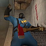
@ Baron. Try adding scratches or somethin on the metal, and maybe some text showin somethin rather, the blade just looks rather bland right now.

Re: 2D/3D art
Posted by BlisTer on
Thu Jun 15th 2006 at 12:59am
Posted
2006-06-15 12:59am
 BlisTer
member
801 posts
1304 snarkmarks
Registered:
Jun 10th 2004
Location: Belgium
looks nice pvt scythe, almost real
These words are my diaries screaming out loud
3012 posts
529 snarkmarks
Registered:
Feb 15th 2005
Looks great, although there is something about his lips (and the squarishness of his nose) that looks slightly odd. I think that will probably change when you skin it though.

3012 posts
529 snarkmarks
Registered:
Feb 15th 2005
Your Earth piece looks amazing. Seriously. Did you do it all from scratch? I'm not familiar with the program you're using so I don't know how hard it was to create it, but jeez it looks good. Why not combine your passions and edit the earth to show simultaneous nuclear explosions or something? :smile:
Explosion: I think the fire and the smoke look great, but the ground/dirt looks fake, and the particles look strange. I would think the explosion would look better without the metal scraps flying around. I dunno, maybe.
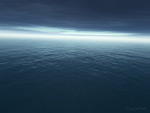
Seascape 1 looks pretty good, but for some reason the slight trough in the bottom right corner looks a little weird, considering the rest of the ocean doesn't seem to feature symmetrical troughs and crests. I dunno, just looks like there's a dent in the ocean in that one spot.
Seascape 2: The swells look better here I think, but it doesn't seem like the rain is really part of the image. It just looks like a layer on top of everything else. The ocean isn't frothy for one, and I'd expect at least some indication that rain was striking the surface of the ocean.
3: This looks nice, although I wish there wasn't the bottom part of the lens flare. The top part works fine as the sun, but the bottom is kind of distracting. It just struck me... would you be able to turn these types of scenes into skyboxes for use in game? If so, I'd want to use 'em :wink:
4: I'm not really a fan of the white horizon or the bright sun on this one. The blood red also doesn't please my eye, but that could just be my tastes. I like the way the waves near the bottom look, the close ones.
5: I really like the color and angle of this one. The water looks like the HL2 shaders. I don't particularly like your sig in the bottom right corner though :smile: The others were very subtle, but this one, not so much.
I like the short focus on the iPod.
All in all, great stuff, thanks for sharing. I know you're probably done with all the stuff I critiqued, but I felt I had to respond to them somehow :smile:
Re: 2D/3D art
Posted by midkay on
Thu Aug 3rd 2006 at 3:20pm
 midkay
member
398 posts
120 snarkmarks
Registered:
Apr 15th 2005
Location: United States
Thanks, morph :smile: Yeah, done with these more or less. I'll keep your suggestions in mind for whatever happens next.. and yeah, I regret the lens flare on the blood-red one. :smile: Gosh, I should just respond to each point quickly.. :smile:
Earth: Well, I didn't paint the texture... :smile: The textures are from.. hmm.. NASA or Visible Earth or something like that, I just set up the material to use certain layers of it as well as a nice shadow-casting cloud layer. :biggrin:
Explosion: Still frame (tweaked, though) of an animation I did. :smile: Maybe it would work better without the random pieces, good thought...
Seascapes: Yeah, these used the Dreamscape plugin, and I learned more about it each time I did a new one.. first I just kind of started messing around but by the latter ones I had learned a lot about it. :smile: Skyboxes, hmm.. I think dreamscape will let you render out the sky, yeah. :smile: Or did you mean also with the water? I could set up six cameras and render out each needed frame... and as for the 5th one, yes, that's my favorite of these.. I've been using it as a desktop for a few months now. :biggrin: Ah, is the sig brightish? I guess it kinda stands out..
Thanks for all your comments. :biggrin: Cool to get more than just map advice here! :smile:
-- midkay
3012 posts
529 snarkmarks
Registered:
Feb 15th 2005
I'm no art expert by any means, but I like to share my thoughts anyhow :smile:
 It's not even serious.. It was just a test :razz:
